The Architect of Abstraction: A Life in Geometric Harmony
Theo van Doesburg, born Christian Emil Marie Küpper in 1883 in Utrecht, Netherlands, was more than a painter; he was a revolutionary force who reshaped the very foundations of modern art. His journey began amidst the lingering echoes of Impressionism and Post-Impressionism, initially mirroring styles reminiscent of Vincent van Gogh – both in subject matter and emotional intensity. However, this early phase served as a crucial prelude, a necessary stepping stone toward the radical transformation that would define his enduring legacy. A pivotal moment arrived in 1913 with his encounter with Wassily Kandinsky’s *Rückblicke*. This text sparked within van Doesburg a profound realization: true artistic expression lay not in replicating the external world but in channeling an inner, spiritual reality through pure abstraction. It was this conviction that birthed Neoplasticism, more commonly known as De Stijl – a movement he founded and fiercely championed, becoming its most ardent advocate.
Forging a New Visual Language: The Principles of De Stijl
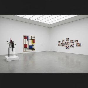
De Stijl wasn’t merely an artistic style; it was a comprehensive philosophical manifesto translated into visual form. Van Doesburg believed in stripping art down to its most essential elements – straight lines, right angles, and the primary colors of red, yellow, and blue, alongside black, white, and gray. This austere palette wasn't born from limitation but from a desire for universality—a belief that these fundamental forms resonated with an underlying cosmic order. He envisioned a *total* work of art, extending beyond the canvas to encompass architecture, design, and even everyday objects. Collaboration was key; van Doesburg worked closely with architects like J.J.P. Oud and Gerrit Rietveld, designing stained glass windows, furniture, and entire interiors that embodied the principles of De Stijl. His collaborations extended to fellow artists such as Piet Mondrian, with whom he co-founded the influential journal *De Stijl*, a platform for disseminating their ideas and attracting like-minded creatives. However, despite their shared origins, tensions arose between van Doesburg and Mondrian regarding the rigidity of Neoplasticism. Van Doesburg introduced “Elementarism” in 1926, advocating for diagonal lines and more dynamic compositions – a departure that ultimately led to a schism within the movement, revealing his restless spirit and constant pursuit of artistic evolution.
Beyond Painting: A Multifaceted Artistic Vision
While celebrated as a painter, van Doesburg’s artistic pursuits were remarkably diverse. He was a prolific writer, poet, and critic, using his pen to articulate the theoretical underpinnings of De Stijl and challenge conventional notions of art. His engagement with Dadaism in the early 1920s further broadened his artistic horizons, leading to experimental works that incorporated collage and typography. This period also saw him teaching at the Bauhaus, where he shared his ideas with a new generation of artists and designers. He wasn’t content to remain within the confines of traditional art forms; van Doesburg actively sought to integrate art into everyday life, believing it had the power to transform society. His designs for interiors and furniture weren't merely aesthetic exercises but attempts to create harmonious living spaces that reflected the principles of De Stijl. A prime example is his collaboration with Sophie Taeuber-Arp and Georges Vantongerloo on designing artist residences, showcasing a holistic approach to artistic creation – an attempt to build a world *in* the image of his ideals.
Legacy and Enduring Influence: A Pioneer of Modernism
Theo van Doesburg’s life was tragically cut short in 1931 at the age of 47, yet his impact on modern art remains profound. De Stijl, though relatively short-lived as a cohesive movement, exerted an enormous influence on subsequent artistic developments, including Bauhaus design, Minimalism, and Constructivism. His emphasis on geometric abstraction, pure color, and functionalism continues to resonate with artists and designers today. His work serves as a reminder that art is not merely about representation but about the exploration of fundamental forms and ideas. Van Doesburg’s legacy extends beyond his paintings and designs; it lies in his unwavering commitment to artistic innovation and his belief in the transformative power of abstraction. His vision of a unified, harmonious world – expressed through the language of De Stijl – continues to inspire those who seek to create a more beautiful and meaningful environment.
Key Works & Lasting Impact
- Study for Simultaneous Compositions XXII (1922): A quintessential example of Neoplasticism, showcasing the movement’s signature geometric forms and limited color palette.
- Composition with half values (1928): Demonstrates van Doesburg's exploration of tonal variations within the De Stijl aesthetic.
- Dancers (1917-1918): Represents a transitional phase in his work, blending figurative elements with emerging abstract tendencies.
- Collaboration on *De Stijl* journal: A crucial platform for disseminating the movement’s ideas and fostering dialogue among artists and intellectuals.
- Elementarism (1926): Van Doesburg's attempt to inject dynamism into Neoplasticism, introducing diagonal lines and a more fluid approach to composition.
Van Doesburg’s influence can be seen in countless aspects of modern design – from architecture and furniture to graphic design and typography. He remains a pivotal figure in the history of art, a true pioneer who dared to challenge conventions and envision a new visual language for the 20th century and beyond—a legacy etched in straight lines and primary hues.

 Send
Send


 Glass option is only available in size under 110 CM