The Psychology of Color in Interior Design
From the ochre pigments found in prehistoric cave paintings to the vibrant hues adorning Renaissance masterpieces, color has always been intrinsically linked to human expression and emotion. It’s a fundamental element of our perception, capable of stirring memories, influencing moods, and even altering physiological responses. For the freelance decorator, understanding this profound connection is not merely about aesthetic preference; it's about crafting environments that resonate deeply with those who inhabit them. The power lies in recognizing that color isn’t simply *seen*; it’s *felt*. Consider Edvard Munch’s ‘Autoportrait,’ a haunting exploration of isolation rendered through swirling, emotionally charged brushstrokes and a palette dominated by somber tones. The painting doesn't just depict sadness; it evokes it within the viewer, demonstrating how color can bypass intellectual analysis and speak directly to our subconscious.
Historically, the association between color and emotion has been remarkably consistent across cultures, though nuances certainly exist. Red, for instance, frequently symbolizes passion, energy, and even danger – a legacy stemming from its connection to blood and fire. Blue often represents tranquility, stability, and trust, mirroring the vastness of the sky and sea. Yellow evokes optimism and cheerfulness, while green is linked to nature, growth, and harmony. However, these associations aren’t immutable. Cultural context plays a vital role; what might be considered auspicious in one society could hold entirely different connotations elsewhere. A skilled decorator acknowledges these subtleties, tailoring color schemes not only to the desired mood but also to the cultural background of their clients.
Color & Mood: Selecting Palettes for Different Spaces
The application of color psychology within interior design is a nuanced art. It’s about more than simply choosing favorite shades; it's about understanding how different colors interact with light, texture, and space to create specific atmospheres. A living room intended as a social hub might benefit from warmer tones – inviting oranges, rich reds, or sunny yellows – fostering conversation and energy. However, an excess of these stimulating hues can lead to restlessness, necessitating balance with cooler neutrals like creams or grays. Conversely, bedrooms demand tranquility; soft blues, calming greens, and muted lavenders are ideal for promoting relaxation and restful sleep. Joan Miró’s ‘Desnudo de pie,’ with its vibrant yet harmonious blend of colors, exemplifies this principle – a dynamic composition that feels both energizing and balanced.
Beyond the primary emotional responses, consider the *physiological* effects of color. Studies have shown that certain hues can influence heart rate, blood pressure, and even brain activity. For example, blue is often associated with reduced stress levels, making it a popular choice for healthcare environments. Green, linked to nature, can promote feelings of well-being and reduce anxiety. When designing workspaces, incorporating blues and greens can enhance focus and productivity. It’s also crucial to consider the impact of saturation and value. Light pastels create airy, spacious atmospheres, while deep, saturated tones add drama and intimacy. The key is to layer colors thoughtfully, creating a harmonious balance that supports the intended function of each space.
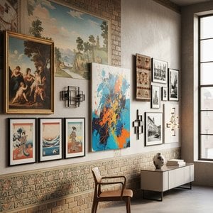
Integrating Art with Color Schemes: A Designer's Approach
Art serves as a powerful tool for reinforcing or subtly shifting the emotional tone established by a room’s color scheme. A carefully chosen painting can act as a focal point, drawing the eye and adding depth to the overall design. When selecting artwork, consider its dominant colors and how they interact with the surrounding environment. A piece featuring bold reds and oranges might complement a neutral living room, injecting energy and visual interest. Conversely, a calming landscape dominated by blues and greens could enhance the tranquility of a bedroom.
The relationship between art and color extends beyond mere compatibility; it’s about creating a cohesive narrative. Consider the style of the artwork as well. A vibrant Fauvist portrait like Edvard Munch's ‘untitled (7987)’ demands attention and injects a sense of raw emotion, while a more subdued abstract piece might offer a calming counterpoint to a bolder color palette. Don’t be afraid to experiment with contrasting colors – a splash of unexpected hue can create visual tension and add personality to a space. The goal is not simply to match colors but to orchestrate them in a way that enhances the overall aesthetic experience.
’s Services: Bringing Your Vision to Life
At , we understand the transformative power of art and color. We offer a comprehensive range of services designed to help you bring your design vision to life, from custom oil reproductions to expertly curated prints. Our artists are skilled in replicating the styles of masters across various periods, allowing you to seamlessly integrate iconic artworks into your projects. Need a specific piece reimagined with a different palette? Our photo-to-painting service allows you to transform cherished memories into stunning works of art, styled after your favorite painters.
We also provide professional art consultation services, offering expert guidance on color selection, artwork placement, and framing options. Whether you’re designing a luxury hotel, a private residence, or a commercial space, our team can help you create an environment that is both aesthetically pleasing and emotionally resonant. From blueprint to brushstroke – as highlighted in our article From Blueprint to Brushstroke: Seamless Art Integration Through Collaborative Design - we are dedicated to providing seamless art integration solutions. Explore our extensive collection of over 465,000 artworks, or commission a custom piece tailored to your exact specifications. Let be your partner in creating spaces that inspire and captivate.