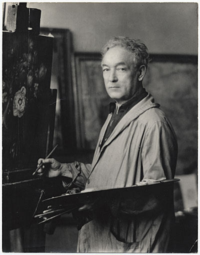
Un pioniere dell'Ashcan School
William James Glackens, una figura di spicco nell'arte americana, ha lasciato un segno indelebile sulla tela della storia con i suoi affascinanti dipinti realistici. Nato a Philadelphia, Pennsylvania, nel 1870, il percorso artistico di Glackens è stato una testimonianza della sua incrollabile passione per catturare l’essenza della vita quotidiana.
Vita e influenze iniziali
Gli anni formativi di Glackens furono segnati da una naturale inclinazione verso l'arte, che lo portò a iscriversi alla
Pennsylvania Academy of the Fine Arts. Sotto la guida di Thomas Anshutz, un rinomato realista, Glackens affinò le sue capacità, diventando infine uno dei fondatori dell'Ashcan School. Questo movimento rifiutava i confini convenzionali della bellezza artistica, concentrandosi invece sulle aspre realtà della vita metropolitana.
Carriera Artistica
Il lavoro di Glackens è caratterizzato dalle sue scene di strada dai toni scuri e vibranti e dalle raffigurazioni della vita quotidiana nella New York e Parigi pre-belliche. I suoi pezzi successivi, influenzati da Renoir, presentavano un tono più luminoso, riflettendo la sua crescita come artista. Notabilmente, Glackens lavorò anche come illustratore per giornali e riviste a Philadelphia e New York City.
- Vista di Haarlem con terreni di sbiancamento, un dipinto di Jacob Isaakszoon van Ruisdael (Ruisdael), esemplifica il livello di dettaglio e maestria che definisce l'opera di Glackens. Questo pezzo fa ora parte della collezione del Chrysler Museum of Art.
- Il capolavoro di Glackens, The Shoppers, è una testimonianza della sua abilità nel catturare l'essenza della vita urbana. Questo dipinto può essere trovato nella collezione New Realism su WahooArt.com.
Evoluzione e Sviluppo Artistico
Nel corso della sua carriera, Glackens ha dimostrato una notevole capacità di adattamento e crescita artistica. Inizialmente influenzato dal realismo di Anshutz e dall'approccio diretto dell'Ashcan School, il suo stile si è evoluto incorporando elementi dell’impressionismo francese, in particolare l’opera di Renoir. Questa influenza è evidente nei suoi dipinti successivi, che presentano una tavolozza più luminosa e un approccio più libero alla pennellata, pur mantenendo la sua attenzione per i soggetti della vita quotidiana. La sua esperienza come illustratore gli ha fornito anche una solida base nella composizione e nel disegno, elementi che sono evidenti in tutta la sua opera.
Eredità e Significato Storico
I contributi di Glackens all'arte americana sono molteplici, estendendosi oltre il suo lavoro personale. Ha svolto un ruolo fondamentale nell’aiutare Albert C. Barnes ad acquisire dipinti europei per la
Barnes Foundation a Philadelphia. Questa collezione è diventata un pilastro della storia dell'arte americana.
Opere chiave e collezioni: *
The Shoppers (New Realism, olio su tela, Chrysler Museum of Art) *
Vista di Haarlem con terreni di sbiancamento (Ruisdael, Castello Sforzesco, Milano, Italia)
Letture consigliate: * [https://WahooArt.com/@/william-james-glackens](https://WahooArt.com/@/william-james-glackens) - Esplora l'ampia collezione di opere di Glackens su WahooArt.com. * [https://en.wikipedia.org/wiki/william_glackens](https://en.wikipedia.org/wiki/william_glackens) - Approfondisci la biografia dettagliata di William James Glackens su Wikipedia.



 Anteprima in scala reale
 Passa alle stampe
 Condividi
 Condividi
 Dettagli
 Guida stampabile

 Scarica
 Articoli simili
 Radiografia
 Slideshow
 Statistiche


 Leggi tutto