The Psychology of Warmth: Establishing Atmosphere through Amber Hues
In the curation of high-end hospitality environments, color functions as much more than a decorative layer; it is an invisible architecture that dictates how a guest perceives the very air of a room. When we introduce warm tones—those found in the reds, oranges, and yellows of a sun-drenched landscape—we are fundamentally altering the psychological temperature of a space. These hues possess an inherent ability to make expansive, often intimidating lobbies or dining halls feel profoundly more intimate. Warm colors are known to advance toward the viewer, creating a sense of proximity and connection that cool blues cannot achieve.
By integrating works that feature these amber spectrums, a designer can transform a sterile, high-ceilinged atrium into a sanctuary of comfort. The presence of soft golds or deep ochres evokes the primal familiarity of fire and sunshine, fostering a sense of security and welcome. This is particularly vital in large-scale projects where the objective is to mitigate the coldness of modern materials like marble or steel. A well-placed landscape, rich with these tones, acts as a visual hearth, grounding the room and inviting guests to linger rather than merely pass through.
The Golden Hour Spectrum: Understanding the Visual Impact of Low-Angle Light
Discover 'Dawn Landscape' by George Smith – a serene 18th-century oil painting of ruins & cityscape bathed in sunset light. Romantic style, balanced composition. Explore this evocative artwork!
There exists a fleeting interval in the daily cycle of the sun, a transient window known to photographers and painters alike as the golden hour. During this period, shortly after sunrise or before sunset, the atmosphere acts as a natural prism, filtering out shorter blue wavelengths and bathing the world in a soft, honeyed glow. This light is decidedly warmer on the Kelvin scale, dominated by golds, oranges, and reds. In landscape art, capturing this specific luminosity requires an intimate understanding of how light interacts with texture and atmosphere.
When these light-drenched moments are translated onto canvas, they bring a unique clarity to interior design. The low sun angle produces longer, softer shadows that add structural depth to a room without the harshness of midday glare. In works such as Dawn Landscape by George Smith, we see how this diffused light can soften the edges of a cityscape, creating a sense of peace. For the hospitality professional, utilizing art that mimics this spectrum allows for a controlled infusion of natural warmth, even in windowless or north-facing corridors, ensuring the lighting remains soft and the atmosphere stays inviting.
Anchoring Expansive Spaces: Using Warm Tones to Foster Intimacy and Comfort
A Dutch Legacy: The Heart of Dordrecht Nestled within the historic, winding streets of Dordrecht—a city defined by centuries of maritime trade and artistic brilliance—stands the Dordrechts Museum. Founded in 1842, this institution is far more than a ...
In large-scale interior design, particularly within hotel suites or grand ballrooms, the challenge often lies in preventing a space from feeling hollow. Warm tones serve as an essential tool for managing volume. While cool colors tend to recede, making walls appear further away, warm colors advance, effectively "shrinking" a room to a more manageable and cozy scale. Using dark reds or deep terracottas on large furniture or significant wall sections can enrich the character of a room, providing a sense of weight and permanence.
This technique is not merely about color choice but about the strategic placement of visual anchors. A landscape featuring earthy browns and muted yellows, much like the works found in the Dordrecht Museum, can provide a focal point that draws the eye inward. By selecting pieces that utilize these advancing colors, designers can create "pockets" of intimacy within larger architectural plans. This ensures that even the most vast lounge feels as though it has been designed for personal connection and quiet repose.
Zonal Color Strategies: From Energizing Yellows to Sophisticated Terracottas
Effective interior design requires a nuanced approach to color zoning, recognizing that different areas of a hospitality space demand different emotional responses. Yellow is a uniquely versatile tool; in its paler forms, it is excellent for kitchens or breakfast areas, providing a clean and energizing light. However, when moved into richer, more saturated shades like mustard, honey, or butterscotch, it becomes a sophisticated element suitable for lounges or executive suites.
Conversely, the use of orange offers a spectrum ranging from bold, modern statements to gentle whispers of sophistication. For a welcoming lobby, fuller and darker tones such as rust or grapefruit can make an area feel profoundly hospitable. In more active zones, lighter, juicy red tones can be utilized in smaller accents—such as cushions or lampshades—to provide a rhythmic pulse of energy. The goal is to balance these bolder tones with neutrals to maintain an air of elegance, ensuring the warmth never becomes overwhelming but instead remains a curated element of the design narrative.
Tactile Depth: How Textured Landscapes Interact with Ambient Lighting
The Soulful Resonance of Color: The Life and Art of Wayne Bennett To understand the visual language of Wayne Bennett , one must first listen to the rhythm of the blues. Born in Memphis, Tennessee, on December 13, 1932, Bennett’s early life was define...
The true impact of a landscape painting in a professional setting is often found in its physical presence. A high-quality oil reproduction offers a dimension that a flat print simply cannot replicate: the impasto technique. When an artist applies thick, visible layers of paint, the surface becomes a dynamic landscape of its_own, capable of catching ambient light in unpredictable ways. This tactile power is essential for creating visual interest in spaces with controlled or dim lighting.
Consider the work of Wayne Bennett, where the heavy application of paint allows the canvas to mirror the shifting dynamics of nature. In a hospitality setting, such texture prevents the art from appearing as mere "wallpaper." Instead, the painting becomes an active participant in the room's lighting scheme. As guests move through a space, the shadows cast by the raised brushstrokes change, providing a sense of movement and life. This depth is particularly effective when paired with modern architectural lighting, as it rewards the observant guest with a discovery of detail and craftsmanship.
Logistics of Scale: Integrating Multi-Panel Series into Large-Scale Hospitality Design
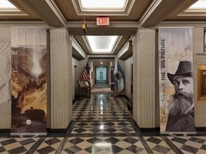
A Sanctuary of American Heritage: The Soul of the Interior Nestled within the monumental Stewart Lee Udall Main Interior Building in Washington, D.C., the U.S. Department of the Interior Museum stands as a singular testament to both artistic expressi...
For the professional designer managing large-scale installations, the logistics of scale are paramount. A single, small frame often fails to command the attention required in a grand hall or a long corridor. This is where the "multi-panel" trend becomes an invaluable design strategy. Splitting a singular landscape across three, four, or even five panels allows for a seamless integration into wide architectural features like staircases or expansive feature walls.
This approach requires meticulous planning to ensure that colors and brushstrokes flow continuously across the gaps between panels, maintaining a cohesive visual narrative. Such large-format works can be commissioned as custom murals or canvas rolls, much like the grander installations seen in the U.S. Department of the Interior Museum. By utilizing group set paintings, designers can create a monumental presence that respects the scale of the architecture while providing a sophisticated, modern aesthetic that is both impactful and structurally integrated into the building's design.
At WahooArt.com, we specialize in supporting the needs of hospitality professionals through bespoke oil reproductions and large-scale commissions. Whether you are looking to transform a personal photograph into a period-style masterpiece or require custom-sized multi-panel series for a hotel lobby, our team provides the expertise and global logistics necessary to execute your vision with absolute precision.
Discover John George Brown (1831-1913), a British-American painter celebrated for his charming genre scenes of American childhood & Victorian life. Explore reproductions and learn about his legacy!
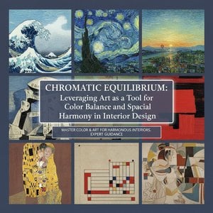
Master the art of chromatic equilibrium! Learn how to leverage color & artwork for harmonious interior design. Expert guidance on palettes, psychology, bespoke commissions & spatial balance.
Master the art of atmosphere with our expert guide on color psychology. Discover how Impressionist light and Post-Impressionist palettes transform hospitality spaces through the lens of art history and professional interior design curation.
Elevate hospitality spaces with the profound psychology of color. Discover how masterfully curated art and strategic chromatic palettes transform hotel interiors into immersive, emotive experiences for the discerning traveler.



 Dawn Landscape
 Dordrechts Museum
 Wayne Bennett
 U.S. Department of the Interior Museum