Early Life and the Seeds of Artistic Vision
Mark Rothko, born Markus Yakovlevich Rothkowitz in Dvinsk, Latvia, in 1903, carried within him from the outset a sense of displacement that would profoundly shape his artistic journey. His early years were marked by the anxieties of a Jewish family living within the Pale of Settlement, shadowed by pogroms and political unrest. This atmosphere instilled a deep sensitivity to human suffering, a theme that would resonate throughout his oeuvre. The 1913 immigration to Portland, Oregon, represented not just a geographical shift but a cultural upheaval for the young Rothko. While his father, a pharmacist and intellectual with socialist leanings, fostered a home filled with debate and learning, the loss of Jacob Rothkowitz shortly after their arrival cast a long shadow. This early experience of loss, coupled with the challenges of assimilation, fueled a lifelong exploration of existential themes – mortality, trauma, and the search for meaning in a chaotic world. Though he excelled academically at Yale University, Rothko found himself drawn more to the vibrant energy of New York City, abandoning formal studies to pursue his passion for art at the Art Students League. These formative years laid the groundwork for an artistic vision that would ultimately challenge conventional notions of painting and redefine the emotional power of color.
From Figurative Beginnings to Abstract Expressionism
Rothko’s initial artistic explorations were firmly rooted in realism, depicting urban scenes and portraits with a keen eye for detail. However, these early works already hinted at the psychological depth that would become his hallmark. As the 1940s unfolded, and the world grappled with the horrors of World War II, Rothko’s art underwent a dramatic transformation. Influenced by Surrealism and mythology, he began to move away from representational imagery, seeking instead to express universal human emotions through symbolic forms. This period saw the emergence of multi-form paintings – canvases populated by ambiguous, biomorphic shapes that seemed to hover between figuration and abstraction. These works were not merely experiments in form; they were deeply felt responses to the anxieties and uncertainties of a world at war. By the late 1940s, Rothko had arrived at his signature style: large-scale canvases featuring rectangular blocks of color that appeared to float and resonate with one another. He stripped away all vestiges of recognizable imagery, focusing instead on the pure emotional impact of color and form. This marked a pivotal moment in the development of Abstract Expressionism, and established Rothko as a leading figure in this groundbreaking movement.
The Color Field and the Pursuit of Transcendence
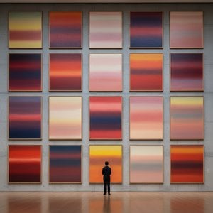
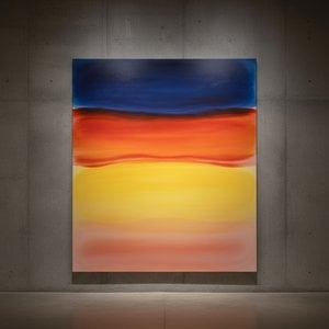
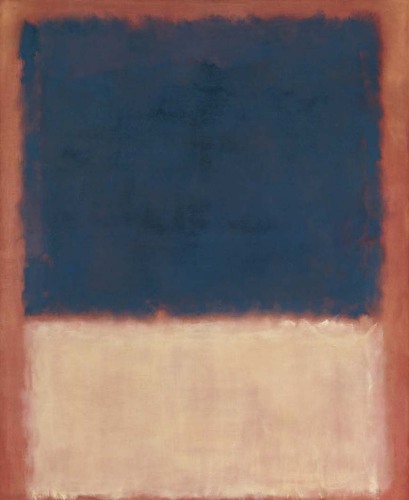
Rothko’s mature work is defined by what came to be known as “Color Field” painting – vast expanses of luminous color that envelop the viewer in an immersive experience. These paintings are not about *what* they depict, but rather *how* they make you feel. Rothko believed that art should engage the viewer viscerally, bypassing intellectual analysis and speaking directly to the emotions. He meticulously layered thin washes of paint, creating subtle variations in tone and texture that seemed to emanate from within the canvas. The edges of his rectangular forms are often blurred, allowing them to blend and interact with one another, creating a sense of depth and movement. Rothko deliberately avoided titles beyond numbers – “No. 1,” “No. 6” – encouraging viewers to confront the paintings without preconceived notions and allow their own emotional responses to guide their experience. He sought to create a space for contemplation, a sanctuary where viewers could connect with something larger than themselves.
His ambition was nothing less than to evoke profound spiritual experiences through the language of color.
Major Achievements and Lasting Legacy
Among Rothko’s most significant achievements are “No. 10 (1950),” a pivotal work that exemplifies his evolving style, and the Seagram Murals (1958). Commissioned for the Four Seasons Restaurant in New York City, these murals were ultimately rejected by Rothko, who felt they would be compromised by their intended environment. He instead donated them to the Tate Gallery in London, where they continue to inspire awe and contemplation. Perhaps his most ambitious project was the Rothko Chapel (1971) in Houston, Texas – a non-denominational sanctuary housing fourteen of his paintings. Designed as a space for quiet reflection, the chapel is considered a sacred place by many, embodying Rothko’s belief in the spiritual power of art.
Rothko's influence on subsequent generations of artists has been immense. He paved the way for Minimalist art and continues to inspire contemporary painters who explore the emotional possibilities of abstraction. Despite struggling with depression throughout his life, culminating in his tragic suicide in 1970, Mark Rothko remains one of the most important and influential artists of the 20th century – a master of color whose work continues to resonate with audiences around the world.
The Enduring Power of Emotional Resonance
- Rothko’s paintings are celebrated for their ability to convey universal human emotions—tragedy, ecstasy, despair, and hope.
- His exploration of color as a vehicle for emotional expression revolutionized abstract painting.
- The Rothko Chapel stands as a testament to his belief in the spiritual power of art.
- He remains a pivotal figure in Abstract Expressionism and a major influence on contemporary artists.
Rothko’s legacy extends beyond the realm of art history. His work invites us to confront our own mortality, to grapple with the complexities of human existence, and to seek meaning in a world often devoid of it. He reminds us that art is not merely about aesthetics; it is about connection—connection to ourselves, to others, and to something larger than ourselves. The enduring power of his paintings lies in their ability to evoke these profound emotions, offering solace, inspiration, and a glimpse into the depths of the human soul.
 Send
Send


 Glass option is only available in size under 110 CM