实景预览
实景预览
 分享
分享 分享
分享
 详情
详情 指南
指南

 下载作品
下载作品
 相似作品
相似作品 X射线
X射线 幻灯片播放
幻灯片播放 问答
问答
 统计数据
统计数据Lain 手绘油画复制品


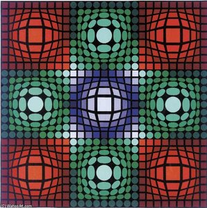
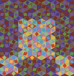
Victor Vasarely (1906-1997) was born Károly Vaszary in Pécs, Croatia. Initially pursuing medical studies at Eötvös Loránd University in Budapest, he abandoned medicine for painting in 1927 after enrolling at Sándor Bortnyik’s Műhely – a Bauhaus-influenced school. This formative experience instilled him with the principles of functional design and geometric abstraction, shaping his signature Op Art
 展开全文
展开全文
探索奥普艺术先驱维克多·瓦萨雷利 (1906-1997) 的迷人世界! 发现他的几何抽象、视觉错觉及其对现代艺术和设计的持久影响。从“蓝色研究”到“苏米”餐具,体验他系统化的光学幻象。
手工油画复制品
由我们的艺术家按需定制,为您提供您所选尺寸及画框的布面手工油画。 ( 切换至版画销售渠道 切换至数字图像销售渠道)




P118B ¥10

P118H ¥10

P118W ¥10

P438Z ¥10

P508JH ¥12

P508YH ¥12

P805H ¥10

P805Z ¥10

P919BZ ¥10

P919G ¥10

P919XJ ¥10

P959ZH ¥10

P968JZ ¥12

W106C ¥8

W218G ¥10

W218JH ¥8

W218Y ¥10

W307PJ ¥10

W316G ¥10

W316PJ ¥8

W316Y ¥10

W398PJ ¥8

W4111J ¥10

W500HY ¥15

W500JH ¥15

W692G ¥12

W849H ¥8

W940BG ¥15

W953PJ ¥8




标准尺寸
定制
CM
INCH
您可以从与原作比例一致的预设尺寸中进行选择。
Loading sizes...

宽度
高度
请输入您需要的宽度和高度,以适配您的画框或墙面。由于作品为手工绘制,若选择不同比例的尺寸,艺术家可能会在画面边缘多画一些或稍作裁剪 —— 由您决定。在开始绘画之前,我们会为您发送一份数字效果图供您确认。本页面上展示的图片并非最终实物 —— 只有效果图才能反映真实结果。
可定制示例:将面部替换为客户照片;添加宠物(例如,将猫替换为狗);在背景中加入隐藏信息;更改背景风景或元素。
下单后,WahooArt.com 团队将通过电子邮件联系客户获取具体要求,并提供效果预览图
下单后,WahooArt.com 团队将通过电子邮件联系客户获取具体要求,并提供效果预览图


 玻璃选项仅适用于110厘米以下的尺寸。

Lain
复制品材质
复刻品尺寸