
由我们的艺术家按需定制,为您提供您所选尺寸及画框的布面手工油画。 ( 切换至版画销售渠道 切换至数字图像销售渠道)
您可以从与原作比例一致的预设尺寸中进行选择。

您可以输入自定义尺寸,以适配特定的画框或空间。如果所选尺寸与原图比例不符,我们将通过裁剪作品或添加手绘元素来扩展画面。数字样稿将在制作开始前发送给您确认。
请注意,屏幕预览无法准确反映实际的裁剪或扩展效果,只有样稿才能真实呈现最终的构图。
虽然我们提供定制尺寸服务,但为了保留原作比例,建议您从预设列表中选择尺寸。
Wrong
复刻品尺寸说明
In the quiet, sun-drenched corners of suburban life, where the rhythm of the street feels predictable and safe, John Baldessari’s 1967 work, "Wrong," arrives like a sudden, jarring thought. At first glance, the viewer is presented with a scene that feels deeply familiar—a black and white photograph capturing a man standing stoically by a curb, framed by the lush, vertical silhouette of a palm tree and the structured lines of residential architecture. It possesses the unpretentious, documentary quality of a snapshot, yet there is an unmistakable tension vibrating beneath its surface. The grayscale palette, ranging from deep, velvety blacks to stark, brilliant whites, strips away the distractions of color, forcing the eye to confront the raw geometry and textures of the asphalt, concrete, and foliage.
The true genius of this piece lies in its deliberate intervention. Across the lower portion of this seemingly ordinary landscape, the word "WRONG" is printed in bold, unapologetic, sans-serif capital letters. This typographic intrusion acts as a conceptual wedge, splitting the reality of the photograph from our perception of it. By labeling the scene, Baldessari does not merely describe the image; he interrogates it. He invites us to question whether the error lies within the composition, the subject, or perhaps within our own preconceived notions of what constitutes a "correct" or "normal" suburban existence. It is a masterful use of text as an artistic medium, transforming a piece of photographic documentation into a profound philosophical inquiry.
As a pioneer of the Conceptual Art movement, Baldessari’s technique in "Wrong" serves as a blueprint for how ideas can supersede aesthetic beauty. The work is not concerned with the mastery of light or the elegance of form for their own sake; rather, it utilizes the medium of film and darkroom printing to stage a confrontation. The composition follows a traditional central perspective, creating a sense of order through horizontal street lines and vertical architectural elements, only to have that order subverted by the linguistic overlay. This tension between the organic shapes of nature and the rigid, man-made text creates a psychological friction that is both unsettling and deeply engaging.
For the discerning collector or interior designer, "Wrong" offers a sophisticated layer of intellectual depth to any space. It is a piece that demands conversation, acting as a focal point that challenges the passivity of the viewer. The starkness of the black and white medium allows it to integrate seamlessly into modern, minimalist, or industrial aesthetics, while its conceptual weight provides a soulful, contemplative energy. To possess a reproduction of this work is to invite a permanent state of questioning into one's environment—a reminder that beauty often resides in the disruption of the expected and the courage to look at the ordinary through a lens of profound uncertainty.
在“Wrong”中,Statement的对比与Unified Palette的和谐相得益彰。
若想表达Statement之意,将“Wrong”作为送给Corporate Gift的礼物是不错的选择。
John Baldessari 的《Wrong》 的 X 光视图可在作品的 X射线检测 页面查看:通过十一层光学图层对图像进行交互式深度解析。
"Wrong" 提供下载:该作品的 下载 页面提供 高分辨率数字图像下载。
"Wrong" 的色彩呈现出 Luminous 的亮度。
"Wrong" 的色彩基调由以 Espresso (#312d25) 为主的 Pastels 色系构成。
“Wrong”的色彩饱和度为Monochromatic。饱和度描述了色彩呈现的浓郁程度。
“Wrong”是一件Photo作品。


1931 - , United States of America

Elevate your most cherished memories with WahooArt’s bespoke service. We transform your personal photos into breathtaking, hand-painted black & white oil masterpieces. Experience museum-quality craftsmanship and timeless elegance for your private collection. Discover the art of legacy.

Explore the profound artistry of black and white photography. From historical mastery to the interplay of light and shadow, discover how monochrome captures timeless emotion and form through a sophisticated lens of art history.
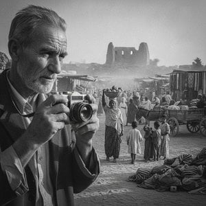
Explore the profound evolution of documentary photography through a cultural lens. From early social realism to modern visual narratives, discover how photographers have captured history, labor, and the human condition to redefine fine art.

Explore the profound emotional depth of documentary photography art. Discover how collectors curate powerful historical narratives through museum-quality black and white prints and fine art reproductions that preserve humanity's most resilient moments.

Explore the profound evolution of contemporary photography through a connoisseur's lens. From monochrome mastery to digital innovation, discover how modern photographic works shape fine art collections and define our cultural legacy.


 发送
发送 分享
分享
 详情
详情 指南
指南

 下载图片
下载图片
 相似作品
相似作品 幻灯片播放
幻灯片播放 统计数据
统计数据


 阅读全文
阅读全文






































 玻璃选项仅适用于110厘米以下的尺寸。


