Mark Rothko: Renklerin Derinliğinde İnsanlığın İzleri
Mark Rothko, 25 Eylül 1903’te Letonya'nın Daugavpils şehrinde doğmuş, Yahudi bir ailenin çocuğu olarak dünyaya gelmişti. Markus Yakovlevich Rothkowitz adıyla hayatına başlayan sanatçı, genç yaşta yaşadığı göç ve ailevi kayıplar, onu derin bir melankoli ve varoluşsal sorgulamaya yöneltti. 1913’te ailesiyle birlikte Portland, Oregon'a taşınması, hem kültürel bir uyum süreci hem de yeni bir kimlik arayışı anlamına geliyordu. Babasının entelektüel ortamı ve tartışma dolu sohbetleri, Rothko’nun düşünce dünyasını şekillendirirken, erken yaşta kaybettiği babası da hayatının ilerleyen dönemlerinde eserlerine yansıyan hüzünlü bir gölge bıraktı. Yale Üniversitesi'nde edindiği eğitimden sonra New York'a yerleşen Rothko, sanatın peşinde koşarken çeşitli işlerle geçimini sağladı ve kendini sürekli olarak otodidakt bir öğrenci olarak geliştirmeye adadı. Bu dönemde Arshile Gorky gibi önemli isimlerden etkilenmesi, soyutlamaya doğru kayışının başlangıcını oluşturdu.
Figüratif Kökenlerden Soyut Dışavurumculuğa Dönüşüm
Rothko’nun ilk dönem eserleri, gerçekçi betimlemelere odaklanıyordu; New York sokaklarını ve portrelerini dikkatle resmediyordu. Ancak bu erken çalışmalar bile, sanatçının psikolojik derinliği olan bir ifade arayışı içinde olduğunu gösteriyordu. İkinci Dünya Savaşı'nın getirdiği yıkım ve insanlık dramı, Rothko’nun sanatsal yönelimini kökten değiştirdi. Sürrealizm ve mitolojiden etkilenen sanatçı, temsil yeteneğinden uzaklaşarak evrensel insan duygularını sembolik formlar aracılığıyla ifade etmeye başladı. Çok biçimli resimler döneminde, figürasyon ve soyutlamanın arasında gidip gelen belirsiz, biyoform şekillerle dolu tuvaller ortaya çıktı. Bu çalışmalar sadece biçim denemeleri değil, aynı zamanda savaşın yarattığı kaygıların ve belirsizliklerin derin bir yansımasıydı. 1940'ların sonlarında Rothko, imza niteliğindeki tarzına ulaştı: büyük ölçekli tuvallerde, canlı renklerle oluşturulmuş dikdörtgen bloklar birbirleriyle etkileşime girerek yüzen ve yankılanan bir atmosfer yaratıyordu. Her türlü tanınabilir imgelerden arındırarak, Rothko yalnızca rengin ve biçimin saf duygusal etkisine odaklandı. Bu, Soyut Dışavurumculuk hareketinin gelişiminde önemli bir dönüm noktası oldu ve Rothko'yu bu çığır açan akımın önde gelen temsilcilerinden biri olarak konumlandırdı.
Renk Alanı ve Transandans Arayışı
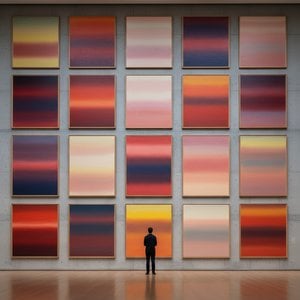
Rothko’nun olgun dönem eserleri, “Renk Alanı” resmini tanımlayan anlayışla karakterize edilir; izleyiciyi içine çeken, ışıklı renk alanları. Bu resimler, ne betimlendikleri değil, aksine nasıl hissettirdikleri önemlidir. Rothko, sanatın izleyiciyle duyusal düzeyde etkileşim kurması gerektiğine inanıyordu; entelektüel analizi aşarak doğrudan duygulara hitap etmeliydi. İnce boya katmanlarını titizlikle uygulayarak, renk tonlarında ve dokularda ince varyasyonlar yaratarak, sanki tuvalin içinden yayılan bir ışık hissi uyandırıyordu. Dikdörtgen formların kenarları genellikle bulanıktır; bu da renklerin birbirleriyle karışmasına ve etkileşime girmesine olanak tanıyarak derinlik ve hareket hissi yaratır. Rothko, eserlerine yalnızca numaralarla (örneğin "No. 1") isim vererek, izleyicilerin ön yargılardan arınmış bir şekilde resimlerle yüzleşmelerini ve kendi duygusal tepkilerinin yönlendirmesiyle deneyimlemelerini teşvik etti. İzleyiciyi düşünceye dalmaya davet eden, sessizliğin ve iç huzurun hüküm sürdüğü bir alan yaratmayı amaçlıyordu.
Amacı, rengin dili aracılığıyla derin ruhani deneyimleri uyandırmaktan başka değildi.
Önemli Başarılar ve Kalıcı Miras
Rothko’nun en önemli başarılarından biri, evrimleşen tarzını mükemmel bir şekilde yansıtan "No. 10 (1950)" adlı eseridir. Ayrıca, New York'taki Four Seasons Restaurant için tasarlanan Seagram Muralları da dikkat çekicidir. Rothko, bu duvar resimlerinin amaçlanan ortam tarafından kısıtlanacağını düşünerek onları reddetti ve bunun yerine İngiltere’deki Tate Galerisi’ne bağışladı; burada eserleri hala hayranlık uyandırmaya ve düşündürmeye devam ediyor. Belki de en iddialı projesi, Teksas'ın Houston kentinde bulunan Rothko Şapeli (1971) idi. Farklı inançlardan insanlara açık olan bu kutsal mekan, on dört adet Rothko resmine ev sahipliği yapıyor. Sakin bir düşünce alanı olarak tasarlanan şapel, Rothko’nun sanatın ruhani gücüne dair inancının bir kanıtı niteliğindedir.
Rothko'nun sonraki nesillerdeki sanatçılar üzerindeki etkisi muazzam olmuştur. Minimalist sanata öncülük etmiş ve günümüzdeki soyutlamayı keşfeden çağdaş ressamlara ilham vermeye devam etmektedir. Hayatının sonuna doğru yaşadığı depresyona rağmen, 1970 yılında trajik bir şekilde hayatını kaybettiğinde Mark Rothko, 20. yüzyılın en önemli ve etkili sanatçılarından biri olarak tarihe geçti – renklerin ustası olan ve eserleri dünya çapındaki izleyicilerle yankılanmaya devam eden bir dahi.
Duygusal Yankının Kalıcılığı
- Rothko’nun resimleri, trajediden coşkuya, umutsuzluktan dile kadar evrensel insan duygularını aktarma yeteneğiyle kutlanır.
- Renkleri duygusal ifade aracı olarak keşfi, soyut resmi devrim niteliğinde değiştirmiştir.
- Rothko Şapeli, sanatın ruhani gücüne olan inancının bir kanıtı olarak durmaktadır.
- Soyut Dışavurumculukta önemli bir figür olmaya ve çağdaş sanatçılar üzerinde büyük bir etki bırakmaya devam etmektedir.
Rothko’nun mirası, sanat tarihinin ötesine geçmektedir. Eserleri, kendi ölümümüzle yüzleşmemize, insan varoluşunun karmaşıklığıyla mücadele etmemize ve sıklıkla anlamsız görünen bir dünyada anlam aramaya davet ediyor. Sanatın yalnızca estetikle ilgili olmadığını, aynı zamanda bağlantı kurmakla ilgili olduğunu – kendimizle, başkalarıyla ve bizden daha büyük bir şeyle bağlantı kurmakla ilgili olduğunu hatırlatıyor. Eserlerinin kalıcı gücü, bu derin duyguları uyandırma yeteneklerinde yatmaktadır; teselli, ilham ve insan ruhunun derinliklerine dair bir bakış sunmaktadırlar.



 Önizle
 El Yapımı Tablo Satın Al
 Gönder
 Paylaş
 Detaylar
 Rehber

 Dosyayı İndir
 Benzerleri
 X-Işını
 Slayt Gösterisi
 İstatistikler

 Devamını Oku






































 Cam seçeneği yalnızca 110 cm altındaki boyutlar için mevcuttur.