Începuturile și Viziunea Artistică
Mark Rothko, născut Markus Yakovlevich Rothkowitz în Dvinsk, Letonia, în 1903, a purtat de la bun început un sentiment de dezrădăcinare care i-a modelat profund traiectoria artistică. Anii săi timpurii au fost marcați de anxietățile unei familii evreiești ce trăia în zona de reședință a Imperiului Rus, umbrită de pogromuri și tulburări politice. Această atmosferă i-a insuflat o sensibilitate profundă față de suferința umană, o temă care va răsuna pe tot parcursul operei sale. Imigrația din 1913 în Portland, Oregon, a reprezentat nu doar o schimbare geografică, ci și un șoc cultural pentru tânărul Rothko. Deși tatăl său, farmacist și intelectual cu simpatii socialiste, a cultivat o casă plină de dezbateri și învățături, pierderea lui Jacob Rothkowitz la scurt timp după sosire a aruncat o umbră lungă asupra vieții sale. Această primă experiență a pierderii, combinată cu provocările asimilării, i-a alimentat o explorare pe tot parcursul vieții a temelor existențiale – mortalitatea, trauma și căutarea sensului într-o lume haotică. Deși a excelat academic la Universitatea Yale, Rothko s-a simțit atras de energia vibrantă a orașului New York, abandonând studiile formale pentru a-și urmări pasiunea pentru artă la Art Students League. Acești ani formativi au pus bazele unei viziuni artistice care avea să sfideze concepțiile convenționale despre pictură și să redefinească puterea emoțională a culorii.
De la Realism la Expresionismul Abstract
Primele explorări artistice ale lui Rothko au fost ferm ancorate în realism, reprezentând scene urbane și portrete cu un ochi atent pentru detalii. Cu toate acestea, aceste prime lucrări prevesteau deja profunzimea psihologică ce avea să-i devină semnătură. Pe măsură ce anii ’40 se desfășurau, iar lumea se confrunta cu ororile celui de-al Doilea Război Mondial, arta lui Rothko a suferit o transformare dramatică. Influențat de suprarealism și mitologie, el a început să se îndepărteze de imagini reprezentative, căutând în schimb să exprime emoții universale umane prin forme simbolice. Această perioadă a marcat apariția picturilor multi-formă – pânze populate de forme ambigue, biomorfe care păreau să plutească între figurativ și abstracție. Aceste lucrări nu erau simple experimente formale; ele erau răspunsuri profunde la anxietățile și incertitudinile unei lumi aflate în război. Spre sfârșitul anilor ’40, Rothko ajunsese la stilul său caracteristic: pânze de mari dimensiuni cu blocuri rectangulare de culoare care păreau să plutească și să rezoneze unele cu altele. El a eliminat orice urmă de imagini recunoscibile, concentrându-se în schimb pe impactul emoțional pur al culorii și formei. Aceasta a marcat un moment crucial în dezvoltarea Expresionismului Abstract, stabilindu-l pe Rothko ca o figură proeminentă în această mișcare revoluționară.
Câmpul de Culoare și Urmărirea Transcendentalității
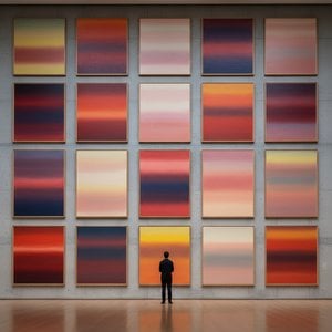
Opera matură a lui Rothko este definită de ceea ce a devenit cunoscut sub numele de pictura “Câmpului de Culoare” – întinderi vaste de culoare luminoasă care învăluie privitorul într-o experiență imersivă. Aceste picturi nu se referă la *ce* reprezintă, ci mai degrabă la *cum* te fac să te simți. Rothko credea că arta ar trebui să implice privitorul visceral, ocolind analiza intelectuală și vorbind direct emoțiilor. El a stratificat meticulos spălături subțiri de vopsea, creând subtile variații de ton și textură care păreau să emane din interiorul pânzei. Marginile formelor sale rectangulare sunt adesea estompate, permițându-le să se amestece și să interacționeze unele cu altele, creând un sentiment de profunzime și mișcare. Rothko a evitat deliberat titlurile dincolo de numere – “Nr. 1”, “Nr. 6” – încurajând privitorii să se confrunte cu picturile fără prejudecăți și să permită propriilor lor răspunsuri emoționale să le ghideze experiența. El a căutat să creeze un spațiu pentru contemplare, un sanctuar unde privitorii s-au putut conecta cu ceva mai mare decât ei înșiși.
Ambiția sa nu era nimic mai puțin decât evocarea unor experiențe spirituale profunde prin limbajul culorii.
Realizări Majore și Moștenirea Durabilă
Printre cele mai importante realizări ale lui Rothko se numără “Nr. 10 (1950)”, o lucrare esențială care exemplifică stilul său în evoluție, și Muralele Seagram (1958). Comisionate pentru restaurantul Four Seasons din New York City, aceste murale au fost în cele din urmă respinse de Rothko, care a simțit că ar fi compromise de mediul lor destinat. În schimb, le-a donat Tate Gallery din Londra, unde continuă să inspire admirație și contemplare. Poate cel mai ambițios proiect al său a fost Capela Rothko (1971) din Houston, Texas – un sanctuar non-denominational care găzduiește paisprezece dintre picturile sale. Proiectată ca un spațiu pentru reflecție liniștită, capela este considerată de mulți un loc sacru, întruchipând credința lui Rothko în puterea spirituală a artei.
Influența lui Rothko asupra generațiilor ulterioare de artiști a fost imensă. El a deschis drumul pentru arta minimalistă și continuă să inspire pictorii contemporani care explorează posibilitățile emoționale ale abstracției. În ciuda luptei cu depresia pe tot parcursul vieții, culminând cu sinuciderea sa tragică în 1970, Mark Rothko rămâne unul dintre cei mai importanți și influenți artiști ai secolului al XX-lea – un maestru al culorii a cărui operă continuă să rezoneze cu publicul din întreaga lume.
Puterea Durabilă a Rezonanței Emoționale
- Picturile lui Rothko sunt celebrate pentru capacitatea lor de a transmite emoții universale umane – tragedie, extaz, disperare și speranță.
- Explorarea sa a culorii ca vehicul al expresiei emoționale a revoluționat pictura abstractă.
- Capela Rothko stă drept mărturie a credinței sale în puterea spirituală a artei.
- El rămâne o figură pivotantă în Expresionismul Abstract și o influență majoră asupra artiștilor contemporani.
Moștenirea lui Rothko se extinde dincolo de domeniul istoriei artei. Opera sa ne invită să ne confruntăm cu propria noastră mortalitate, să facem față complexității existenței umane și să căutăm sens într-o lume adesea lipsită de acesta. Ne amintește că arta nu este doar despre estetică; este despre conexiune – conexiune cu noi înșine, cu ceilalți și cu ceva mai mare decât noi înșine. Puterea durabilă a picturilor sale constă în capacitatea lor de a evoca aceste emoții profunde, oferind alinare, inspirație și o privire asupra adâncurilor sufletului uman.



 Vezi în context
 Comandă pictură realizată manual
 Trimite
 Distribuie
 Detalii
 Ghidul

 Descarcă
 Produse similare
 Radiografie
 Diaporama
 Statistici

 Citește mai mult






































 Opțiunea cu sticlă este disponibilă doar pentru dimensiuni de sub 110 cm