Marko Rotko: Spalvos ir emocijų simfonija
Markas Rotko, gimęs Markus Yakovlevičius Rotkovičius 1903 m. rugsėjo 25 d. Daugpilyje, tuometinėje Rusijos imperijoje (dabar Latvija), nuo pat vaikystės jautėsi atitrūkęs nuo aplinkos – jausmas, kuris giliai paveikė jo meninę kelionę. Jo ankstyvieji metai buvo apipolti žydų šeimos nerimu, gyvenančios Pale of Settlement, kur vyravo pogromai ir politinė nestabilumas. Šis klimatas įskiepijo gilų žmogaus kančių jautrumą – temą, kuri atsispindės visoje jo kūryboje. 1913 m. emigracija į Portlandą, Oregone, JAV, ne tik pakeitė geografinę padėtį, bet ir sukėlė kultūrinę pertvarką jaunam Rotko. Nors jo tėvas, farmacininkas ir intelektualas su socialistiniais pažiūrėmis, skatino namuose diskusijas ir mokymąsi, netrukus po atvykimo miręs Jacob Rothkowitz metė ilgą šešėlį. Ši ankstyvoji nuostolio patirtis, kartu su asimiliacijos iššūkiais, paskatino visą gyvenimą trukusią egzistencinių temų – mirties, traumos ir prasmės paieškos – tyrinėjimą. Nors jis sėkmingai studijavo Jeilio universitete, Rotko jautėsi patrauktas Niujorko miesto energinga atmosfera, atsisakęs formaliojo išsilavinimo siekdamas savo aistros menui Meno studentų lygoje. Šie ankstyvieji metai padėjo pagrindą meninei vizijai, kuri galiausiai sužadintų tradicinius tapybos supratimą ir perrašytų spalvos emocinį galią.
Nuo figūratyvumo iki abstraktaus ekspresionizmo
Rotko ankstyvieji meno tyrinėjimai buvo tvirtai įsišaknyję realizme, vaizduodami miesto scenas ir portretus su aštriu detalių atpažinimu. Tačiau šie ankstyvieji darbai jau numatė psichologinę gylį, kuris taps jo pasižymėjimo ženklu. 1940-ųjų dešimtajame dešimtmetyje, kai pasaulis susidūrė su Antrojo pasaulinio karo siaubingais įvykiais, Rotko meno transformacija buvo dramatiška. Paveiktas surrealizmo ir mitologijos, jis pradėjo atsiriboti nuo reprezentacinės vaizdinės raiškos, siekdamas išreikšti universalias žmogaus emocijas per simbolines formas. Šis laikotarpis pažymėjo daugformių paveikslų atsiradimą – drobėmis, kuriose pulsuoja dviprasmiški, biomorfiniai pavidalai, tarsi plūduriuojantys tarp figūratyvumo ir abstrakcijos. Šie darbai nebuvo tik formos eksperimentai; tai buvo giliai jaučiami atsakymai į karo sukeltas nerimtis ir neapibrėtumas. Vėliau 1940-ųjų dešimtajame dešimtmetyje Rotko atrado savo pasižymėjimo stilių: didelio formato drobės, kuriomis dominuoja stačiakampių spalvų blokai, kurie tarsi plūduriuoja ir rezonuoja vienas su kitu. Jis atsisakė visų atpažįstamos vaizdinės raiškos pėdsakų, sutelkdamas dėmesį į gryno spalvos ir formos emocinį poveikį. Tai buvo esminis momentas abstraktaus ekspresionizmo plėtrą, kuris Rotko paskelbė lyderiu šioje inovatyvioje srovėje.
Spalvų laukai ir siekis į transcendenciją
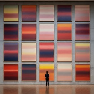
Rotko brandžiojo darbo apibrėžimas yra tai, kas tapo žinoma kaip „spalvos laukų“ tapyba – didelės spinduliuojančių spalvų erdvės, kurios panardina žiūrovą imersijai. Šie paveikslai nėra apie *ką* jie vaizduoja, bet apie *kaip* jie jus verčia jausti. Rotko tikėjo, kad menas turėtų įtraukti žiūrovą visceraliai, apeidamas intelektualųjį analizę ir kalbėdamas tiesiogiai su emocijomis. Jis kruopščiai sluoksnavo plonus dažų sluoksnius, sukurdama subtilių tonų ir tekstūrų variacijas, kurios atrodė kylanti iš pačios drobės viduje. Jo stačiakampių formų kraštukai dažnai yra neryškūs, leidžiantis joms susijungti ir sąveikauti viena su kita, sukuriant gylio ir judesio jausmą. Rotko specialiai vengė pavadinimų, be numerių – „Nr. 1“, „Nr. 6“ – skatindamas žiūrovus susidurti su paveikslais be išankstinių įsitikinimų ir leisti savo emociniams atsakams juos vadovauti. Jis siekė sukurti erdvę meditacijai, prieglaudą, kur žiūrovas galėtų susijungti su kažkuo didesniu už save.
Jo ambicija buvo nieko mažiau nei sukelti gilias dvasines patirtis spalvų kalba.
Svarbiausi pasiekimai ir palikimas
Tarp Rotko reikšmingiausių pasiekimų yra „Nr. 10 (1950)“, esminis darbas, kuriame atsispindi jo besivystantis stilius, ir Seagram Murals (1958). Užsakyti Niujorko Four Seasons restoranui, šie muralai galiausiai buvo atmesti Rotko, kuris jautėsi, kad jie bus pažeisti savo numatytoje aplinkoje. Vietoj to jis juos padovanojo Londono Tate galerijai, kur jie ir dabar įkvepia nuostabą ir apmąstymus. Galbūt jo ambicingiausias projektas buvo Rothko Chapel (1971) Hjustone, Teksase – nedaugmaitinė šventykla, kuriame eksponuojami keturiolika jo paveikslų. Sukurtas kaip tylios kontempliacijos erdvė, koplyčia daugelio laikoma sakralia vieta, įkūnijusia Rotko tikėjimą meno dvasiniu galiu.
Rotko įtaka paskesnėms kartoms menininkų yra didžiulė. Jis atidarė kelią minimalistiniam menui ir toliau įkvepia šiuolaikinius dailininkus, kurie tyrinėja abstrakcijos emocines galimybes. Nepaisant viso gyvenimo kovos su depresija, baigusiomis tragišku savižudybe 1970 m., Markas Rotko išlieka vienu svarbiausių ir įtakingiausių XX amžiaus menininkų – spalvų meistru, kurio darbai ir toliau rezonuoja su publikomis visame pasaulyje.
Emocinės rezonanso galia
- Rotko paveikslai yra šventi dėl savo gebėjimo perteikti universalias žmogaus emocijas – tragediją, ekstazę, bejėgiškumą ir vilties.
- Jo spalvą kaip emocinio išraiškos priemonę tyrinėjimas su revoliucija abstraktaus tapybos.
- Rothko koplyčia yra liudijimas jo tikėjimo meno dvasiniu galiu.
- Jis išlieka esminiu figūru abstraktaus ekspresionizmo ir didžiule įtaka šiuolaikiniams menininkams.
Rotko palikimas tęsiasi už meno istorijos ribų. Jo darbai kviečia mus susidurti su savo pačių mirtingumu, susimovuoti su žmogaus egzistencijos sudėtingumais ir ieškoti prasmės pasaulyje, kuriame dažnai netrūksta jos. Jis primena mums, kad menas nėra tik apie estetiką; tai apie ryšį – ryšį su savimi, su kitais ir su kažkuo didesniu už



 Peržiūrėti realaus dydžio版
 Pirkti rankomis tapytą reprodukciją
 Siųsti
 Dalintis
 Išsamiau
 Vadovas

 Atsisiųsti
 Panašūs eksponatai
 Rentgeno spindulių nuotrauka
 Diaporama
 Statistika

 Rodyti daugiau






































 Stiklo variantas prieinamas tik pasirinkus dydį iki 110 cm