추상의 설계자: 기하학적 조화 속에 피어난 삶
1883년 네덜란드 위트레흐트에서 크리스티안 에밀 마리 퀴퍼라는 이름으로 태어난 테오 반 뒤스부르흐는 단순한 화가 그 이상이었습니다. 그는 현대 미술의 근간을 재편한 혁명적인 동력이었습니다. 그의 예술적 여정은 인상주의와 후기 인상주의의 잔향 속에서 시작되었으며, 초기에는 빈센트 반 고흐를 연상시키는 주제와 정서적 강렬함을 투영하기도 했습니다. 그러나 이 초기 단계는 그가 남긴 영원한 유산을 정의할 급진적인 변화를 향한 필수적인 디딤돌이자 중요한 서곡이었습니다. 결정적인 순간은 1히13년, 바실리 칸딘스키의
Rückblicke(회고)를 접하면서 찾아왔습니다. 이 텍스트는 반 뒤스부르흐의 내면에 깊은 깨달음을 불러일으켰습니다. 진정한 예술적 표현이란 외부 세계를 복제하는 것이 아니라, 순수 추상을 통해 내면의 영적인 실재를 전달하는 데 있다는 사실을 말입니다. 이러한 확신은 신조형주의, 즉 우리에게 더 잘 알려진 '데 스틸(De Stijl)' 운동을 탄생시켰으며, 그는 이 운동의 창시자이자 가장 열렬한 옹호자로 활동했습니다.
새로운 시각 언어의 구축: 데 스틸의 원칙
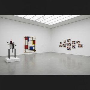
데 스틸은 단순한 예술 양식이 아니었습니다. 그것은 시각적 형태로 번역된 포괄적인 철학적 선언문이었습니다. 반 뒤스로르흐는 예술을 가장 본질적인 요소들, 즉 직선과 직각, 그리고 빨강, 노랑, 파랑의 삼원색과 함께 검정, 하양, 회색으로 정제해야 한다고 믿었습니다. 이 절제된 팔레트는 결코 제약에서 비롯된 것이 아니라, 보편성을 향한 갈망, 즉 이러한 근본적인 형태들이 우주의 질서와 공명한다는 믿음에서 탄생했습니다. 그는 캔버스를 넘어 건축, 디자인, 심지어 일상의 사물에까지 확장되는 '총체적 예술(total work of art)'을 꿈꿨습니다. 협업은 그의 작업에서 핵심이었습니다. 반 뒤스부르흐는 J.J.P. 아우드나 게리트 리트벨트와 같은 건축가들과 긴밀히 협력하며, 데 스틸의 원칙을 구현한 스테인드글라스 창문, 가구, 그리고 공간 전체를 디자인했습니다. 그의 협업은 피에트 몬드리안과 같은 동료 예술가들에게도 이어졌으며, 이들은 영향력 있는 잡지
De Stijl를 공동 창간하여 자신들의 아이디어를 전파하고 뜻을 같이하는 창작자들을 모으는 플랫폼으로 삼았습니다. 그러나 공유된 뿌리에도 불구하고, 신조형주의의 경직성을 둘러싸고 반 뒤스로르흐와 몬드리안 사이에 긴장이 발생하기도 했습니다. 1926년, 반 뒤스부르흐는 대각선과 더욱 역동적인 구도를 옹호하는 '엘레멘타리즘(Elementarism)'을 도입했습니다. 이러한 변화는 결국 운동 내의 분열로 이어졌으나, 이는 예술적 진화를 끊임없이 추구했던 그의 역동적인 정신을 여실히 보여주었습니다.
회화를 넘어: 다각적인 예술적 비전
화가로서 찬사를 받는 한편, 반 뒤스부르흐의 예술적 탐구는 놀라울 정도로 다양했습니다. 그는 다작을 하는 작가이자 시인, 그리고 비평가였으며, 펜을 통해 데 스틸의 이론적 토대를 명확히 하고 기존의 관습적인 예술 개념에 도전했습니다. 1920년대 초 다다이즘과의 교류는 그의 예술적 지평을 더욱 넓혔고, 콜라주와 타이포그래피를 결합한 실험적인 작품들로 이어졌습니다. 이 시기에 그는 바우하우스에서 강의하며 새로운 세대의 예술가와 디자이너들에게 자신의 아이디어를 공유하기도 했습니다. 그는 전통적인 예술 형식의 틀 안에 머무는 것에 만족하지 않았습니다. 반 뒤스부르흐는 예술이 사회를 변화시킬 힘을 가지고 있다고 믿었으며, 예술을 일상생활 속에 통합시키고자 적극적으로 노력했습니다. 그가 디자인한 인테리어와 가구들은 단순한 미적 실험이 아니라, 데 스틸의 원칙을 반영하여 조화로운 생활 공간을 창조하려는 시도였습니다. 소피 타우버-아르프, 조르주 반토네를 비롯한 예술가들과 함께 예술가 주거지를 디자인했던 사례는 그의 총체적인 예술적 접근법을 잘 보여줍니다. 이는 자신의 이상을 투영한 세상을 구축하려 했던 숭고한 시도였습니다.
유산과 영원한 영향력: 모더니즘의 선구자
테오 반 뒤스부르흐의 삶은 1931년, 47세라는 젊은 나이에 비극적으로 중단되었지만, 현대 미술에 남긴 그의 충격은 여전히 깊고 강렬합니다. 데 스틸 운동은 하나의 응집된 운동으로서 지속된 기간은 비교적 짧았으나, 바우하우스 디자인, 미니멀리즘, 구성주의를 포함한 후대의 예술적 발전 과정에 엄청난 영향을 미쳤습니다. 기하학적 추상, 순수 색채, 그리고 기능주의에 대한 그의 강조는 오늘날의 예술가와 디자이너들에게도 끊임없이 공명을 일으키고 있습니다. 그의 작업은 예술이 단순히 대상을 재현하는 것이 아니라, 근본적인 형태와 아이디어를 탐구하는 과정임을 상기시켜 줍니다. 반 뒤스부르흐의 유산은 그의 회화와 디자인을 넘어, 예술적 혁신에 대한 흔들림 없는 헌신과 추상의 변혁적 힘에 대한 믿음에 맞닿아 있습니다. 데 스틸의 언어로 표현된 통합되고 조화로운 세계에 대한 그의 비전은, 더욱 아름답고 의미 있는 환경을 만들고자 하는 이들에게 영원한 영감을 주고 있습니다.
주요 작품 및 지속적인 영향
- 동시적 구성을 위한 연구 XXII (1922): 신조형주의의 전형적인 예로, 운동의 상징적인 기하학적 형태와 제한된 색채 팔레트를 보여줍니다.
- 반값의 구도 (1928): 데 스틸 미학 안에서 톤의 변화를 탐구한 반 뒤스부르흐의 노력을 잘 나타냅니다.
- 무용수들 (1917-1918): 구상적 요소와 떠오르는 추상적 경향이 혼합된 그의 과도기적 단계를 보여줍니다.
- 잡지 De Stijl 공동 창간: 운동의 아이디어를 전파하고 예술가와 지식인들 사이의 대화를 촉진한 결정적인 플랫폼입니다.
- 엘레멘타리즘 (1926): 신조형주의에 역동성을 불어넣기 위해 대각선과 더욱 유연한 구도를 도입하려 했던 반 뒤스부르흐의 시도입니다.
반 뒤스부르흐의 영향력은 건축과 가구에서부터 그래픽 디자인과 타이포그래피에 이르기까지 현대 디자인의 수많은 측면에서 발견됩니다. 그는 관습에 도전하고 20세기와 그 이후를 위한 새로운 시각 언어를 꿈꿨던 진정한 선구자로, 미술사에서 중추적인 인물로 남아 있습니다. 그의 유산은 직선과 원색의 빛깔 속에 영원히 새겨져 있습니다.

 공유하기
공유하기


 유리 옵션은 110cm 미만 크기에서만 선택 가능합니다.