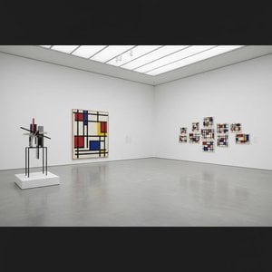
A Prelude to Neoplasticism: Exploring Mondrian’s ‘Composition 1916’
Piet Mondrian's ‘Composition 1916’ is a pivotal work marking a crucial transition in the artist’s oeuvre, and within the broader trajectory of abstract art. It stands as a compelling example of his move away from representational painting towards the radical simplification that would define his signature Neoplastic style. This isn’t merely an arrangement of lines and colors; it's a visual articulation of Mondrian’s evolving spiritual and philosophical beliefs.
Deconstructing Reality: Style & Technique
The artwork is firmly rooted in geometric abstraction, displaying characteristics that align with both Constructivism and De Stijl – movements emphasizing pure abstraction and universal forms. However, ‘Composition 1916’ isn't yet the rigidly defined grid system Mondrian would later become famous for. Instead, it presents a more dynamic interplay of intersecting lines, rectangles, and squares.
The technique is meticulous, suggesting careful planning and precise application of oil paint on canvas. The layering effect indicates a deliberate process, possibly utilizing masking techniques to achieve the sharp edges and overlapping planes. While appearing flat, this depth is cleverly created through the arrangement of forms rather than traditional perspective.
A Journey Towards Universal Harmony
Born in 1872, Piet Mondrian was deeply influenced by Theosophy – a spiritual movement seeking universal truths beyond the material world. He believed that art should transcend the particular and represent the underlying order of reality. ‘Composition 1916’ embodies this quest.
The absence of recognizable objects isn't an omission, but rather a deliberate attempt to strip away the superficial and reveal essential structures. The interplay of vertical and horizontal lines, along with the limited palette of red, blue, yellow, grey, and black, represents a striving for balance and harmony – core tenets of his artistic philosophy.
Symbolism & Emotional Resonance
While abstract, ‘Composition 1916’ isn't devoid of meaning. The intersecting lines can be interpreted as representing the interconnectedness of all things, while the geometric shapes symbolize fundamental building blocks of reality.
The dynamic tension between order and chaos, control and freedom, creates a visual energy that is both stimulating and calming. It evokes a sense of intellectual rigor combined with spiritual aspiration. The colors themselves carry symbolic weight: red representing vitality, blue signifying spirituality, and yellow embodying earthly energy.
Historical Significance & Legacy
Created around 1916, this work predates the formal establishment of De Stijl in 1917, yet it foreshadows its core principles. Mondrian co-founded De Stijl with Theo van Doesburg, and together they sought to create a “universal style” applicable to all forms of art and design. ‘Composition 1916’ is therefore not just a painting; it's a stepping stone towards a revolutionary artistic vision that would profoundly influence modern art, architecture, and design throughout the 20th century and beyond.
Its impact can be seen in everything from furniture to fashion, demonstrating the enduring power of Mondrian’s abstract language.
Collecting & Interior Design
A reproduction of ‘Composition 1916’ offers a sophisticated touch to any interior space. Its geometric precision and balanced color palette make it particularly well-suited for modern or minimalist settings.
- Its abstract nature allows it to complement a wide range of color schemes.
- The artwork's intellectual depth adds a layer of sophistication to living rooms, offices, or studies.
- Consider pairing it with furniture featuring clean lines and geometric forms for a cohesive aesthetic.
Owning a piece inspired by Mondrian is not just acquiring art; it’s embracing a legacy of innovation and a commitment to the pursuit of universal beauty.
질의응답
피에트 몬드리안의 다른 이름이나 별칭에는 무엇이 있나요?
"Composition 1916"의 작가인 피에트 몬드리안의 다른 이름으로는 피터 콘스탄틴 모드리얀, 피터 코르넬리스 몬드리안, Pieter Cornelis Mondriaan 등이 있습니다.
피에트 몬드리안의 "Composition 1916"의 구성을 주도하는 색상은 무엇인가요?
"Composition 1916"에서 가장 돋보이는 색상은 Rosy Brown (#b6a99a)입니다. 작품의 주된 색상은 인테리어와 작품을 조화롭게 매치할 때 유용합니다.
피에트 몬드리안의 "Composition 1916"을(를) 다른 조명 아래에서 볼 수 있을까요?
"Composition 1916"은 작품의 X선 분석 페이지에서 층별로 자세히 살펴볼 수 있습니다. 이 뷰어는 보존 과학자의 라이트 벤치(light bench)에서 영감을 얻었으며, 이미지의 11가지 광학적 판독값을 제공합니다.