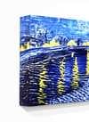
A Symphony of Quietude: Unpacking Mark Rothko’s “No. 9”
Mark Rothko's "No. 9," painted in 1948, isn’t merely a canvas splashed with color; it’s an immersion into the profound and often unsettling realm of human experience. Born Markus Yakovlevich Rothkowitz in Dvinsk, Latvia, in 1903, Rothko's early life was steeped in displacement – a constant negotiation between cultural identities shaped by pogroms and political instability. This inherent sense of otherness profoundly informed his artistic vision, driving him to explore themes of mortality, trauma, and the elusive search for meaning. “No. 9” embodies this exploration with an arresting simplicity, inviting viewers into a meditative space where color itself becomes a conduit for emotion.
The Language of Color: Form and Atmosphere
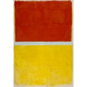
At first glance, "No. 9" appears almost elemental – a collection of rectangular blocks in muted tones of ivory, slate blue, crimson red, and apricot orange. However, to reduce it to mere geometric abstraction would be a grave oversight. Rothko’s masterful technique lies in the subtle blending of these forms, creating an atmosphere of hazy depth. The edges are deliberately blurred, dissolving the boundaries between shapes and fostering a sense of ambiguity. It's not about precise representation; rather, it’s about conveying a feeling – a quiet melancholy, perhaps, or a yearning for something beyond comprehension. Notice how the slate blue streak, beginning near the center and cascading downwards, acts as a visual anchor, grounding the composition while simultaneously suggesting an inexorable flow.
- Color Palette: Rothko’s choice of colors is deliberately restrained, evoking a sense of timelessness and universality. The muted tones – particularly the ivory and apricot orange – create a feeling of serenity, while the flashes of red and blue inject moments of intense emotion.
- Blurring Technique: This deliberate blurring is crucial to Rothko’s style. It softens the forms, preventing them from becoming overly defined or assertive, and instead allowing them to resonate with the viewer on an emotional level.
- Verticality & Composition: The predominantly vertical orientation of the painting draws the eye upwards, mirroring a potential aspiration or reaching for something beyond the visible world.
Symbolic Resonance: Loss and Remembrance
Considering Rothko’s personal history – his early experiences with loss and displacement – it's not surprising that “No. 9” carries a palpable sense of grief and remembrance. The stacked shapes in the left corner, beginning with pale pink rectangles and culminating in an ivory-white rectangle extending off the bottom edge, could be interpreted as fragments of memory, stubbornly clinging to existence. The crimson red rectangle streaked with white lines evokes a feeling of blood or tears, while the overall composition suggests a landscape scarred by hardship. The repetition of forms – particularly the vertical rectangles – creates a hypnotic effect, drawing the viewer into a state of contemplation and inviting them to confront their own experiences of loss.
A Window into the Soul: Rothko’s Legacy
“No. 9” is a pivotal work in Rothko's development, marking a shift towards his signature style – large, luminous fields of color intended to evoke profound emotional responses. Painted just after his arrival in Portland and following the tragic loss of his father, it’s a testament to the artist’s ability to transform personal sorrow into universal themes. The painting’s enduring power lies not in its representational qualities but in its capacity to connect with viewers on an intuitive level, prompting introspection and offering a glimpse into the depths of human emotion. WahooArt offers meticulously crafted hand-painted reproductions that faithfully capture the essence of this iconic piece, allowing you to experience Rothko's vision firsthand.

 გაგზავნა


 მინის ჩარჩოს არჩევანი ხელმისაწვდომია მხოლოდ 110 სმ-ზე ნაკლები ზომისთვის