Oil On PaperWallArtAbstract Expressionism
 1949Modern
 46.0 x 51.0 cm
このページに掲載されている作品は著作権法によって保護されており、当社の許可なく同一の複製物を制作または販売することは法律で禁じられています。この保護は、以下のような国際条約に基づき執行されます。 ベルヌ条約 および、以下の条項に定められたものを含む各国の法律により、 米国著作権法 第17編。
この手法は、著作権で保護された作品の複製や複写を伴わないため、著作権法に完全に準拠しています。これは単なる模倣ではなく、創造的な再解釈です。元の作品からインスピレーションを受けつつも、それとは異なる、全く新しい絵画を生み出すものです。
スピーディーな制作と多彩な仕上げオプションが魅力の、ミュージアムクオリティなジークレー・キャンバスプリント。 ( 手描きの複製画を注文する デジタル画像販売へ切り替え)





























作品のオリジナル比率に合わせた、当店の規定サイズからお選びください。

額縁や壁のスペースに合わせて、ご希望の幅と高さを入力してください。プリントはカットすることは可能ですが、元の画像より大きくすることはできないため、異なる比率のサイズを選択された場合は、画像の一部が欠けることになります。印刷を開始する前に、内容を確認していただくためのデジタルモックアップをお送りいたします。このページに表示されている画像は、実際のカット後の状態を示すものではありません。実際の仕上がりはモックアップにてご確認ください。
Zot
複製画サイズ一覧
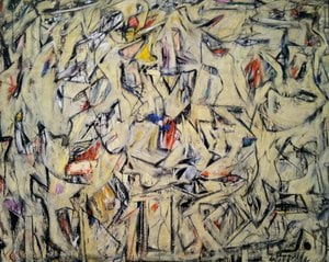
Willem de Kooning's "Zot," painted in 1949, isn’t merely a painting; it’s an embodiment of the fervor and uncertainty that characterized the height of Abstract Expressionism. This monumental canvas—measuring 46 x 51 cm—immediately confronts the viewer with a landscape dominated by stark white space punctuated by bursts of energetic pigment. It's a visual declaration of spontaneity, rejecting traditional representational conventions in favor of conveying raw emotion and psychological depth.
The painting’s compositional strategy defies easy categorization. Rather than adhering to linear perspective or establishing a discernible horizon line, De Kooning employs an all-over design where shapes overlap and intersect, creating a mesmerizing dance of visual complexity. Thick impasto—heavy application of paint—dominates much of the surface, punctuated by drips and splatters that seem to defy gravity. This technique isn’t about meticulous control; it's about allowing chance to guide the artist’s hand, resulting in textures that are palpably alive.
Despite its apparent lack of color, “Zot” possesses a subtle chromatic richness. Predominantly white serves as the foundational backdrop, subtly shifting hues through tonal variations achieved with black, grey, and fleeting touches of ochre yellow. These colors aren’t blended harmoniously; instead, they are layered and juxtaposed to generate tension and provoke contemplation. The muted palette contributes significantly to the painting's emotional impact—a feeling of unease mingled with exhilaration—reflecting the anxieties prevalent during the postwar period.
Lines in “Zot” are not descriptive; they’re expressive. Bold, sweeping strokes wrestle for dominance across the canvas, while thinner scribbles weave intricate patterns beneath them. Shapes— amorphous and fragmented—lack recognizable forms, resembling organic growths rather than geometric solids. This deliberate rejection of form underscores De Kooning's commitment to conveying emotion directly through gesture – capturing the artist’s subconscious impulses on a monumental scale.
Created during the Second World War and immediately following its conclusion, “Zot” speaks to the profound psychological upheaval experienced by artists grappling with trauma and disillusionment. The title itself—a nonsensical word—adds another layer of intrigue, suggesting a playful defiance of logic and inviting viewers to engage in an imaginative dialogue. As exemplified by The Metropolitan Museum of Art’s detailed analysis, De Kooning's work stands as a testament to the transformative power of abstraction – prioritizing feeling over representation and cementing his place among the titans of 20th-century art.
「Zot」はGreen Spectrumの色調が際立っています。
ヴィレム・デ・クーニング作「Zot」は、彩度Mutedで記録されています。
ヴィレム・デ・クーニング作「Zot」は、Energeticな情緒を伝えています。

1904 - 1997 , オランダ

Journey through the raw emotion of Abstract Expressionism. From Pollock's drips to Rothko's color fields, explore 10 iconic masterpieces and their stories. Find museum-quality art reproductions for your space at WahooArt.com. Discover all masterpieces on WahooArt.com.

Immerse yourself in the luminous world of Laurent Fabre. Explore 25 iconic Neo-Abstract masterpieces defined by geometric precision and chromatic harmony. Find inspiration for your space with museum-quality art reproductions. Discover all masterpieces on WahooArt.com.

 設置イメージを確認
 送る
送る シェア
シェア
 詳細情報
詳細情報 ガイドを表示

 画像をダウンロード
 似ている作品
 X線調査
X線調査 スライドショー
 統計情報
統計情報 続きを読む
続きを読む









 ガラスオプションは、110cm未満のサイズでのみご利用いただけます。