
迅速な制作と多彩な仕上げオプションを備えた、ミュージアムクオリティのジークレーまたはキャンバスプリント。 ( 手描きの絵画を購入 デジタル画像販売へ切り替え)





























作品のオリジナル比率に合わせた、当店の規定サイズからお選びください。

特定のフレームやスペースに合わせて、ご自身でサイズを指定することも可能です。選択されたサイズが元の画像の比率と一致しない場合、作品をトリミングするか、鏡面反射または単色での塗りつぶしによって画像を拡張いたします。制作を開始する前に、ご確認用のデジタルモックアップをお送りいたします。
画面上のプレビューには、実際のトリミングや拡張は反映されませんのでご注意ください。最終的な構図を正確に確認できるのは、モックアップのみとなります。
カスタムサイズも承っておりますが、元の比率を維持するためには、あらかじめ用意されたリストからサイズを選択することをお勧めいたします。

ホープンスタンプデザイン
複製画のサイズ

Leon Urbanski (1926 – 1998) stands as a monumental figure in the history of Polish graphic design and typography, shaping the visual landscape of his nation for decades. Born in Tarnów, Poland, Urbanski’s artistic journey began amidst the turbulent backdrop of post-war Europe, fostering an unwavering dedication to craftsmanship and innovation that would define his prolific career. He was far more than a mere designer; he was a storyteller who meticulously crafted images and lettering to convey profound meaning and emotion—a legacy that continues to inspire contemporary artists today.
His formative years were deeply marked by exposure to the powerful currents of European avant-garde movements, particularly Surrealism and Constructivism. These influences instilled in him a lifelong belief in experimentation and a resolute rejection of decorative excess, prioritizing clarity, functionality, and structural integrity as his guiding principles. While studying at the Kraków Academy of Fine Arts, he honed his skills in painting and drawing, gaining a foundational understanding of visual composition that would later breathe life into his typographic endeavors. Notably, Urbanski collaborated closely with Leon Kozłowski, another prominent Polish artist and educator, whose mentorship solidified Urbanski's commitment to intellectual rigor alongside aesthetic sensitivity.
Urbanski’s true brilliance resided in his unparalleled mastery of typography, where he transformed the printed word into a visual experience. He embarked on a remarkable career designing over 200 books—a staggering accomplishment that cemented his reputation as Poland's foremost book designer. His approach was never simply about the arrangement of text; rather, it was about creating a rhythmic, visual dialogue between words and images, reflecting the unique spirit of each project with meticulous attention to detail. Renowned publishers such as Ossolineum, Państwowy Instytut Wydawniczy, Wydawnictwo Iskry, Wydawnictwo Czytelnik, and Nasza Księgarnia all benefited immensely from his expertise, commissioning him to create works that were as intellectually profound as they were aesthetically striking.
In his more ephemeral works, Urbanski demonstrated a remarkable ability to elevate even the smallest medium. His collection of over 100 low-circulation ephemera—including invitations, programs, and greeting cards created between the early 1960s and the early 1990s—serves as a testament to his versatility. Many of these pieces were commissioned for high-level diplomatic meetings and international delegations, making them rare historical documents that capture the social and organizational fabric of Poland during that era. In these works, he often drew upon Renaissance printing traditions and utilized the ancient Greek principle of the "golden ratio," ensuring that even a simple invitation possessed a timeless, classical harmony.
Perhaps his most celebrated achievement is the Chopin Stamp Design, a project commissioned by the Fryderyk Chopin Institute in Warsaw. This artwork encapsulates the very essence of his stylistic approach, demanding a delicate balance between honoring Poland's musical heritage and communicating its ethereal spirit through visual representation. To achieve this, Urbanski skillfully employed a monochrome halftone technique, mirroring the muted, nostalgic tones found in vintage printing processes. This method allowed him to create an illusionistic detail that felt both modern and deeply rooted in artistic tradition.
The historical significance of Leon Urbanski lies in his ability to bridge the gap between fine art and functional design. His work remains a cornerstone of Polish graphic identity, characterized by:

1926 - 1998 , Poland

Embark on a sophisticated journey through the history of line drawing. From classical mastery to modern minimalism, explore how the power of the line shapes emotion and space in fine art. Discover expert insights for collectors and enthusiasts of graphic elegance.
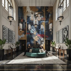
Transform luxury hospitality spaces with striking graphic art. From custom oil reproductions to architectural murals, our curated collection provides the visual impact your designs demand. Trust WahooArt.com for bespoke, museum-grade artistry and professional B2B services.


 プレビュー
プレビュー
 シェアする
シェアする シェアする
シェアする
 詳細を見る
詳細を見る ガイド
ガイド

 ダウンロード
 似ている作品
 X線調査
X線調査 スライドショー
 統計情報
統計情報

 詳細を見る
詳細を見る









 ガラスオプションは、110cm未満のサイズでのみご利用いただけます。


