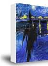
Peter Max’s *Flag*: A Burst of Optimism & Disquiet
Peter Max’s 1954 painting, *Flag*, isn't merely a depiction of the American Stars and Stripes; it’s a vibrant declaration – a youthful reimagining of national identity at a pivotal moment in history. This artwork transcends simple patriotism, offering instead a bold and enduring commentary that continues to resonate with viewers today. Max masterfully blends the burgeoning energy of Pop Art with the expressive freedom of Abstract Expressionism, creating an image that feels both familiar and strikingly unconventional. The composition deliberately distorts traditional flag elements: stars swell into monumental forms, stripes undulate with a fluid rhythm, and the overall effect is delightfully off-balance – a visual representation of restless vitality and constant change.
Technically, Max employs thick, gestural brushstrokes layered upon each other, building a rich tactile surface that practically begs to be examined closely. The paint application isn’t precise; lines bleed and blend, suggesting an ongoing process of evolution – a powerful metaphor for the ever-shifting concept of national identity itself. While the exact materials used remain somewhat debated (likely a combination of acrylics and oils), the resulting luminosity and depth are undeniable, contributing to the artwork's captivating glow. It’s as if the colors themselves are emanating from within, creating an almost psychedelic effect that draws the eye deeper into the composition.
Beyond Red, White & Blue: A Revolutionary Palette
The most immediately striking aspect of *Flag* is undoubtedly its unconventional color palette. Max deliberately abandons the traditional patriotic hues of red, white, and blue in favor of a near-neon spectrum – vibrant purples, greens, oranges, and intensely saturated reds and blues dominate the canvas. This chromatic choice isn’t arbitrary; it's a deliberate disruption designed to provoke thought and challenge expectations. These colors don’t simply sit on the flag; they seem to pulse with an inner light, creating a dynamic and energetic visual experience.
Consider the context of 1954: America was enjoying post-war prosperity, yet beneath the surface lay anxieties about Cold War tensions and social change. Max's bold color choices can be interpreted as a reflection of this underlying disquiet – a refusal to simply accept the status quo. The artwork isn’t a static symbol of national pride; it’s an active engagement with the complexities of American identity, suggesting both optimism and uncertainty.
1954: A World in Flux
The year 1954 was a period of immense global transformation. Beyond America's post-war boom, Europe was grappling with the aftermath of World War II, while China was undergoing significant political upheaval. This backdrop profoundly influenced Max’s artistic vision. His early experiences in Shanghai, witnessing a culture brimming with vibrant colors and philosophical depth, undoubtedly shaped his approach to art – a legacy that is powerfully evident in *Flag*. The artwork can be seen as a reflection of this broader sense of change and uncertainty, capturing the feeling of a world on the cusp of something new.
The painting’s dynamic composition and unconventional color palette contribute to its enduring appeal. It's a piece that invites interpretation – prompting viewers to consider what it means to be American in a rapidly changing world. *Flag* remains a testament to Max’s artistic genius, offering a captivating blend of Pop Art energy and Abstract Expressionist freedom.

 Megosztás


 Az üvegkeretes opció csak 110 cm alatti méretben érhető el


