Varhaiset Vuodet ja Taiteellisen Polun Alku
Pieter Cornelis Mondriaan Jr., syntynyt 7. maaliskuuta 1872 Amersfoortissa, Hollannissa, ei aloittanut taiteilijanuraansa välittömällä oivalluksella vaan asteittaisella kehityksellä. Hänen lapsuutensa oli syvällä perinteissä; hänen setänsä, Frits Mondriaan, oli jo vakiintunut taidemaalari, ja tämä sukulaisuussuhde ohjasi hänet aluksi maisemamaalauksen pariin. Nämä varhaiset teokset, jotka muistuttavat Haagin koulukuntaa ja hollantilaista impressionismia – kuten *Punainen mylly* – paljastavat nuoren taiteilijan ahkeran luonnon tutkimisen ja tekniikan hallinnan, mutta myös hienovaraisen etsinnän jotain pelkkää toistoa syvempää. Jo tuolloin yksinkertaistamisen kaipuu tuntui vetävän hänen siveltimiään puoleensa. Hän ei tyytynyt vain peilaamaan maailmaa; hän halusi tislata sen olemuksen. Tämä varhainen vaihe sisälsi kokeiluja pointillismilla ja fauvismilla, joista jokainen tarjosi erilaisen linssin värien ja muotojen tarkasteluun, mutta mikään ei täysin tyydyttänyt hänen kehittyviä taiteellisia visioitaan. Se oli tutkimuksen aikaa, välttämätön esipeli radikaalille muutokselle, joka määrittelisi hänen perintönsä.
Pariisin Herääminen ja Neoplastismin Synty
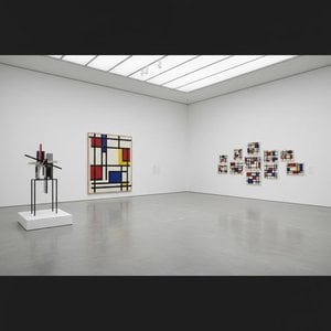
Ratkaiseva hetki koitti vuonna 1912, kun Mondriaan muutti Pariisiin. Kaupunki sykki avantgardistista energiaa, ja hän uppoutui kubismin vallankumoukselliseen maailmaan. Tämä kohtaaminen osoittautui mullistavaksi. Hän alkoi hajottaa muotoja, pilkkoa esineitä geometrisiksi komponenteikseen, siirtyen pois siitä, että kuvattiin *mitä* hän näki, kohti sitä, miten hän sen näki. Mondriaan ei kuitenkaan vain omaksunut uutta tyyliä; hän aloitti hengellisen etsinnän. Syvästi teosofian vaikutuksen alaisena – mystiseen filosofiaan, joka korosti universaaleja periaatteita – hän uskoi taiteen voivan olla väline piilotettujen totuuksien ilmaisemiseksi. Tämä usko ruokki hänen armotonta pyrkimystään abstraktioon, ajaen hänet vähentämään värit ja muodot niiden perustavanlaatuisimpiin elementteihin. Noin vuonna 1917 tämä matka huipentui neoplastismin muodostumiseen, jota kutsutaan usein ‘puhtaaksi plastiseksi taiteeksi’. Se oli radikaali estetiikka, joka perustui olennaisiin muotoihin – suoraviivaisiin viivoihin, oikeisiin kulmiin – ja rajoitettuun väripalettiin: perusväreihin (punainen, sininen, keltainen), mustaan, valkoiseen ja harmaaseen. Mondriaanille tämä pelkistys ei ollut tyhjyyttä; se oli universumin piilevän harmonian paljastamista, visuaalinen ilmentymä hengellisestä järjestyksestä. Hän perusti *De Stijl* -liikkeen Theo van Doesburgin kanssa edistääkseen näitä ideoita ja vakiinnuttaakseen neoplastismin modernin taiteen määrittäväksi voimaksi. Mestarityöt, kuten *Kompositio punaisella, sinisellä ja keltaisella* ja *Taulu nro 2 Kompositio nro V*, ovat todisteita tästä ajanjaksosta, ikonisia esityksiä hänen horjumattomasta sitoutumisestaan geometriseen puhtauteen.
Uudet Rytmit: Myöhäiselämän Kukoistus New Yorkissa
Toisen maailmansodan puhkeaminen pakotti Mondriaanin pakenemaan Euroopasta vuonna 1940 ja löytämään turvapaikan vilkkaasta New Yorkin metropolista. Tämä muutto osoittautui odottamattoman virkistäväksi. Kaupungin jäykkä ruuturakenne – jyrkkä kontrasti orgaanisempiin maisemiin, jotka hän oli tuntenut – resonoi hänen taiteellisten periaatteidensa kanssa. Hänen myöhemmät työnsä, erityisesti *Broadway Boogie Woogie* (1943), heijastavat tätä vaikutusta. Säilyttäen neoplastismin ydinelementit, maalaus tuo esiin dynaamista energiaa, eloisaa rytmiä, joka on inspiroitunut kaupungin sykkivästä elämästä ja jazzmusiikista. Suorat viivat ovat edelleen läsnä, mutta ne tanssivat ja leikkaavat nyt vapaammin, luoden liikkeen ja ilon tunteen. Ikään kuin Mondriaan olisi löytänyt uuden kielen vakiintuneen sanastonsa sisällä, tavan ilmaista modernin kaupunkielämän monimutkaisuutta geometrisen abstraktion yksinkertaisuuden kautta. Hän jatkoi tyylinsä hienosäätöä kuolemaansa asti vuonna 1944 jättäen jälkeensä teoksia, jotka edelleen kiehtovat ja inspiroivat.
Kestävä Perintö: Mondriaanin Pitkäaikainen Vaikutus
Piet Mondriaanin vaikutus taidemaailmaan on mittaamaton. Hän ei ollut pelkkä taiteilija; hän oli visionääri, joka muutti perustavanlaatuisesti ymmärryksemme abstraktiosta ja sen potentiaalista universaalisten totuuksien ilmaisemisessa. Hänen työnsä vaikutti syvästi lukemattomiin taiteilijoihin, liikkeisiin ja tieteenaloihin. Abstrakti ekspressionismi, minimalismi ja värikenttämaalaus ovat kaikki velkaa hänen uraauurtavalle hengelleen. Mutta hänen vaikutuksensa ulottuu kankaalta paljon pidemmälle. Neoplastismin periaatteet – yksinkertaisuus, selkeys, geometrinen järjestys – ovat tunkeutuneet arkkitehtuuriin, suunnitteluun ja muotiin. Huonekaluista tekstiileihin rakennusten julkisivuihin ja graafisiin asetteluihin Mondriaanin estetiikka jatkaa visuaalisen maailmamme muokkaamista. Hän on edelleen ikoninen hahmo modernissa taiteessa, abstraktion loputonta etsintää ja taiteellisen innovaation kestävää voimaa symboloiva. Kuten suunnitteluhistorioitsija Stephen Bayley osuvasti totesi, Mondriaanista on tullut “totemi kaikelle modernismin pyrkimykselle.” Hänen perintönsä ei ole pelkästään esteettistä kauneutta vaan älyllistä tiukkuutta, hengellistä syvyyttä ja horjumatonta uskoa taiteen muuttavaan voimaan.
Vaikutteet ja Keskeiset Teokset
- Varhaiset Vaikutteet: Haagin koulukunta, hollantilainen impressionismi, pointillismi, fauvismi tarjosivat pohjan hänen varhaisille taiteellisille tutkimuksilleen.
- Mullistava Vaikutus: Kubismi Pariisissa oli ratkaiseva hänen siirtymälleen abstraktioon ja geometrisiin muotoihin.
- Filosofinen Perusta: Teosofia vaikutti syvästi hänen uskoonsa, jonka mukaan taide voi ilmaista universaaleja hengellisiä periaatteita.
- Keskeiset Teokset: *Punainen mylly* (varhainen naturalistinen ajanjakso), *Kompositio punaisella, sinisellä ja keltaisella* (neoplastismin kvintessenssi), *Taulu nro 2 Kompositio nro V* (osoittaa olennaisten muotojen vähentämisen), *Broadway Boogie Woogie* (myöhäiselämän dynamiikkaa, johon New York City vaikutti).
- Kestävä Vaikutus: Mondriaanin työ inspiroi edelleen taiteilijoita, arkkitehteja ja suunnittelijoita muokaten modernia estetiikkaa eri ti

 Jaa
Jaa


 Lasivaihtoehto on saatavilla vain alle 110 cm kokoisina teoksina