Mark Rothko: Värvide ja Hingede Sümfoonia
Mark Rothko, sündinud Markus Yakovlevitš Rotkovitš 1903. aastal Läti Daugavpilsis, oli kunstnik, kes suunas abstraktse ekspressionismi radikaalselt uutesse horisontidesse. Tema elu oli värvitud nii loovuse kui ka sisemise võitlusega, mis peegeldus tema maalidel sügavalt ja haaravalt. Lapsepõlv Läti juudi kogukonnas, hilisem immigratsioon Ameerika Ühendriikidesse ning isa ärajätmine – need sündmused kujundasid Rothko maailmavaadet ja andsid aluse tema kunstile, mis käsitleb eksistentsiaalseid teemasid, nagu kaotus, trauma ja inimhinge otsinguid. Varaseimad aastad Portlandis Oregoni osariigis olid täis akadeemilisi saavutusi, kuid Rothko tunnetas kutset suundumata kunstile, mis viis ta New Yorki, kus ta õppis Art Students League'is ja hakkas kujundama oma ainulaadset stiili.
Figuratiivsusest Värvikäibeni: Kunstniku Arenemine
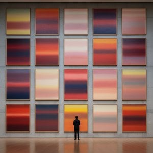
Rothko algusaegade looming oli seotud realistliku maalimisega – täpsed vaated linnavaadetele ja portreed, mis näitasid juba tol ajal tema teoste psühholoogilist sügavust. Teise maailmasõja aegsed aastad tõid aga kaasa radikaalse muutuse. Surrealismi ja müütoloogia mõjul pöördus Rothko ära esinduslikest kujutistest, otsides võimalusi väljendada universaalseid inimemotsioone sümbolite vahendusel. Nii tekkis periood, kus ta lõi mitme vormiga maalijaid – lained abstraktselt hõljuvaid biomorfseid kujusid, mis asetsesid figuurse ja abstraktse vahel. Need tööd ei olnud pelgud vormikatsumusi, vaid sügavalt tunda vastuseid maailma sõja aegsetele muredele. 1940ndate lõpuks jõudis Rothko oma tuntud stiilini: suurtes mõõtmetes lõuenditel paiknevad ristkülikukujulised värviblokid, mis näisid hõljuvat ja resoniseerivat omavahel. Ta hülgas kõik äratuntavad kujutised, keskendudes puhtalt värvi ja vormi emotsionaalsele mõjule. See oli pöördepunkt abstraktse ekspressionismi arendamisel ning Rothko kinnitas oma positsiooni selle liikumise juhi hulgas.
Värvikute Põllud ja Vaimulikkuse Püüdlus
Rothko hilisem looming on määratletav kui "värvikute põldude" maalijad – tohutu värvilaigade süles, mis neelavad vaataja sisse immersiivsesse kogemusse. Need maalid ei käsitle seda, *mida* nad kujutavad, vaid pigem *kui palju* need tekitavad tundeid. Rothko uskus, et kunst peaks rääkima vaatajaga visceralselt, möödes intellektuaalse analüüsiga ja pöördudes otse emotsioonide poole. Ta kihastas hoolikalt õhukesi värvikihte, luues peeneid toonimuutusi ja tekstuurseid variatsioone, mis näisid lähtivat lõuendist endast. Tema ristkülikukujuliste vormide servad on sageli hägused, lubades neil seguneda ja interakteerida omavahel, luues sügavuse ja liikumise tunde. Rothko vältis tahtlikult pealkirju, piirdudes ainult numbritega – "Nr. 1", "Nr. 6" –, julgustades vaatajaid kohtuma maalidega eelarvamuseta ja lasta oma emotsionaalsetel reaktsioonidel juhendada kogemust. Ta püüdis luua ruumi meditatsioonile, varjupaiga, kus vaatajad saaksid ühendust midagi endast suurema miljööga.
Tema ambitsioon oli mitte midagi vähemat kui tekitada sügavaid vaimulikke kogemusi värvi keele abil.
Peamised Saavutused ja Püsiv Järelmõju
Rothko olulisemate saavutuste hulka kuuluvad "Nr. 10 (1950)", mis kehastas tema stiili arengut, ning Seagrami seinamaalingud (1958). Algselt tellitud New Yorki Four Seasons restorani jaoks, Rothko keelas need lõpult ära, tundetades, et nad oleksid kahjustatud oma kavandatavas keskkonnas. Selle asemel annetas ta need Tate Gallerysse Londonis, kus need jätkuvad inspiratsiooniallikana ja imetluse tekitajana. Ilmselt tema ambitsioonikaim projekt oli Rothko kabel Houstoni osariigis Texases (1971) – mittkonfessionaalne pühakoda, mis majutab neljateist tema maali. Kavandatud kui ruum vaikseks peegluseks, on kabel paljude jaoks püha koht, mis kehastab Rothko uskumust kunsti vaimulikus jõus.
Rothko mõju järgnevatele kunstnike põlvkondadele on olnud tohutu. Ta rajas tee minimalistlikule kunstile ja jätkab kaasaegsete maalijate inspireerimist, kes uurivad abstraktse värvi emotsionaalseid võimalusi. Vaatamata depressiooniga võitlemisele kogu elaja jooksul, mille lõppjõudmeks oli tragöödia 1970. aastal, jääb Mark Rothko 20. sajandi üheks olulisimaks ja mõjukamaks kunstnikuks – värvimeistriks, kelle looming jätkab publiku haaranud maailmas.
Emotsionaalse Resonantsi Püsiv Jõud
- Rothko maal on tähistatud nende võimega väljendada universaalseid inimemotse – traagikat, ekstaasi, meelehärmatust ja lootust.
- Tema värvi emotsionaalseks väljendusvahendiks kasutamine revolutsioonitas abstraktset maali.
- Rothko kabel seisab tõestusena tema uskumuses kunsti vaimulikus jõus.
- Ta jääb oluliseks tegelaseks abstraktse ekspressionismi seas ja suureks mõjutajaks kaasaegsete kunstnike jaoks.
Rothko pärand ulatub kaugemale kunstiajaloo piiridest. Tema töö kutsub meid üles silmitsi seisma oma surmusega, käsitlema inimeksistentsi keerukust ja otsima tähendust maailmas, mis on sageli vaba sellest. Ta tuletab meile meelde, et kunst ei ole pelgalt esteetiline küsimus; see on seotus – seotus iseendaga, teistega ja millegi suurema miljööga. Tema maalide püsiv jõud peitub nende võimes tekitada neid sügavaid emotsioone, pakkudes leebust, inspiratsiooni ja pilgu inimhinge sügavusse.



 Vaata sisu
 Telli käsitsi maalitud reproduktsioon
 Jaga teost
 Jaga
Jaga
 Detailid
 Õppekate juhend

 Laadi alla
 Sarnased teosed
 Röntgenuuring
 Slaidietendus
 Statistika

 Loe lähemalt






































 Klaasivalik on saadaval ainult kuni 110 cm suuruses teostes