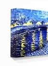
Composition (1923) af Theo van Doesburg, håndmalet oliemalerireproduktion udført af en mesterkunstner
Se i rummet Se i AR Skift til printsalg Skift til digitalt billede Del som kort
Detaljer Guide Tilføj til favoritter Download Lignende værker Røntgenundersøgelse Diasshow Spørgsmål og svar Præsentation Statistikker

Composition Håndmalet oliemalerireproduktion

Dimensioner
41.0 x 33.0 cm

A balanced grid of primary red, blue, and yellow rectangles against black and white, reflecting a search for cosmic order in 1923.

Hollandsk De Stijl-pioner, der brugte primærfarver og geometrisk abstraktion til at skabe dynamiske kompositioner med rette linjer og vinkler.

Håndlavet oliereproduktion

Håndmalet olie på lærred i din valgte størrelse og ramme, udført efter bestilling af vores kunstnere. ( Skift til printsalg Skift til digitalt billede)
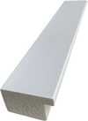
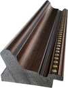
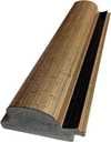
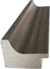
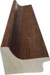
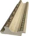
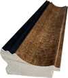
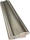
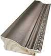
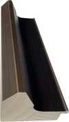
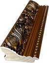
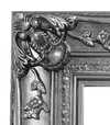
Corner sample of the P118B picture frame: støbt polystyren, 5 cm wide and 3 cm thick
P118B Dkr10
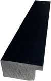
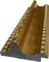
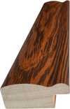
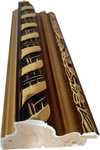
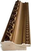
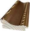
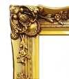
Corner sample of the P118H picture frame: støbt polystyren, 5 cm wide and 3 cm thick
P118H Dkr10
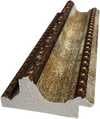
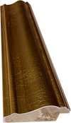
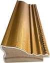
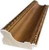
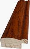
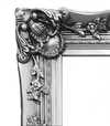
Corner sample of the P118W picture frame: støbt polystyren, 5 cm wide and 3 cm thick
P118W Dkr10
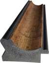
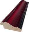
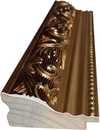
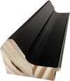
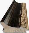
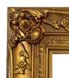
Corner sample of the P438Z picture frame: støbt polystyren, 5.5 cm wide and 3.5 cm thick
P438Z Dkr10
Corner sample of the P508JH picture frame: støbt polystyren, 7 cm wide and 3.5 cm thick
P508JH Dkr12
Corner sample of the P508YH picture frame: støbt polystyren, 7 cm wide and 3.5 cm thick
P508YH Dkr12
Corner sample of the P805H picture frame: støbt polystyren, 5 cm wide and 3.5 cm thick
P805H Dkr10
Corner sample of the P805Z picture frame: støbt polystyren, 5 cm wide and 3.5 cm thick
P805Z Dkr10
Corner sample of the P919BZ picture frame: støbt polystyren, 7 cm wide and 3.5 cm thick
P919BZ Dkr10
Corner sample of the P919G picture frame: støbt polystyren, 7 cm wide and 3.5 cm thick
P919G Dkr10
Corner sample of the P919XJ picture frame: støbt polystyren, 7 cm wide and 3.5 cm thick
P919XJ Dkr10
Corner sample of the P959ZH picture frame: støbt polystyren, 5 cm wide and 3 cm thick
P959ZH Dkr10
Corner sample of the P968JZ picture frame: støbt polystyren, 6 cm wide and 4 cm thick
P968JZ Dkr12
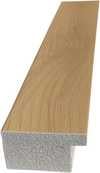
Corner sample of the W106C picture frame: massivt træ, 5 cm wide and 3 cm thick
W106C Dkr8
Corner sample of the W218G picture frame: massivt træ, 5 cm wide and 3 cm thick
W218G Dkr10
Corner sample of the W218JH picture frame: massivt træ, 5 cm wide and 3 cm thick
W218JH Dkr8
Corner sample of the W218Y picture frame: massivt træ, 5 cm wide and 3 cm thick
W218Y Dkr10
Corner sample of the W307PJ picture frame: massivt træ, 6 cm wide and 3 cm thick
W307PJ Dkr10
Corner sample of the W316G picture frame: massivt træ, 6 cm wide and 3 cm thick
W316G Dkr10
Corner sample of the W316PJ picture frame: massivt træ, 6 cm wide and 3 cm thick
W316PJ Dkr8
Corner sample of the W316Y picture frame: massivt træ, 6 cm wide and 3 cm thick
W316Y Dkr10
Corner sample of the W398PJ picture frame: massivt træ, 5 cm wide and 3 cm thick
W398PJ Dkr8
Corner sample of the W4111J picture frame: massivt træ, 6.5 cm wide and 3.5 cm thick
W4111J Dkr10
Corner sample of the W500HY picture frame: massivt træ, 7 cm wide and 5 cm thick
W500HY Dkr15
Corner sample of the W500JH picture frame: massivt træ, 7 cm wide and 5 cm thick
W500JH Dkr15
Corner sample of the W692G picture frame: massivt træ, 8 cm wide and 4 cm thick
W692G Dkr12
Corner sample of the W849H picture frame: massivt træ, 5 cm wide and 3 cm thick
W849H Dkr8
Corner sample of the W940BG picture frame: massivt træ, 7.5 cm wide and 4.5 cm thick
W940BG Dkr15
Corner sample of the W953PJ picture frame: massivt træ, 6 cm wide and 3.5 cm thick
W953PJ Dkr8

Standardstørrelse
speciallavet
CM
INCH

Vælg mellem vores forudindstillede størrelser, der matcher kunstværkets originale proportioner.

bredde
højde

Indtast den bredde og højde, du har brug for, så det passer til din ramme eller din væg. Da dette er håndmalet, kan kunstneren ved en anden form på størrelsen male lidt mere rundt om billedet eller skære lidt væk — det er op til dig. Vi sender dig et digitalt mockup til godkendelse, før maleriet påbegyndes. Billedet, der vises på denne side, viser ikke det endelige resultat — det er kun mockuppet, der gør.

Eksempler på hvad der kan ændres: Udskift ansigt med kundens eget foto; Tilføj kæledyr (f.eks. udskift kat med hund); Inkluder en skjult besked i baggrunden; Ændr baggrundslandskab eller elementer.
Efter bestilling vil WahooArt.com team sende en e-mail til kunden for at indhente instruktioner og fremsende et udkast til gennemgang

Verdensomspændende levering () på 3-4 uger i stedet for de standard 5 uger. (25 november). Ingen kompromiser med kvaliteten.

Gratis ekspresforsendelse til hele verden
Lærred af linned i høj kvalitet
Fuld transportforsikring
Garanti for refusion af told og importafgifter
Garanti for præcis farvegengivelse
100 dages returret ved fabrikationsfejl
100% fuld returret
Mængderabat ved flere køb

Samlet pris

Dkr 1824

Composition

Reproduktionsmetode

Størrelse på reproduktion

-

Samlet pris

Dkr 1824

Hurtige fakta

  • Dimensions: 41 x 33 cm
  • Movement: De Stijl
  • Notable elements or techniques: Grid-like arrangement, vertical and horizontal lines
  • Artist: Theo van Doesburg
  • Title: Composition

Kunstquiz

Der er kun ét korrekt svar på hvert spørgsmål.

Spørgsmål 1:
What is the primary artistic style of the painting 'Composition'?
Spørgsmål 2:
In which year was the artwork 'Composition' created?
Spørgsmål 3:
Which movement did Theo van Doesburg found?
Spørgsmål 4:
What are the primary colors used in the painting's composition?
Spørgsmål 5:
What is the size of the painting?

Identification of Composition by Theo van Doesburg

The canvas known as Composition emerges from the mind of Theo van Doesburg, a work that captures a specific moment in 1923. This piece exists as a precise arrangement of form and color, born from a period of intense creative focus. The artist, Theo van Doesburg, brings a sense of equilibrium to the surface, translating abstract thought into a tangible presence. It is a work that demands attention through its structural clarity and its commitment to the principles of the De Stijl movement.

The history of this object is tied to a specific circle of thinkers and patrons. Antony Kok commissioned the work, setting it on its path through the hands of those who shaped the modern era. From there, the painting finds its way into the hands of Bart de Ligt (1883–1938), who becomes its first owner. This transition marks the beginning of a long lineage of stewardship, as the work moves from the artist's studio into a private collection where its presence remains constant.

Every line and color choice within Composition reflects the artist's pursuit of a universal visual language. As we observe the work, we see the direct result of a vision that seeks to strip away the unnecessary to find a fundamental truth. The painting remains a vital part of the history of abstraction, holding the weight of its 1923 origins in every carefully placed rectangle and primary hue.

Visual Composition and Geometric Elements

The canvas unfolds as a precise grid of rectangles, where vertical and horizontal lines intersect to dictate the movement of the eye. There is a profound sense of equilibrium achieved through this arrangement, as non-representational forms find their place within a structured, rhythmic order. The eye moves across the surface, guided by the intersections of these straight lines, finding balance in the way the shapes occupy the space. It is a study in pure geometry, where the subject matter is stripped of any external reference, leaving only the essence of form and relation.

Color acts as the primary force within this structured environment. The palette relies on the fundamental strength of red, yellow, and blue, which anchor the composition. These primary hues interact with a supporting cast of black, white, and grey, creating a tension between the boldest tones and the more neutral shades. The colors appear solid and flat, avoiding any blending or shading, which emphasizes the stark, clean nature of the geometric arrangement. Each rectangle holds its own weight, contributing to a visual language that seeks a universal harmony through simplicity.

Provenance and History of the Object

The history of this work begins in the creative atmosphere of Paris, where it finds its way from the artist's studio into the hands of Bart de Ligt. This acquisition likely occurs in late 1923, marking the start of a long and steady lineage. De Ligt, a man deeply connected to the avant-garde circles of the time, holds the piece within his personal collection until his passing in 1938.

From that moment, the painting enters a quiet, private chapter. It remains within the same family, passing through the hands of descendants for nearly a century. This continuity preserves the work's integrity, keeping it sheltered within a single domestic line since 1923. The colors and forms remain as they were when they first left the artist's side, held in a state of careful preservation through the decades.

Documented Interpretations and Artistic Debates

The canvas captures a moment of profound transition, acting as a key work within the artist's entire oeuvre. It reveals a growing complexity within his purist style, where the rigid logic of geometry begins to dance with a more nuanced sense of equilibrium. One senses the tension between the absolute and the evolving, as the lines and colors find a new, sophisticated rhythm. This evolution suggests a mind moving beyond simple shapes toward a more intricate visual language.

A deep connection between the realm of architecture and the act of painting pulses through the work. The composition feels less like a mere arrangement of pigment and more like a blueprint for a structured reality. This link is no accident; the artist himself articulated the concept behind its creation in the magazine Architectura on 17th July 1923. The painting exists as a bridge, where the spatial logic of built environments meets the spiritual pursuit of pure abstraction.

Related Works by the Same Artist

The evolution of this geometric language unfolds through several other pieces that trace the artist's shifting focus. One can look back to Composition XX from 1920 to see the early movements of these shapes. Nearby in the timeline, the 1923 work Study for a Composition offers a glimpse into the creative process behind these structured arrangements. These works exist as part of a continuous search for balance and order within the frame.

As the years progress, the compositions grow more complex and dynamic. The 1925 Counter composition XIV introduces a different energy to the grid. Later, the Simultaneous Counter-Composition from 1929–1930 pushes the boundaries of the aesthetic even further. Each piece captures a specific moment in a lifelong pursuit of a new visual language, moving from the rigid to the more fluid and experimental.

Spørgsmål og svar

Hvilket rum anbefales "Composition" af Theo van Doesburg til?

En reproduktion af "Composition" vil passe smukt ind i et Office.

Hvilken teknik og stil er "Composition" udført i?

"Composition" af Theo van Doesburg kombinerer Oil On Canvas-teknikken med De Stijl-stilen. Teknik og stilart beskriver værkets fremstilling og æstetiske udtryk.

Bruger "Composition" af Theo van Doesburg stærke kontraster eller bløde harmonier?

I "Composition" parres en Statement kontrast med en Discordant Palette harmoni.


Kunstnerbiografi

Theo van Doesburg: Arkitekten af Abstraktion – En Livshistorie i Geometriske Harmonier

Theo van Doesburg, født Christian Emil Marie Küpper den 30. august 1883 i Utrecht, var langt mere end blot en maler; han var en revolutionerende kraft, der omskabte selve fundamentet for moderne kunst. Hans rejse begyndte midt i de vedvarende ekkoer af Impressionismen og Post-Impressionismen, hvor han i første omgang afspejlede stilarter, der minder om Vincent van Goghs – både i emnevalg og følelsesmæssig intensitet. Men denne tidlige fase tjente som en kritisk forberedelse, et nødvendigt skridt mod den radikale transformation, der ville definere hans varige arv. Et afgørende øjeblik kom i 1913 med hans møde med Wassily Kandinskys *Rückblicke*. Denne tekst udløste en dyb erkendelse inden i van Doesburg: kunstens sande udtryk lå ikke i at gengive den ydre verden, men i at kanalisere en indre, åndelig virkelighed gennem ren abstraktion. Det var denne overbevisning, der fødte Neoplasticismen – mere almindeligt kendt som De Stijl – et bevægelse, han grundlagde og med sit hjerte brændende forsvarede, og hvor han blev dens mest passionerede fortaler.

Dannelse af en Ny Visuel Sprog: Principperne bag De Stijl

De Stijl var ikke blot en kunstnerisk stil; det var et omfattende filosofisk manifest oversat til visuel form. Van Doesburg mente, at kunst skulle reduceres til dets mest essentielle elementer – lige linjer, rette vinkler og de primære farver rød, gul og blå, sammen med sort, hvid og grå. Denne spartanske palet blev ikke født af begrænsning, men af et ønske om universelhed – en overbevisning om, at disse fundamentale former resonerede med en underliggende kosmisk orden. Han forestillede sig et *totalt* kunstværk, der strækker sig ud over lærredet til at omfatte arkitektur, design og endda hverdagsgenstande. Samarbejde var nøglen; van Doesburg arbejdede tæt sammen med arkitekter som J.J.P. Oud og Gerrit Rietveld, designede glasfacader, møbler og hele interiører, der udtrykte principperne for De Stijl. Hans samarbejder omfattede også kunstnere som Piet Mondrian, med hvem han grundlagde det indflydelsesrige tidsskrift *De Stijl*, en platform for at sprede bevægelsens ideer og tiltrække ligesindede kreative sjæle. Alligevel opstod der spændinger mellem van Doesburg og Mondrian omkring Neoplasticismens rigiditet. Van Doesburg introducerede "Elementarismen" i 1926, idet han argumenterede for diagonale linjer og en mere dynamisk tilgang til komposition – et afbrud fra den oprindelige stil, der førte til en splittelse inden for bevægelsen.

Ud over Maleriet: En Multifacetteret Kunstnerisk Vision

Mens han fejres som maler, var van Doesburgs kunstneriske ambitioner utroligt mangfoldige. Han var en produktiv skribent, digter og kritiker, der brugte sin pen til at artikulere De Stijl teoretiske underpinnings og udfordre konventionelle opfattelser af kunst. Hans engagement i Dadaismen i de tidlige 1920'ere udvidede yderligere hans kunstneriske horisonter, hvilket førte til eksperimenterende værker, der inkluderede collage og typografi. Denne periode så ham også undervise på Bauhaus, hvor han delte sine ideer med en ny generation af kunstnere og designere. Han var ikke tilfreds med at forblive inden for de traditionelle kunstformer; van Doesburg søgte aktivt at integrere kunst i hverdagen, idet han mente, at den havde magten til at transformere samfundet. Hans designs til interiører og møbler var ikke blot æstetiske øvelser, men forsøg på at skabe harmoniske boligrum, der afspejlede principperne for De Stijl. Et fremragende eksempel er hans samarbejde med Sophie Taeuber-Arp og Georges Vantongerloo om at designe kunstnerboliger, hvilket viste en holistisk tilgang til kunstnerisk skabelse – et forsøg på at bygge en verden *i* billedet af sine idealer.

Indflydelse og Betydningsfuld Effekt: En Pioner inden for Modernismen

Theo van Doesburgs liv blev tragisk afkortet i 1931 i en alder af 47, men hans indflydelse på moderne kunst forbliver dybtgående. De Stijl, selvom den var relativt kortvarig som en sammenhængende bevægelse, har udøvet enorm indflydelse på efterfølgende kunstudviklinger, herunder Bauhaus-design, Minimalisme og Konstruktivisme. Hans fokus på geometrisk abstraktion, ren farve og funktionelt design resonerer stadig med kunstnere og designere i dag. Hans arbejde tjener som en påmindelse om, at kunst ikke kun handler om repræsentation, men om at udforske fundamentale former og ideer. Van Doesburgs vision om en forenet, harmonisk verden – udtrykt gennem sproget for De Stijl – inspirerer stadig dem, der søger at skabe et mere smukt og meningsfuldt miljø.

Nøgleværker & Betydningsfuld Effekt

  • Study for Simultaneous Compositions XXII (1922): Et quintessential eksempel på Neoplasticismen, der viser bevægelsens signatur geometriske former og begrænsede farvepalet.
  • Composition with half values (1928): Demonstrerer van Doesburgs udforskning af tonevariationer inden for De Stijl æstetikken.
  • Dancers (1917-1918): Repræsenterer en overgangsfase i hans arbejde, der blander figurativt elementer med fremvoksende abstrakte tendenser.
  • Samarbejde om tidsskriftet *De Stijl* (1917-1923): En kritisk platform for at sprede bevægelsens ideer og fremme dialog mellem kunstnere og intellektuelle.
  • Elementarismen (1926): Van Doesburgs forsøg på at tilføre dynamik til Neoplasticismen, ved introduktion af diagonale linjer og en mere flydende tilgang til komposition.
Van Doesburgs indflydelse kan ses i utallige aspekter af moderne design – fra arkitektur og møbler til grafisk design og typografi. Han er fortsat en central figur i kunsthistorien, en sand pioner, der modigt udfordrede konventionerne og forestillede sig et nyt visuelt sprog for det 20. århundrede og frem.
Theo van Doesburg

Theo van Doesburg

1883 - 1931 , Holland

Kort om kunstneren

  • Artistic Movement Or Style: De Stijl, Neoplasticisme
  • Artists Or Movements Influenced By This Artist:
    • Bauhaus
    • Minimalisme
  • Artists Who Influenced This Artist:
    • Wassily Kandinsky
    • Vincent van Gogh
  • Date Of Birth: 30. august 1883
  • Date Of Death: 7. marts 1931
  • Full Name: Theo van Doesburg
  • Nationality: Hollandsk
  • Notable Artworks:
    • Komposition med rød
    • Studie for simultane
    • Danskere
  • Place Of Birth: Utrecht, Holland
Udforsk kunstværker organiseret efter temaer, stilarter og karakteristika.