x

 Del
Del
Giclée- eller lærredstryk i museumskvalitet med hurtig produktion og fleksible muligheder for finish.
Vælg mellem vores forudindstillede størrelser, der matcher kunstværkets originale proportioner.
Du kan indtaste dine egne mål for at passe til en specifik ramme eller et bestemt område. Hvis den valgte størrelse ikke stemmer overens med det originale billedes proportioner, vil vi enten beskære kunstværket eller udvide billedet med en spejlet eller ensfarvet kant. En digital mockup vil blive sendt til din godkendelse, før produktionen påbegyndes.
Bemærk venligst, at forhåndsvisningen på skærmen ikke afspejler den faktiske beskæring eller udvidelse. Kun mockuppen vil nøjagtigt vise den endelige komposition.
Selvom specialmål er tilgængelige, anbefaler vi at vælge et mål fra den foruddefinerede liste for at bevare de originale proportioner.
Verdensomspændende levering () på 2 uger i stedet for de sædvanlige 4/5 uger. (5 juli)


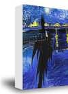
No. 5/No. 22
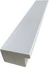
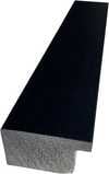
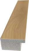
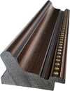
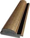
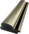
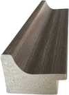
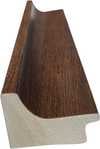
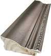
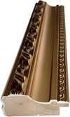
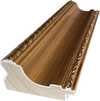
Størrelse på reproduktion

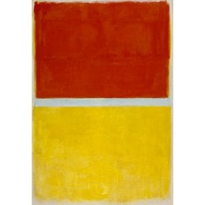


1903 - 1970 , Latvian
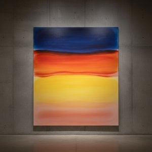
Explore the profound emotional depth of Mark Rothko's abstract expressionism. Discover the history, techniques & lasting impact of this pivotal Color Field painter. Expert insights for collectors and art enthusiasts.

Explore the life & work of Jacob Kainen, a pivotal figure in American Abstract Expressionism and Color Field painting. Discover his journey from Social Realism to vibrant abstraction and lasting influence on 20th-century art.
Oplev Mark Rothkos 25 mest ikoniske malerier – en dybdegående rejse i abstrakt ekspressionisme og farvefeltmaleri. Lær historien bag værkerne & find inspiration til din indretning med WahooArt.dk. Udforsk samlingen online!

Explore the groundbreaking abstract expressionism of Morris Louis, a pioneer of Color Field painting. Discover his innovative techniques, influential series & lasting legacy in post-war American art. Learn more at WahooArt.

Explore the captivating world of Beatrice Parsons, a pioneering British abstract expressionist. Discover her journey from garden watercolors to evocative color field paintings and learn about her place within art history.


Hold dig opdateret med de seneste kunstnyheder, eksklusive tilbud og indretningsideer.
Fortæl os om dit projekt, og vores kunsteksperter vil give dig 3 personlige kunstforslag.
Vi kuraterer 3 valgmuligheder kun til dig – Gratis!


 Glasmulighed er kun tilgængelig i størrelser under 110 cm


