
由我们的艺术家按需定制,为您提供您所选尺寸及画框的布面手工油画。 ( 切换至版画销售渠道 切换至数字图像销售渠道)





























您可以从与原作比例一致的预设尺寸中进行选择。

请输入您需要的宽度和高度,以适配您的画框或墙面。由于作品为手工绘制,若您选择不同的尺寸比例,艺术家可能会在画面边缘多画一些或稍作裁剪 —— 由您决定。在开始绘画之前,我们会为您发送一份数字效果图供您确认。本页面上展示的图片并非最终实物 —— 只有效果图才能反映真实结果。
Counter composition X
复刻品尺寸说明
To stand before Theo van Doesburg's Counter composition X is not merely to observe paint on canvas; it is to encounter a moment of profound intellectual clarity, a visual manifesto rendered in primary colors and absolute structure. This piece, dating from 1924, pulses with the revolutionary spirit of early modernism. It presents itself as a seemingly simple square, yet within its rigid confines—the bold placement of red in the upper left, yellow centrally positioned, blue anchoring the lower left, and black completing the composition in the lower right—lies an entire philosophy. Van Doesburg strips away the illusion of depth and narrative chaos, leaving behind only the essential dialogue between form and color.
This work is deeply embedded within the ethos of Neoplasticism, the movement that gave rise to De Stijl. For Van Doesburg, art could no longer afford the sentimental trappings of representation. The world, he argued, was best understood not through mimicry, but through its underlying structural harmonies. Counter composition X embodies this quest for universal order. The technique is characterized by an almost ascetic purity; clean lines meet flat planes of saturated color. It speaks to a desire to distill existence down to its most fundamental components—the vertical and the horizontal, the primary hues. Owning a reproduction of this piece allows one to bring that same sense of disciplined harmony into a contemporary living space.
The selection of colors is never arbitrary; it is a carefully orchestrated symbolic language. The primaries—red, yellow, and blue—are the foundational notes of visual experience, while black provides the necessary grounding counterpoint. These elements interact not as separate entities, but as interdependent forces balancing within the square matrix. Consider the tension between the vibrant red corner and the deep, stabilizing black quadrant. This interplay suggests a dynamic equilibrium—a perfect balance achieved through opposing yet complementary forces. It is an abstract meditation on structure itself, suggesting that true beauty resides in the relationship between parts.
For the collector or designer, Counter composition X offers more than mere decoration; it offers a focal point of contemplation. Its bold graphic nature acts as an immediate visual anchor, capable of elevating any room from mundane to monumental. The emotional impact is one of invigorating calm—the kind that comes from understanding underlying principles. It demands that the viewer slow down, look closer, and engage their intellect alongside their eye. Whether displayed in a minimalist gallery setting or integrated into a richly decorated interior, this painting asserts an undeniable modern sophistication, celebrating geometry as the ultimate form of expressive power.
西奥·凡·杜斯堡 的《Counter composition X》 采用了 Dark 色调,并以 Bronze (#c6a032) 作为主导色。
"Counter composition X" 的作者是 西奥·凡·杜斯堡,创作于 1924 年。
“Counter composition X” 传达出一种 Energetic 的情感。这种情感基调描述了作品给人的印象。


1883 - 1931 , 荷兰

Explore the profound spiritual depth of geometric abstraction. From Malevich's Suprematism to modern masters, our expert guide reveals how pure form and color command presence in fine art collections.

Explore the profound elegance of De Stijl. Discover how Piet Mondrian and the masters of Neoplasticism utilized geometric harmony and primary colors to redefine modern abstraction. An authoritative guide for the discerning collector seeking timeless, structured beauty.
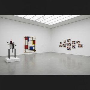
Explore the profound essence of Neoplasticism. Discover how Piet Mondrian and De Stijl masters used pure color and geometric form to redefine modern art. An essential guide for collectors seeking to understand the enduring power of abstract harmony and universal order.


 实景预览
实景预览
 发送
发送 分享
分享
 详情
详情 指南
指南

 下载图片
下载图片
 相似作品
相似作品 X射线
X射线 幻灯片播放
幻灯片播放 统计数据
统计数据


 阅读全文
阅读全文









 玻璃选项仅适用于110厘米以下的尺寸。


