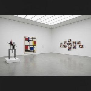
Exploring Geometric Harmony: Piet Mondrian’s Composition 2
Piet Mondrian, born Pieter Cornelis Mondriaan in Amersfoort, Netherlands, wasn't a painter who burst onto the artistic scene with flamboyant declarations. Instead, his journey toward groundbreaking abstraction unfolded gradually, nurtured by familial influences and an early fascination with landscape painting—specifically works reminiscent of the Hague School and Dutch Impressionism like *The Red Mill*. These formative pieces demonstrate a young Mondrian diligently honing his craft, mastering traditional techniques while simultaneously harboring a profound desire for something beyond mere visual representation. He recognized that capturing nature faithfully wasn’t enough; he sought to distill its core essence into pure form.
- Style: Mondrian's oeuvre is undeniably defined by Neoplasticism—a radical departure from representational art. This style championed the reduction of visual elements to their most fundamental components: straight lines and squares, primarily in black, white, and primary colors (red, yellow, blue). It’s a deliberate rejection of illusionistic perspective and color gradients, prioritizing clarity and intellectual rigor.
- Technique: Mondrian meticulously executed his compositions using tempera on canvas. This medium allowed for precise layering and blending, crucial to achieving the desired tonal balance and emphasizing the geometric forms. The careful application of paint contributes to the artwork’s textural quality—though subtle—enhancing its visual impact.
A Reflection of Philosophical Ideals
Composition 2 embodies Mondrian's unwavering belief in universal harmony, rooted in mathematical principles and influenced by Zen Buddhism. He saw these geometric shapes as representing the underlying structure of reality – a cosmos governed by order and balance—and his paintings served as visual manifestations of this philosophical conviction. The deliberate absence of organic forms symbolizes transcendence from earthly concerns, elevating the artwork to a realm of pure abstraction.
- Historical Context: Created in 1921, Composition 2 emerged during Mondrian’s pivotal period of artistic experimentation and intellectual engagement. It coincided with his growing interest in Eastern philosophy and his desire to express spiritual truths through visual language—a reaction against the perceived excesses of Expressionism.
- Symbolism: The dominant black lines delineate boundaries, representing stability and permanence, while the white squares symbolize purity and openness. The placement and proportions of these shapes are carefully considered, reflecting Mondrian’s belief in harmonious relationships between opposing forces—a concept central to his philosophical worldview.
Emotional Resonance: Beyond Representation
Despite its austere appearance, Composition 2 possesses a remarkable emotional impact. The artwork doesn't evoke sentimental feelings or narrative storytelling; rather, it invites contemplation and encourages viewers to engage with the fundamental principles of visual perception. Its simplicity fosters a sense of calm and serenity—a testament to Mondrian’s ability to communicate profound ideas through deceptively simple forms. It speaks to an innate human desire for order and beauty, resonating deeply within those who appreciate its intellectual elegance.
问答详情
如何购买 蒙德里安 的《Composition 2》 的版画?
“Composition 2”可通过 采用棉质帆布或档案级画布纸制作的艺术版画 进行订购。您可以在 本页 选择心仪的尺寸进行下单。
蒙德里安 的《Composition 2》 的版权情况是如何界定的?
"Composition 2" 的版权状态 —— 属于公有领域 —— 其版权已过期 —— 取决于艺术家于 1944 年逝世这一事实。
蒙德里安 的《Composition 2》 是一件广为人知的艺术品吗?
蒙德里安 的《Composition 2》 的记录热度为 Iconic。
哪里可以买到蒙德里安 的《Composition 2》的手绘复制品?
您可以在 本页 直接订购 蒙德里安 的《Composition 2》 的手绘复制品:亚麻画布手工绘制油画复制品,按需定制。
在“Composition 2”中,对比与和谐是如何结合的?
蒙德里安 的《Composition 2》 的色彩构成将 Statement 的对比与 Discordant Palette 的和谐融为一体。
“Composition 2”被归于哪位艺术家名下?
"Composition 2" 由 蒙德里安 创作。本页面的信息旨在介绍 蒙德里安 的原作。
“Composition 2”描绘的是什么内容?
蒙德里安 的《Composition 2》 描绘了:geometric shapes, primary colors, minimalism, abstraction, composition, neoplasticism, black white。