藏品详情
A Study in Serenity: Mark Rothko’s 1961 Untitled Composition
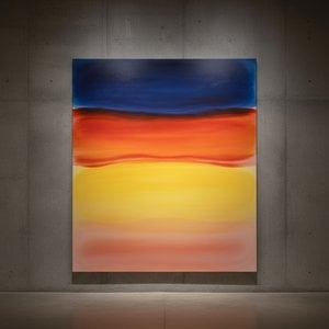
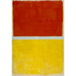
This captivating work by Mark Rothko, created in 1961, exemplifies the artist's mature style and his profound exploration of color and emotion. The painting presents a deceptively simple arrangement – three vertically stacked rectangular blocks rendered in nuanced shades of orange. While seemingly minimalist, this composition embodies the core tenets of Rothko’s artistic vision.
Abstract Expressionism & Color Field Painting
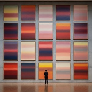
Rothko was a pivotal figure in the Abstract Expressionist movement, but he soon diverged to forge his own distinct path within what became known as Color Field painting. This style prioritized large areas of flat color to evoke emotional responses. Unlike earlier abstract expressionists who emphasized gestural brushwork, Rothko sought a more contemplative and immersive experience for the viewer. The deliberate lack of representational imagery forces attention onto the interplay of hues and their subtle variations.
Technique & Materiality
Executed in oil on canvas, the painting reveals visible brushstrokes that attest to the materiality of the paint itself. Rothko didn’t blend his colors seamlessly; instead, he applied them in layers, allowing each stratum to contribute to the overall luminosity and depth. The surface appears relatively smooth, yet retains a tactile quality that invites close inspection. This technique is crucial to understanding Rothko's intent – he wasn’t aiming for illusionistic space but rather for a direct engagement with the physical presence of color.
Historical Context & Artistic Evolution
Born in Latvia and immigrating to the United States as a child, Marcus Rothkowitz (later Mark Rothko) experienced cultural displacement that profoundly influenced his artistic sensibility. His early work explored figurative subjects, but by the 1940s he began to move towards abstraction, driven by a desire to express universal human emotions. The paintings of 1961, like this one, represent the culmination of years of experimentation and refinement. This period saw Rothko achieving his signature style – large-scale canvases featuring rectangular forms that seem to float and resonate with inner light. His work can be seen in relation to other Color Field painters such as Barnett Newman and Clyfford Still, but Rothko’s paintings possess a unique emotional depth and spiritual quality.
Symbolism & Emotional Impact
While Rothko resisted definitive interpretations of his work, the rectangular forms are often perceived as portals or windows into another realm. The orange hues – ranging from warm terracotta to muted peach – evoke feelings of warmth, tranquility, and perhaps a touch of melancholy. The stacking of the blocks creates a sense of order and stability, yet their imprecise edges hint at underlying tension. Rothko aimed not to depict specific objects or narratives but rather to create an environment that would elicit profound emotional responses in the viewer. He wanted his paintings to be experienced as much as they were seen – to envelop the observer in a field of color and feeling.
Interior Design & Collectibility
This *Untitled* work, or high-quality reproductions thereof, lends itself beautifully to modern and minimalist interiors. The warm orange tones can complement neutral palettes or provide a striking contrast against cooler colors. Its contemplative nature makes it ideal for spaces dedicated to relaxation, meditation, or quiet reflection – living rooms, bedrooms, or private studies. As a significant example of Rothko’s oeuvre, this painting holds considerable value for collectors and art enthusiasts alike, representing a pivotal moment in the history of abstract art.

 分享
分享


 玻璃选项仅适用于110厘米以下的尺寸。