БЕЗКОШТОВНА КОНСУЛЬТАЦІЯ З МИСТЕЦТВА
x

 Надіслати
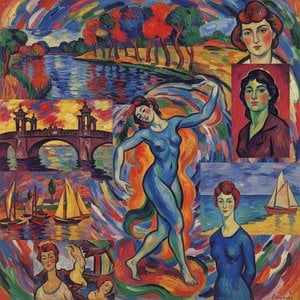
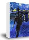
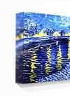
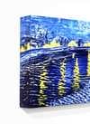
 Acrylic On CanvasWallArtColor Field Painting
 1949Modern
 203.0 x 100.0 cm
Музейна якість друку جيкле або на полотні з оперативним виготовленням та різноманітними варіантами фінішної обробки.
Обирайте з наших стандартних розмірів, що відповідають оригінальним пропорціям твору мистецтва.
Ви можете вказати власні розміри, щоб репродукція ідеально підійшла до конкретної рами або інтер'єру. Якщо обраний вами розмір не відповідає пропорціям оригіналу, ми або обріжемо полотно, або розширимо зображення за допомогою дзеркального відображення чи суцільної заливки країв. Перед початком виробництва вам буде надіслано цифровий макет для затвердження.
Будь ласка, зверніть увагу, що попередній перегляд на екрані не відображає фактичне обрізання або розширення. Тільки макет точно покаже фінальну композицію.
Хоча можливість замовлення індивідуальних розмірів доступна, ми рекомендуємо обирати формат із попередньо визначеного списку, щоб зберегти оригінальні пропорції.
Доставка по всьому світу () за 2 тижні замість стандартних 4/5 тижнів. (2 Липень)


No. 21
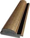
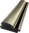
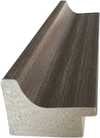
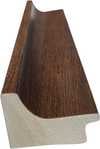
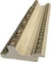
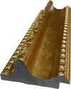
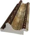
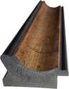
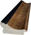
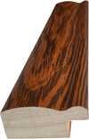
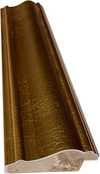
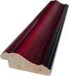
Розмір репродукції


1903 - 1970 , Латвія

Посібник для колекціонерів з інвестицій в абстрактні репродукції. Дізнайтеся про автентичність, ціноутворення та вибір художників. Експертні поради та гарантія якості від WahooArt.
Відкрийте для себе 25 найвідоміших шедеврів Анрі Матісса! Дізнайтесь історію фавізму, колірних рішень та унікального стилю художника. Репродукції картин Матісса для вашого дому – на WahooArt.com. Дослідіть колекцію онлайн!
Відкрийте для себе 10 шедеврів Фавізму від Матісса, Дерена та інших! Дізнайтесь історію яскравих полотен, що змінили мистецтво. Купуйте репродукції картин преміум-якості на WahooArt.com.

Explore the profound spiritual resonance of Color Field Painting with insights into Rothko, Newman & Still. Discover the techniques & legacy of this influential abstract art movement.
Explore the revolutionary art of Henri Matisse! Discover his bold use of color, Fauvist origins, and lasting impact on modern painting. A comprehensive guide for art enthusiasts.


Будьте в курсі останніх новин зі світу мистецтва, ексклюзивних пропозицій та ідей для декорування.
Розкажіть нам про свій проєкт, і наші експерти з мистецтва підготують для вас 3 персоналізовані пропозиції щодо творів мистецтва.
Дозвольте нам підібрати 3 варіанти спеціально для вас — безкоштовно!
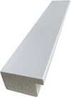
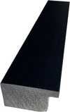
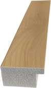
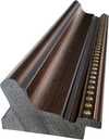
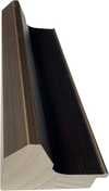
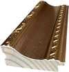
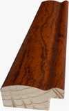
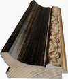
 Скляний варіант доступний лише для розмірів до 110 см


