The Genesis of a Silent Dialogue
Mark Rothko's “No. 12” isn’t merely a painting; it’s an invitation to quiet contemplation, a distilled essence of feeling rendered in pigment and texture. Born Markus Yakovlevich Rothkowitz in Dvinsk, Latvia – a region steeped in historical displacement and cultural upheaval – Rothko’s early life profoundly shaped his artistic vision. The anxieties of a Jewish family living under the shadow of pogroms instilled within him a deep sensitivity to human suffering, a theme that would become a recurring motif throughout his oeuvre. This sense of vulnerability and searching for meaning is palpably present in “No. 12,” a work born from a complex interplay of personal experience and artistic exploration.
The painting’s genesis lies within the broader context of Color Field painting, a movement that sought to elevate color itself as the primary subject matter. Rothko moved to New York City in 1923, immersing himself in the vibrant, often turbulent, atmosphere of the city's artistic scene. He experimented with various styles – Surrealism, mythological themes – before arriving at his signature approach: large, rectangular blocks of color stacked vertically, creating a sense of depth and luminosity. “No. 12” exemplifies this technique perfectly, representing a pivotal moment in Rothko’s development as he moved away from representational imagery towards pure emotional expression.
Deconstructing Form: A Minimalist Composition
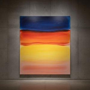
At first glance, "No. 12" appears strikingly simple – three distinct rectangular blocks of color arranged against a reddish-brown frame. However, this apparent minimalism belies a complex interplay of visual elements. The uppermost block is dominated by a deep, saturated blue-purple, transitioning downwards into a lighter, warmer beige hue. This gradient isn’t merely decorative; it suggests movement, depth, and perhaps even the passage of time or emotion. The thin band of reddish-brown acts as an anchor, grounding the composition and providing a subtle contrast to the dominant colors. Notably, there's no discernible perspective or attempt at realistic representation – Rothko deliberately eschewed traditional techniques in favor of conveying feeling directly through color.
The brushwork is crucial to understanding the painting’s impact. It’s visible, textured, and gestural, suggesting an expressive application of paint. Layers are built up, allowing colors to bleed slightly into adjacent areas, creating soft edges and a sense of movement. This technique contributes significantly to the painting's atmospheric quality, evoking a feeling of quiet contemplation and simplicity. The deliberate lack of sharp lines or defined forms encourages the viewer to lose themselves within the color fields, fostering a meditative experience.
Color as Emotion: Symbolism and Interpretation
While Rothko resisted definitive interpretations of his work, it’s widely believed that he aimed to evoke profound emotional responses through color. The blue-purple shade often represents melancholy, spirituality, or the vastness of the universe – a reflection perhaps of his own sense of displacement and longing. The warmer beige tones might symbolize comfort, earthiness, or even mortality. The reddish-brown frame serves as a grounding element, providing stability amidst the expansive color fields.
It’s important to note that Rothko wasn't interested in depicting specific scenes or narratives; instead, he sought to create an experience for the viewer—a direct emotional connection through pure color. “No. 12” invites us to project our own feelings and experiences onto the canvas, transforming it into a personal meditation space. The painting’s enduring power lies in its ability to resonate with viewers on a deeply intuitive level.
A Legacy of Quiet Intensity
Mark Rothko's “No. 12” stands as a testament to the transformative potential of color and abstraction. It exemplifies his mastery of Color Field painting, demonstrating how seemingly simple forms can evoke profound emotional responses. Reproductions capture much of this intensity, offering an accessible way to experience Rothko’s vision in your own space. WahooArt offers meticulously crafted hand-painted reproductions that faithfully recreate the texture, luminosity, and subtle nuances of this iconic work, allowing you to bring a piece of Rothko's contemplative world into your home or office.
Frågor och svar
Uppvisar "No. 12" starka ljus-mörkerkontraster?
Kontrastnivån i "No. 12" av Mark Rothko är Statement.
Finns "No. 12" tillgänglig som ett konsttryck?
Ett tryck av "No. 12" av Mark Rothko kan beställas direkt på dess Konsttryck i hög kvalitet-sida: ett konsttryck på bomullscanvas eller arkivbeständigt canvaspapper.
Vilken känsla förmedlar Abstract Expressionism-verket "No. 12"?
Den Calm känslan i "No. 12" ackompanjeras av dess Abstract Expressionism-stil.



 Visa i rummet
 Köp handmålat konstverk
 Skicka
 Dela
Dela
 Detaljer
 Studentguide för konstverk

 Ladda ner
 Liknande objekt
 Röntgen
 Bildspel
 Besökstatistik

 Läs mer






































 Glasalternativet är endast tillgängligt i storlekar under 110 cm.