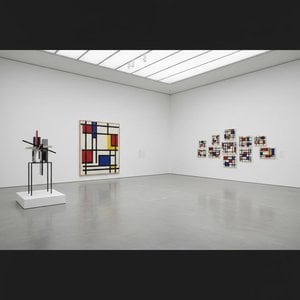
Arhitekt Abstraktne Harmonije: Življenje in Delo Thea van Doesburga
Theo van Doesburg, rojen Christian Emil Marie Küpper leta 1883 v Utrechtu na Nizozemskem, ni bil zgolj slikar; bil je revolucionarna sila, ki je preoblikovala temelje moderne umetnosti. Njegova pot se je začela v odmevih impresionizma in postimpresionizma, sprva odražajoč sloge, ki spominjajo na Vincenta van Gogha – tako po motivih kot po čustveni intenzivnosti. Ta zgodnja faza pa je bila ključni uvod, nujen korak k radikalni preobrazbi, ki bo definirala njegovo trajno zapuščino. Pomemben trenutek je nastal leta 1913 s srečanjem z Wassilyjem Kandinskim in njegovim delom *Rückblicke*. Ta tekst je v van Doesburgu sprožil globoko ugotovitev: resnična umetniška izraznost ne leži v ponavljanju zunanjega sveta, temveč v usmerjanju notranje, duhovne stvarnosti skozi čisto abstrakcijo. Iz tega prepričanja se je rodil Neoplasticizem, bolj znan kot De Stijl – gibanje, ki ga je ustanovil in goreče zagovarjal ter postal njegov najbolj strasten zagovornik.
Kovanje Nove Vizualne Jezike: Načela Gibanja De Stijl
De Stijl ni bil zgolj umetniški slog; bil je celovit filozofski manifest, preveden v vizualno obliko. Van Doesburg je verjel v odvzem umetnosti njenih najbistvenejših elementov – ravnih črt, pravih kotov in primarnih barv rdeče, rumene in modre, skupaj s črno, belo in sivo. Ta strog paleta ni izvirala iz omejitve, temveč iz želje po univerzalnosti – prepričanja, da te temeljne oblike odmevajo z osnovnim kozmičnim redom. Zamislil si je *totalno* umetniško delo, ki presega platno in zajema arhitekturo, dizajn in celo vsakdanje predmete. Sodelovanje je bilo ključnega pomena; van Doesburg je tesno sodeloval z arhitekti, kot sta J.J.P. Oud in Gerrit Rietveld, pri oblikovanju vitražev, pohištva in celih notranjosti, ki so utelešale načela De Stijl. Njegovo sodelovanje se je razširilo na umetnike, kot je bil Piet Mondrian, s katerim sta skupaj ustanovila vpliven časopis *De Stijl*, platformo za širjenje njihovih idej in privabljanje podobno mislečih ustvarjalcev. Kljub skupnim začetkom pa so se med van Doesburgom in Mondrianom pojavile napetosti glede togosti Neoplasticizma. Leta 1926 je van Doesburg uvedel “Elementarizem”, zagovarjajoč diagonalne črte in dinamičnejše kompozicije – odstop, ki je sčasoma vodil do razcepa znotraj gibanja, kar je razkrilo njegov nemirni duh in stalno iskanje umetniške evolucije.
Onkraj Slikarstva: Večstranska Umetniška Vizija
Van Doesburg so ga slavili kot slikarja, vendar so bila njegova umetniška prizadevanja izjemno raznolika. Bil je plodovit pisatelj, pesnik in kritik, ki je s svojim peresom artikuliral teoretične temelje De Stijl in izpodbijal konvencionalne predstave o umetnosti. Njegovo vključevanje v Dadaizem v zgodnjih dvajdesetih letih je še razširilo njegove umetniške obzorja, kar je vodilo do eksperimentalnih del, ki so vključevala kolaže in tipografijo. V tem obdobju je poučeval tudi na Bauhausu, kjer je svoje ideje delil z novo generacijo umetnikov in oblikovalcev. Ni se zadovoljil z ostankom v mejah tradicionalnih umetniških form; van Doesburg je aktivno iskal integracijo umetnosti v vsakdanje življenje, verjel pa je, da ima moč preoblikovati družbo. Njegovi načrti za notranjosti in pohištvo niso bili zgolj estetski eksperimenti, temveč poskusi ustvariti harmonične bivalne prostore, ki odražajo načela De Stijl. Odličen primer je njegovo sodelovanje s Sophie Taeuber-Arp in Georgesom Vantongerloo pri oblikovanju umetniških rezidenc, kar kaže holističen pristop k ustvarjalnosti – poskus zgraditi svet *v* podobi njegovih idealov.
Zapuščina in Trajni Vpliv: Pionir Modernizma
Življenje Thea van Doesburga se je tragično končalo leta 1931 v starosti 47 let, vendar pa je njegov vpliv na moderno umetnost ostal globok. De Stijl, čeprav relativno kratkotrajno gibanje kot celota, je izvršilo ogromen vpliv na poznejši umetniški razvoj, vključno z Bauhaus dizajnom, Minimalizmom in Konstruktivizmom. Njegov poudarek na geometrijski abstrakciji, čisti barvi in funkcionalizmu še danes odmeva pri umetnikih in oblikovalcih. Njegovo delo je opomnik, da umetnost ni samo o reprezentaciji, temveč o raziskovanju temeljev form in idej. Van Doesburgova zapuščina sega onkraj njegovih slik in dizajnov; leži v njegovi neomajni zavezanosti umetniški inovativnosti in verovanju v transformativno moč abstrakcije. Njegova vizija enotnega, harmoničnega sveta – izražena skozi jezik De Stijl – še naprej navdihuje tiste, ki si prizadevajo ustvariti lepši in smiselnejši svet.
Ključna Dela & Trajni Vpliv
- Študija za Simultane Kompozicije XXII (1922): Bistven primer Neoplasticizma, ki prikazuje značilne geometrijske oblike in omejeno barvno paleto gibanja.
- Kompozicija s polovičnimi vrednostmi (1928): Ponazarja van Doesburgovo raziskovanje tonskih variacij znotraj estetike De Stijl.
- Plesalci (1917-1918): Predstavlja prehodno fazo v njegovem delu, ki združuje figurativne elemente z nastajajočimi abstraktnimi težnjami.
- Sodelovanje pri časopisu *De Stijl*: Ključna platforma za širjenje idej gibanja in spodbujanje dialoga med umetniki in intelektualci.
- Elementarizem (1926): Van Doesburgov poskus vnesti dinamiko v Neoplasticizem, s čimer je uvedel diagonalne črte in bolj tekoč pristop k kompoziciji.
Van Doesburgov vpliv je mogoče videti v neštetih vidikih modernega dizajna – od arhitekture in pohištva do grafičnega dizajna in tipografije. Ostaja ključna figura v zgodovini umetnosti, pravi pionir, ki se je drznil izzvati konvencije in si zamisliti nov vizualni jezik za 20. stoletje in naprej – zapuščina vklesana v ravnih črtah in primarnih odtenkih.



 Preverite v realnem okolju
 Naročite ročno slikano reprodukcijo
 Pošlji kot čestitko
 Deli
Deli
 Podrobnosti
 Priročnik

 Prenesi
 Podobni artefakti
 Rentgenski posnetek
 Predvajaj diaporama
 Statistika

 Preberi več






































 Možnost stekla je na voljo le za velikosti pod 110 cm