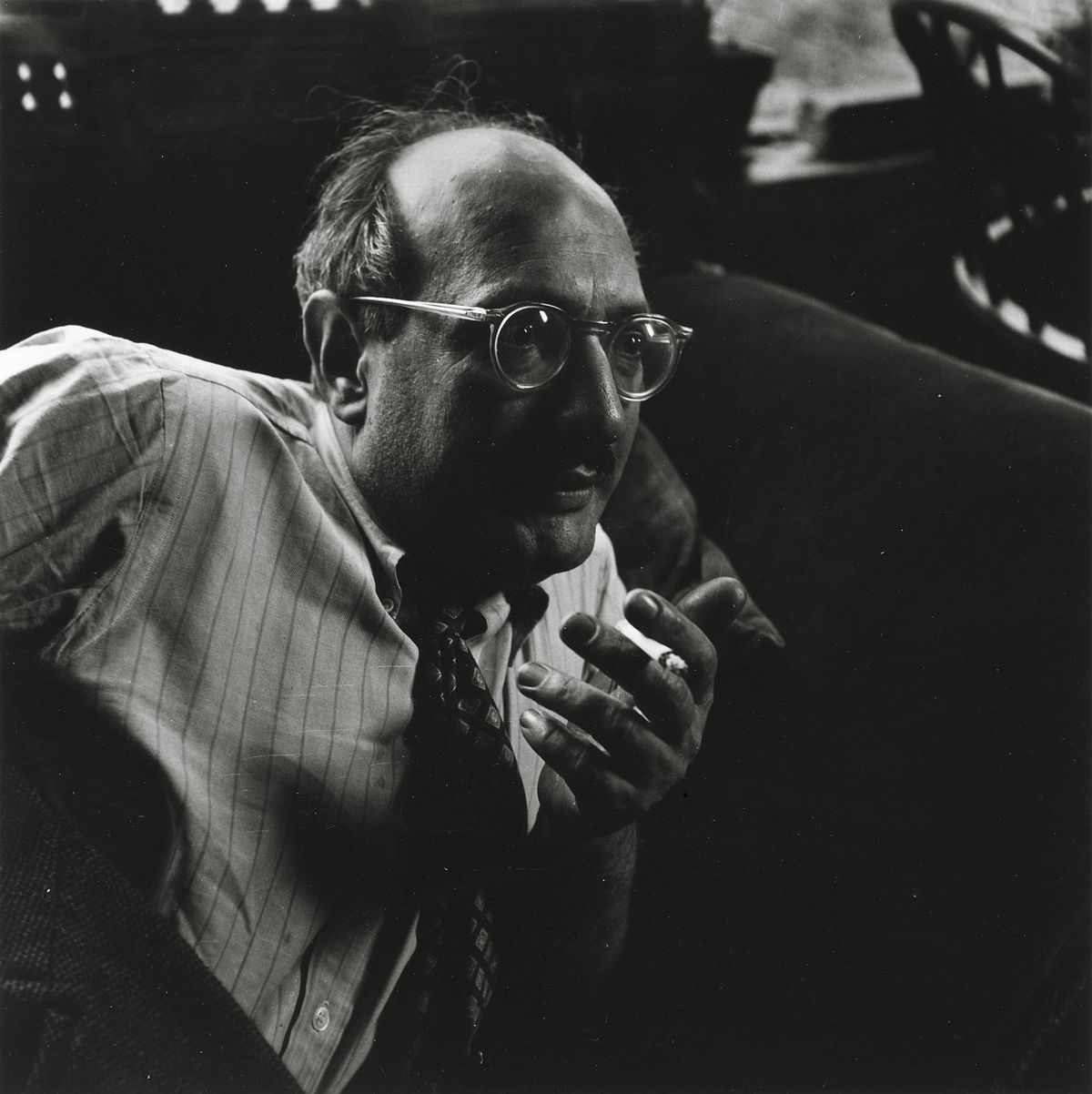
Mark Rothko: Barva, Čustvo in Iskanje Duše
Mark Rothko, rojen kot Markus Yakovlevič Rotkovič v Daugavpilsu, Latviji, leta 1903, je bil slikar, katerega življenje in delo sta globoko prepleteni z iskanjem smisla, čustvene izraznosti in duhovne transcendence. Že zgodnja leta so bila zaznamovana s negotovostjo in strahovi, ki so jih prinašali antisemitizem in politična nestabilnost v njegovem rodu. Emigracija v Portland, Oregon, leta 1913 je predstavljala kulturni šok, a hkrati tudi začetek potovanja, ki ga je vodilo k umetnosti kot sredstvu za raziskovanje človeške duše. Čeprav je študiral na Yaleu, se je Rothko kmalu odločil slediti svoji strasti in se preselil v New York, kjer je obiskoval Art Students League. Te začetne izkušnje so oblikovale njegovo razumevanje sveta in ga usmerile k umetnosti kot sredstvu za izražanje globih čustev, ki jih je nosil v sebi.
Od Figurativizma do Abstraktnega Ekspresionizma: Evolucija Stil
Rothkovo zgodnje delo se je opiralo na figurativno slikanje, prikazujoč mestne prizore in portrete z natančnostjo in pozornostjo do podrobnosti. Vendar pa so že takrat v njegovih slikah sijoči psihološki odtenki, ki napovedujejo njegovo kasnejšo abstraktno pot. Z nastopom druge svetovne vojne se je Rothkovo umetniško razumevanje začelo dramatično spreminjati. Vpliv surrealizma in mitologije ga je spodbudil k premiku stran od reprezentacije, da bi izrazil univerzalna človeška čustva skozi simbolične oblike. Ta prelomnica se je pokazala v nastajanju večplastnih slik – platnes, poslikanih z nedoločenimi, biomorfnimi oblikami, ki so se zdile kot lebdeče med figuracijo in abstrakcijo. Te slike niso bile le eksperimenti z obliko; temveč globoko čustvene odzive na negotovost in strahove vojne. Do konca štiridesetih let je Rothko dosegel svoj prepoznavni slog: platna velikega formata, poslikana s pravokotnimi bloki barv, ki so se zdela lebdeti in resonirati drug z drugim. Odstranil je vse sledove prepoznave, da bi se osredotočil na čisti čustveni vpliv barve in oblike. To je zaznamovalo ključni trenutek v razvoju abstraktnega ekspresionizma in Rothka uveljavilo kot vodilno figuro tega revolucionarnega gibanja.
Barvna Polja in Duhovna Potovanja
Rothkovo zrelo delo je definirano s pojmom "barvnih polj" – obsežnimi prostori svetleče barve, ki obdajo gledalca v imersivni izkušnji. Te slike niso o tem, *kaj* prikazujejo, ampak o tem, *kakšne* čustve sprožajo. Rothko je verjel, da bi morala umetnost angažirati gledalca visceralno, obide intelektualno analizo in govoriti neposredno s čusti. Skrbno je nanašal tanke plasti barve, ustvarjaje subtilne variacije v tonu in teksturi, ki so se zdile izvirati iz platna samega. Robovi njegovih pravokotnih oblik so pogosto zamegljeni, kar omogoča njihovo mešanje in interakcijo, s čimer ustvarja občutek globine in gibanja. Rothko je namerno izogibal imenovanju slik razen številk – "Št. 1", "Št. 6" – da bi spodbudil gledalce, naj se soočijo z deli brez predhodnih zamisli in naj vodijo svoje čustvene odzive. Hotel je ustvariti prostor za kontemplacijo, zatočišče, kjer se lahko gledalci povežejo s čim večjim kot so sami.
Njegov cilj ni bil nič manj kot izzvati globoke duhovne izkušnje skozi jezik barve.
Pomembni Dosežki in Trajna Zapuščina
Med Rothkovimi najpomembnejšimi dosežki sta "Št. 10 (1950)", ključno delo, ki uteleša njegovo razvijajočo se zvrst, in Seagram Murals (1958). Ko so bili naročeni za restavracijo Four Seasons v New Yorku, jih je Rothko kmalu zavrnil, saj je menil, da bodo ogroženi s predvidenim okoljem. Namesto tega jih je podaril Tate Gallery v Londonu, kjer še danes navdihujejo občudovanje in kontemplacijo. Morda njegov najambicioznejši projekt pa je bila Rothko Chapel (1971) v Houstonu, Texas – neverniška svetišče, ki gosti štirinajst njegovih slik. Zasnovana kot prostor za tiho razmišljanje, kapela velja za svet pri mnogih in uteleša Rothkovo prepričanje o duhovni moči umetnosti.
Rothkov vpliv na naslednje generacije umetnikov je bil ogromen. Odprl je pot minimalističnemu slikarstvu in še danes navdihuje sodobne slikarske ustvarjalce, ki raziskujejo čustvene možnosti abstrakcije. Kljub dolgotrajni depresiji, ki se je končala s tragično samomorilnostjo leta 1970, ostaja Mark Rothko eden najpomembnejših in najbolj vplivnih umetnikov 20. stoletja – mojster barve, katerega delo še danes odzvanja pri občinstvu po vsem svetu.
Trajna Moč Čustvene Resonanc
- Rothkove slike so proslavljene zaradi svoje sposobnosti izražanja univerzalnih človeških čustev – tragedije, evforije, obupa in upanja.
- Njegova raziskava barve kot sredstva za čustveno izražanje je revolucionirala abstraktno slikanje.
- Rothko Chapel stoji kot priča njegovemu prepričanju o duhovni moči umetnosti.
- Ostaja ključna figura v abstraktnem ekspresionizmu in pomemben vpliv na sodobne umetnike.
Rothkova zapuščina sega onkraj sveta zgodovine umetnosti. Njegova dela nas vabijo, da se soočimo s smrtjo, raziskujemo kompleksnost človeške eksistence in iščemo smisel v svetu, ki pogosto manjka. Spominja nas, da umetnost ni le o estetiki; gre za povezavo – povezavo z nami samimi, z drugimi in s čim večjim kot smo mi. Trajna moč njegovih slik je v njihovi sposobnosti, da izzovejo ta globoka čustva, nudijo tolažbo, navdih in vpogled v globine človeške duše.



 Preverite v realnem okolju
 Preklop na tiskanine
 Pošlji kot čestitko
 Deli
Deli
 Podrobnosti
 Priročnik

 Prenesi
 Podobni artefakti
 Rentgenski posnetek
 Predvajaj diaporama
 Statistika

 Preberi več