A Symphony of Color and Emotion: Exploring Gerhard Richter’s Untitled (1987)
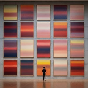
Gerhard Richter's *Untitled* from 1987 is not merely a painting; it’s an encounter with pure sensation, a visual articulation of the complex emotional landscape that defines much of his oeuvre. Executed in oil on canvas, this abstract work explodes with a vibrant energy born from the collision of reds, yellows, and blues. The composition isn't one of deliberate form or recognizable imagery, but rather a dynamic interplay of color fields, scraped surfaces, and layered textures. It’s a testament to Richter’s mastery of manipulating paint – not as a means to represent reality, but as a material with its own inherent expressive power. The painting invites the viewer into an intimate space where color becomes the primary language, bypassing narrative in favor of direct emotional resonance. The dominance of red, punctuated by bursts of yellow and cool accents of blue, creates a sense of both urgency and depth, hinting at underlying tensions and unresolved energies.
The Abstract Expressionist Dialogue
Richter’s *Untitled* emerges from a rich historical context deeply rooted in the traditions of abstract expressionism, yet simultaneously transcends easy categorization. While echoes of artists like Jackson Pollock and Mark Rothko can be discerned – particularly in the gestural application of paint and the emphasis on large-scale color fields – Richter imbues his work with a distinctly contemporary sensibility. He doesn’t seek to replicate the heroic gestures or spiritual aspirations often associated with Abstract Expressionism; instead, he interrogates its very foundations. The scraping and layering techniques, almost violent in their execution, suggest a deliberate dismantling of traditional painterly conventions. This approach reflects Richter's broader artistic project: a constant questioning of representation, perception, and the nature of truth itself. The year 1987 was a pivotal moment for Richter, as he continued to explore abstract forms while simultaneously engaging with photographic realism, demonstrating his remarkable versatility and intellectual rigor.
Technique as Revelation
What truly sets Richter’s work apart is his innovative technique. He doesn't simply apply paint to the canvas; he *works* the surface, using squeegees, knives, and other tools to drag, scrape, and blend colors together. This process isn’t about achieving a polished or refined finish; it’s about revealing the inherent qualities of the material itself. The resulting textures are rich and complex, creating a sense of depth and movement that draws the viewer in. The layers of paint build up over time, obscuring and revealing underlying colors, suggesting a history embedded within the surface of the canvas. This technique also introduces an element of chance and unpredictability into the process, allowing the painting to evolve organically. It’s a method that emphasizes the physicality of painting – the act of applying pigment to a surface – while simultaneously challenging traditional notions of authorship and control.
Emotional Resonance and Interior Spaces
The emotional impact of *Untitled* is profound. The vibrant colors evoke feelings of energy, passion, and even turmoil, while the abstract forms allow for multiple interpretations. It’s a painting that doesn't dictate meaning but rather invites viewers to project their own emotions and experiences onto its surface. For interior designers, this work presents an exciting opportunity to create focal points within a space. The bold colors and dynamic composition can energize a room, adding depth and visual interest. Its abstract nature allows it to complement a wide range of styles, from minimalist modern interiors to more eclectic and bohemian spaces. A high-quality reproduction of *Untitled* would serve not just as an aesthetic addition but as a conversation starter—a powerful statement piece that reflects a sophisticated appreciation for art history and contemporary expression.
Vprašanja in odgovori
Kakšno paleto barv in kakšen občutek združuje "Untitled"?
Paleta Dark dela "Untitled" avtorja Gerhard Michalski se dopolnjuje z njegovim Reflective čustvenim tonom. Barva je eden od načinov, s katerimi delovaje izražajo čustva.
Kakšen je vzdušje v delu "Untitled" avtorja Gerhard Michalski?
Splošni vzdug umetninine "Untitled" avtorja Gerhard Michalski je Serene. Ta vzdug opisuje splošno atmosfero dela.
Kje lahko vidim predogled za "Untitled"?
Stran Predogled za delo "Untitled" vam omogoča ogled umetnin pred naročilom.
Kakšen je zgodovinski pomen dela "Untitled"?
Umetnostno-zgodovinska klasifikacija dela "Untitled" avtorja Gerhard Michalski je Abstract Expressionism, v obdobju Contemporary.
Kje lahko prenesem "Untitled" avtorja Gerhard Michalski?
"Untitled" avtorja Gerhard Michalski lahko prenesete na strani Prenos za to umetniško delo, kot prenos digitalne slike visoke ločljivosti.
Kako močne so barve dela "Untitled"?
"Untitled" avtorja Gerhard Michalski je zabeležen z Clear Color Presence saturacijo in Balanced intenzivnostjo.
Ali je "Untitled" avtorja Gerhard Michalski znano umetniško delo?
"Untitled" je razvrščeno kot Recognized.
Kdaj je "Untitled" pripisano kateremu umetniku?
"Untitled" pripisujemo Gerhard Michalski.



 Preverite v realnem okolju
 Naročite ročno slikano reprodukcijo
 Pošlji kot čestitko
 Deli
Deli
 Podrobnosti
 Priročnik

 Prenesi
 Podobni artefakti
 Rentgenski posnetek
 Predvajaj diaporama
 Statistika

 Preberi več






































 Možnost stekla je na voljo le za velikosti pod 110 cm