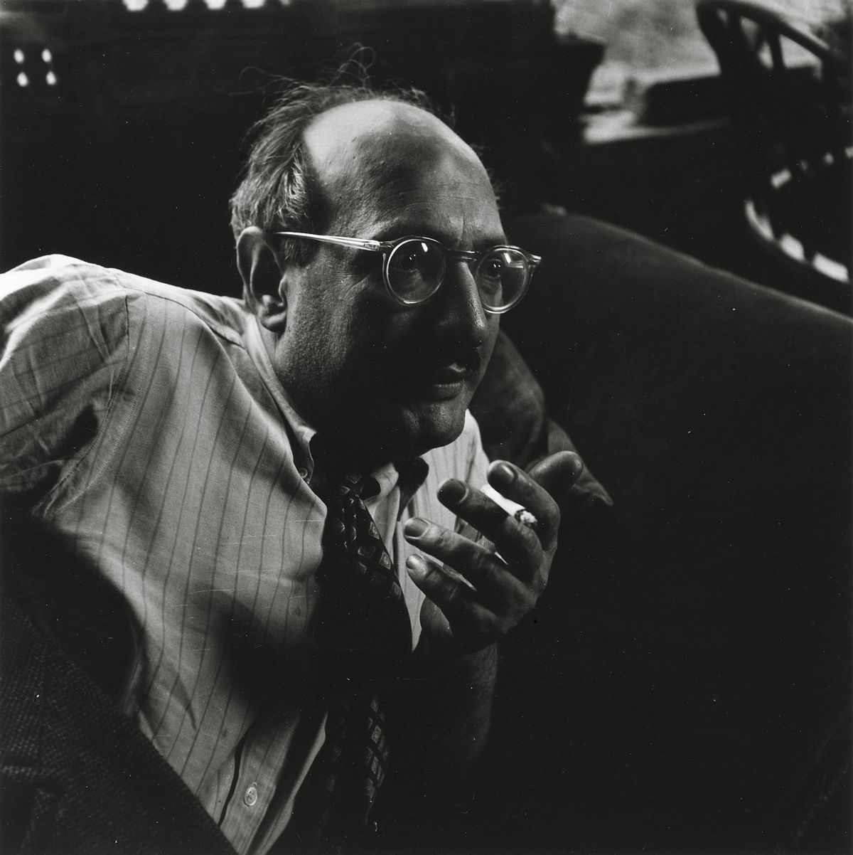
Ранние годы и зарождение художественного видения
Марк Ротко, урожденный Маркус Яковлевич Ротковиц в Двинске (ныне Даугавпилс, Латвия) в 1903 году, с самого начала носил в себе ощущение отчужденности, которое глубоко сформировало его творческий путь. Его юность была отмечена тревогой еврейской семьи, жившей в черте осёдлости, под тенью погромов и политических потрясений. Эта атмосфера внушила глубокую чувствительность к человеческим страданиям – тему, которая будет звучать на протяжении всего его творчества. Иммиграция в Портленд (штат Орегон) в 1913 году стала для молодого Ротко не просто географическим сдвигом, но и культурным переворотом. Хотя его отец, фармацевт и интеллектуал с социалистическими взглядами, создавал дом, наполненный дебатами и знаниями, ранняя потеря Якова Ротковица вскоре после прибытия отбросила длинную тень. Этот ранний опыт потери, вкупе со сложностями ассимиляции, подпитывал его пожизненное исследование экзистенциальных тем – смертности, травмы и поиска смысла в хаотичном мире. Несмотря на академические успехи в Йельском университете, Ротко почувствовал влечение к энергичной атмосфере Нью-Йорка, оставив формальное обучение ради страсти к искусству в Лиге студентов-художников. Эти годы становления заложили основу для художественного видения, которое в конечном итоге бросит вызов общепринятым представлениям о живописи и переопределит эмоциональную силу цвета.
От фигуративных начал к абстрактному экспрессионизму
Первые художественные эксперименты Ротко были твердо укоренены в реализме, изображая городские сцены и портреты с пристальным вниманием к деталям. Однако эти ранние работы уже намекали на ту психологическую глубину, которая станет его визитной карточкой. В 1940-х годах, когда мир боролся с ужасами Второй мировой войны, искусство Ротко претерпело драматические изменения. Под влиянием сюрреализма и мифологии он начал отходить от репрезентативных образов, стремясь выразить универсальные человеческие эмоции через символические формы. В этот период появились многофигурные картины – холсты, населенные неопределенными биоморфными формами, словно парящими между фигурацией и абстракцией. Эти работы были не просто экспериментами в форме; это были глубоко пережитые ответы на тревоги и неопределенность военного времени. К концу 1940-х годов Ротко достиг своего фирменного стиля: крупномасштабные холсты с прямоугольными блоками цвета, казалось бы, плавающими и резонирующими друг с другом. Он лишил свои работы всех следов узнаваемых образов, сосредоточившись исключительно на чистом эмоциональном воздействии цвета и формы. Это стало поворотным моментом в развитии абстрактного экспрессионизма и утвердило Ротко как ведущую фигуру этого новаторского движения.
Цветовое поле и стремление к трансцендентности
Зрелое творчество Ротко определяется тем, что стало известно как живопись «цветового поля» – обширные пространства лучистого цвета, окутывающие зрителя в иммерсивном опыте. Эти картины не о *том*, что они изображают, а скорее о *том*, как они заставляют вас чувствовать. Ротко верил, что искусство должно вовлекать зрителя висцерально, обходя интеллектуальный анализ и обращаясь непосредственно к эмоциям. Он тщательно наносил тонкие слои краски, создавая едва уловимые вариации тона и текстуры, которые, казалось бы, исходили изнутри холста. Края его прямоугольных форм часто размыты, позволяя им смешиваться и взаимодействовать друг с другом, создавая ощущение глубины и движения. Ротко намеренно избегал названий, кроме номеров – «№ 1», «№ 6» – поощряя зрителей сталкиваться с картинами без предвзятых представлений и позволять своим собственным эмоциональным реакциям направлять их опыт. Он стремился создать пространство для созерцания, убежище, где зрители могли бы установить связь с чем-то большим, чем они сами.
Его амбицией было ни что иное, как вызвать глубокие духовные переживания посредством языка цвета.
Основные достижения и непреходящее наследие
Среди наиболее значительных достижений Ротко – «№ 10 (1950)», ключевая работа, иллюстрирующая его эволюционирующий стиль, и Сегремовские муралы (1958). Заказанные для ресторана Four Seasons в Нью-Йорке, эти муралы были в конечном итоге отвергнуты Ротко, который чувствовал, что они будут скомпрометированы своей предполагаемой средой. Вместо этого он пожертвовал их галерее Тейт в Лондоне, где они продолжают вдохновлять трепет и созерцание. Возможно, самым амбициозным проектом была часовня Ротко (1971) в Хьюстоне (Техас) – неконфессиональное святилище, в котором размещены четырнадцать его картин. Созданная как пространство для тихой рефлексии, часовня считается священным местом для многих, воплощая веру Ротко в духовную силу искусства.
Влияние Ротко на последующие поколения художников было огромным. Он проложил путь минималистическому искусству и продолжает вдохновлять современных живописцев, исследующих эмоциональные возможности абстракции. Несмотря на борьбу с депрессией на протяжении всей своей жизни, кульминацией которой стало его трагическое самоубийство в 1970 году, Марк Ротко остается одним из самых важных и влиятельных художников XX века – мастером цвета, чьи работы продолжают находить отклик у аудитории во всем мире.
Непреходящая сила эмоционального резонанса
- Картины Ротко восхваляются за их способность передавать универсальные человеческие эмоции — трагедию, экстаз, отчаяние и надежду.
- Его исследование цвета как средства выражения эмоций революционизировало абстрактную живопись.
- Часовня Ротко является свидетельством его веры в духовную силу искусства.
- Он остается ключевой фигурой абстрактного экспрессионизма и крупным влиянием на современных художников.
Наследие Ротко простирается за пределы мира истории искусства. Его работа приглашает нас столкнуться со своей собственной смертностью, справиться со сложностями человеческого существования и искать смысл в мире, часто лишенном его. Он напоминает нам, что искусство — это не просто об эстетике; речь идет о связи — связи с собой, с другими и с чем-то большим, чем мы сами. Непреходящая сила его картин заключается в их способности вызывать эти глубокие эмоции, предлагая утешение, вдохновение и проблеск глубин человеческой души.



 Примерить в интерьере
 Переключиться на печать
 Отправить
 Поделиться
 Подробнее
 Руководство

 Скачать
 Похожие объекты
 Рентгенография
 Слайд-шоу
 Статистика

 Развернуть текст