The Genesis of a Pop Visionary – Roy Lichtenstein and the Dawn of a New Era
Roy Fox Lichtenstein, born in Manhattan in 1923, wasn’t merely an artist; he was a provocateur, a cultural commentator who seized upon the burgeoning energy of post-war America and transformed it into a visual language. His early fascination with realistic drawing and painting, nurtured by museum visits and a deep appreciation for jazz music – experiences deeply rooted in his upbringing – ultimately paved the way for his groundbreaking embrace of Pop Art. Lichtenstein’s journey wasn't about replicating reality; it was about interrogating its representation, particularly through the lens of advertising, comic books, and mass-produced imagery. This deliberate shift marked a pivotal moment in art history, challenging traditional notions of fine art and establishing a new dialogue between high culture and popular consumption.
His formal training at the Art Students League under Reginald Marsh, followed by brief service during World War II, provided crucial experiences that shaped his artistic approach. However, it was his return to New York City after the war, coupled with the influence of Allan Kaprow’s experimental theater and a renewed interest in proto-Pop imagery, that truly ignited Lichtenstein's creative fire. This period saw him experimenting with abstraction before ultimately settling on his signature style – a bold, graphic aesthetic that would forever alter the landscape of American art.
A Symphony of Yellow: Deconstructing the Sunrise
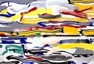
“Sunrise,” painted in 1965, is a quintessential example of Lichtenstein’s Pop Art philosophy. The painting immediately commands attention with its vibrant, almost aggressively bright yellow background – a color typically associated with advertising and commercial signage. This deliberate choice establishes an immediate connection to the consumer culture that would become central to his artistic exploration. Scattered across this luminous field are stylized clouds, rendered in varying shades of blue and gray, creating a sense of depth and atmospheric perspective, albeit achieved through simplified geometric forms.
At the heart of the composition lies a large, bold red circle – the sun itself. This isn’t a realistic depiction; rather, it's an iconic symbol, instantly recognizable as a motif borrowed from comic books and advertising. The stark contrast between the yellow background and the crimson sun creates a powerful visual impact, drawing the viewer’s eye directly to this central element. The clouds are strategically positioned, not to mimic natural forms but to serve as framing devices, further emphasizing the dominance of the radiant sun.
Ben-Day Dots and the Illusion of Depth
Lichtenstein's technique is instantly recognizable through his masterful use of Ben-Day dots – small, colored circles that simulate the halftone printing process used in commercial illustrations. This technique, borrowed directly from comic books and advertising, creates a textured surface and an illusion of depth within the painting. The dots aren’t simply applied randomly; they are meticulously arranged to suggest shading and form, contributing significantly to the overall visual impact. The careful placement of these tiny dots transforms what could have been a flat, two-dimensional image into something remarkably tactile and engaging.
This deliberate mimicry of commercial printing techniques wasn’t merely stylistic; it was a commentary on the way images were produced and consumed in mass culture. By employing this technique, Lichtenstein elevated everyday imagery to the level of fine art, prompting viewers to reconsider their relationship with advertising and popular media.
Emotional Resonance: Beauty in the Everyday
"Sunrise" is more than just a depiction of a natural phenomenon; it’s an exploration of beauty within the context of modern life. The painting evokes a sense of optimism and energy, mirroring the vibrant spirit of the 1960s. Despite its reliance on commercial imagery, there's a surprising elegance to Lichtenstein’s composition – a testament to his artistic skill and his ability to transform the mundane into something visually compelling. The bold colors, simplified forms, and iconic motifs create an image that is both instantly recognizable and deeply evocative, inviting viewers to contemplate the beauty and complexity of the world around them.
Perguntas e Respostas
Para que tipo de uso se recomenda uma impressão de "Sunrise"?
A recomendação de uso para uma impressão de "Sunrise" é Accent.
As cores de "Sunrise" são vibrantes ou suaves?
A cor de "Sunrise" apresenta Clear Color Presence de saturação e Vivid de intensidade.
As cores de "Sunrise" parecem intensas ou suaves?
A intensidade de cor de "Sunrise" é Vivid. A intensidade descreve o quão vibrantes as cores parecem ser.



 Visualizar na parede
 Alternar para Impressão
 Compartilhar
 Compartilhar
 Detalhes
 Guia
Guia

 Baixar imagem
 Semelhantes
 Raio X
 Ver diaporama
 Q&A
Q&A Estatísticas

 Ler mais