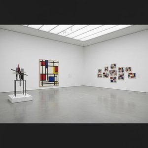
A Study in Restrained Harmony: Piet Mondrian’s *Composition in Colour A*
Piet Mondrian's 1917 work, *Composition in Colour A*, isn’t merely a painting; it’s an architectural meditation on the fundamental elements of visual experience. Emerging from the fertile ground of early 20th-century abstraction, this piece represents a pivotal moment in the development of De Stijl – a movement Mondrian co-founded with Bart van der Leck and Theo van Doesburg – dedicated to stripping art down to its purest essence: lines and colours. It’s a testament to his lifelong pursuit of universal harmony, a vision born from a desire to transcend the limitations of representational painting and create a new language for expressing spiritual truth.
The canvas itself is dominated by a carefully orchestrated interplay of muted tones – a deep rose red, a rich dark ochre, and a profound midnight blue. These aren’t vibrant, assertive hues; rather, they are deliberately subdued, almost melancholic in their restraint. Mondrian eschewed the bright, energetic palette favored by earlier movements like Fauvism, opting instead for a sophisticated, contemplative approach. The colours themselves carry symbolic weight: red representing passion and energy, blue signifying spirituality and intellect, and ochre evoking the earth and grounding the composition. The deliberate choice of these specific shades speaks to Mondrian’s belief in their inherent balance and ability to evoke profound emotional responses.
Deconstructing Form: The Language of Lines
What truly distinguishes *Composition in Colour A* is its masterful use of black lines. These aren't merely outlines defining shapes; they are the very structure of the painting, acting as a rigid grid that governs the placement and relationship of each coloured area. Mondrian’s approach moved beyond simply depicting objects; he sought to define the underlying geometric framework of reality itself. The lines don’t connect or converge in any obvious way – instead, they intersect and overlap with an almost unsettling precision, creating a sense of spatial ambiguity. This deliberate lack of closure contributes significantly to the painting's feeling of timelessness and its suggestion that it exists outside conventional notions of perspective and depth.
The white space surrounding the coloured blocks is equally crucial. It’s not simply a background; it’s an active participant in the composition, treated as a distinct form alongside the lines and colours. Mondrian believed that white held a vital role in creating visual equilibrium, acting as a ‘living component’ of the painting – a concept radical for its time. This rejection of traditional notions of negative space elevates the white areas to the status of integral design elements, mirroring the principles found in architecture and urban planning within the De Stijl philosophy.
A Window into a New World
*Composition in Colour A* is deeply rooted in the intellectual climate of 1917. The De Stijl movement was fueled by a desire to create a new, utopian world – one based on rationality, order, and harmony. Mondrian’s work reflects this ambition, representing an attempt to translate abstract principles into visual form. The painting can be seen as a blueprint for a new architectural style, anticipating the sleek, minimalist designs of the Bauhaus movement that would emerge shortly after. It's a powerful statement about the potential of art to shape not just our aesthetic experience but also our understanding of reality itself.
Beyond its historical significance, *Composition in Colour A* possesses a profound emotional impact. The painting’s quiet intensity and deliberate restraint evoke a sense of calm contemplation. The carefully balanced composition invites the viewer to lose themselves within its geometric embrace, offering a momentary respite from the chaos and complexity of everyday life. It's a work that speaks to our innate desire for order and harmony, suggesting that beauty can be found in simplicity and abstraction.
Bringing *Composition in Colour A* Home
A hand-painted reproduction of *Composition in Colour A* offers a unique opportunity to bring this seminal artwork into your home or office. WahooArt’s meticulous reproductions capture the subtle nuances of Mondrian's technique, faithfully recreating the painting’s muted palette and precise lines. Whether you are an art enthusiast, a collector seeking to expand your collection, or simply someone looking for a piece that embodies timeless elegance and intellectual depth, this reproduction provides a beautiful and meaningful way to experience the legacy of Piet Mondrian.
Pytania i odpowiedzi
Jakie umiejscowienie najlepiej pasuje do formatu dzieła „Composition in colour A” autorstwa Piet Mondrian?
Format Square dzieła „Composition in colour A” autorstwa Piet Mondrian jest rekomendowany do Living Room. Format oraz przestrzeń wspólnie pomagają w odpowiednim rozmieszczeniu reprodukcji.
Czy „Composition in colour A” autorstwa Piet Mondrian to jasne czy ciemne dzieło?
Ogólnie rzecz biorąc, "Composition in colour A" charakteryzuje się poziomem brilliant. Postrzegana jasność opisuje, jak jasne lub ciemne wydaje się dzieło.
Czy dzieło "Composition in colour A" pozostało w ojczyźnie swojego artysty?
Tak – dzieło znajduje się w kraju pochodzenia artysty. Dzieło "Composition in colour A" znajduje się w Holandia, podczas gdy Piet Mondrian urodził(a) się w Holandia.



 Zobacz w skali 1:1
 Przełącz na wersję drukowaną
 Wyślij
 Udostępnij
 Szczegóły
 Przewodnik

 Pobierz plik obrazu
 Podobne obiekty
 RTG
RTG Pokaz slajdów
 Statystyki


 Czytaj więcej






































 Opcja ze szkłem jest dostępna wyłącznie w rozmiarach poniżej 110 cm