Początki Życia i Zarodnienie Wizji Artystycznej
Mark Rothko, urodzony jako Markus Yakovlevich Rothkowitz w Dwińsku (obecnie Dyneburg, Łotwa) w 1903 roku, od samego początku nosił w sobie poczucie wyobcowania, które miało głęboko ukształtować jego artystyczną drogę. Wczesne lata życia naznaczone były niepokojem żydowskiej rodziny żyjącej na terenie Pasu Osadniczego, przyćmione pogromami i napięciami politycznymi. Ta atmosfera zaszczepiła w nim głęboką wrażliwość na ludzkie cierpienie – motyw, który rezonował przez całe jego dzieło. Imigracja do Portland w stanie Oregon w 1913 roku nie była jedynie zmianą geograficzną, ale kulturowym przewrotem dla młodego Rothko. Ojciec, farmaceuta i intelektualista o socjalistycznych poglądach, stworzył dom wypełniony debatami i nauką, jednak śmierć Jakoba Rothkowitza wkrótce po przybyciu rzuciła długi cień na jego życie. To wczesne doświadczenie straty, w połączeniu z trudnościami asymilacji, napędzało całożyciowe poszukiwania egzystencjalnych tematów – śmiertelności, traumy i poszukiwania sensu w chaotycznym świecie. Mimo doskonałych wyników w nauce na Uniwersytecie Yale, Rothko pociągała żywiołowa energia Nowego Jorku, porzucając formalne studia, by podążać za swoją pasją do sztuki w Art Students League. Te formujące lata położyły fundamenty wizji artystycznej, która ostatecznie miała zakwestionować konwencjonalne pojmowanie malarstwa i przedefiniować emocjonalną siłę koloru.
Od Realistycznych Początków do Abstrakcyjnego Ekspresjonizmu
Początkowe poszukiwania artystyczne Rothko były mocno zakorzenione w realizmie, przedstawiając miejskie sceny i portrety z przenikliwym spojrzeniem na szczegóły. Jednak te wczesne prace już zdradzały psychologiczną głębię, która miała stać się jego znakiem rozpoznawczym. Wraz z nadejściem lat 40. XX wieku i zmagań świata z okrucieństwami II wojny światowej, sztuka Rothko przeszła dramatyczną transformację. Pod wpływem surrealizmu i mitologii zaczął odchodzić od reprezentacyjnego obrazowania, szukając sposobów wyrażania uniwersalnych ludzkich emocji poprzez symbole. W tym okresie pojawiły się obrazy wieloformowe – płótna zamieszkane przez niejednoznaczne kształty biomorficzne, które zdawały się wahać między figuracją a abstrakcją. Te prace nie były jedynie eksperymentami formalnymi; były głęboko odczuwanymi reakcjami na lęki i niepewność wojennego świata. Pod koniec lat 40. Rothko osiągnął swój charakterystyczny styl: monumentalne płótna z prostokątnymi blokami koloru, które wydawały się unosić i rezonować ze sobą. Pozbył się wszelkich śladów rozpoznawalnych obrazów, koncentrując się na czystym emocjonalnym oddziaływaniu koloru i formy. To był przełomowy moment w rozwoju Abstrakcyjnego Ekspresjonizmu, który ugruntował pozycję Rothko jako czołowej postaci tego nowatorskiego ruchu.
Pola Kolorów i Poszukiwanie Transcendencji
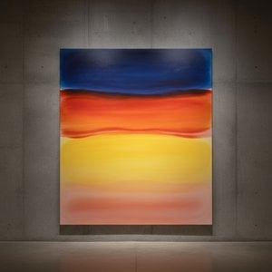
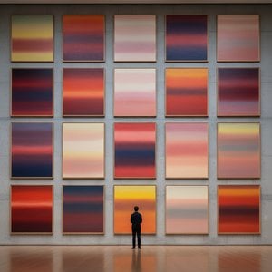
Dojrzałe dzieła Rothko definiuje to, co stało się znane jako malarstwo „Poli Kolorów” – rozległe połacie świetlistych barw, które otaczają widza w immersyjnym doświadczeniu. Te obrazy nie dotyczą *czego* przedstawiają, ale raczej *jak* sprawiają, że się czujemy. Rothko wierzył, że sztuka powinna angażować widza bezpośrednio, omijając intelektualną analizę i przemawiając prosto do emocji. Skrupulatnie nakładał cienkie warstwy farby, tworząc subtelne zmiany tonu i tekstury, które zdawały się emanować z wnętrza płótna. Krawędzie jego prostokątnych form są często rozmyte, pozwalając im mieszać się i oddziaływać na siebie, tworząc poczucie głębi i ruchu. Rothko celowo unikał tytułów ograniczających się do numerów – „Nr 1”, „Nr 6” – zachęcając widzów do konfrontacji z obrazami bez uprzedzeń i pozwalając własnym emocjonalnym reakcjom prowadzić ich doświadczenie. Dążył do stworzenia przestrzeni kontemplacji, sanktuarium, w którym widzowie mogliby połączyć się z czymś większym od siebie.
Jego ambicją było nic innego jak wywoływanie głębokich przeżyć duchowych za pomocą języka koloru.
Główne Osiągnięcia i Trwałe Dziedzictwo
Do najważniejszych osiągnięć Rothko należą „Nr 10 (1950)”, kluczowe dzieło ilustrujące jego ewoluujący styl, oraz Murale Seagrama (1958). Zlecone dla restauracji Four Seasons w Nowym Jorku, murale te ostatecznie zostały odrzucone przez Rothko, który uważał, że zostaną skompromitowane przez zamierzone środowisko. Zamiast tego podarował je Tate Gallery w Londynie, gdzie nadal inspirują zachwyt i kontemplację. Być może jego najbardziej ambitnym projektem była Kaplica Rothko (1971) w Houston w Teksasie – wyznaniowe sanktuarium mieszczące czternaście jego obrazów. Zaprojektowana jako przestrzeń cichej refleksji, kaplica jest uważana przez wielu za miejsce święte, uosabiając przekonanie Rothko o duchowej sile sztuki.
Wpływ Rothko na kolejne pokolenia artystów był ogromny. Torował drogę dla Minimalizmu i nadal inspiruje współczesnych malarzy, którzy eksplorują emocjonalne możliwości abstrakcji. Pomimo zmagań z depresją przez całe życie, zakończonych tragicznym samobójstwem w 1970 roku, Mark Rothko pozostaje jednym z najważniejszych i najbardziej wpływowych artystów XX wieku – mistrzem koloru, którego dzieło nadal rezonuje z odbiorcami na całym świecie.
Trwała Siła Emocjonalnego Rezonansu
- Obrazy Rothko są celebrowane za ich zdolność do przekazywania uniwersalnych ludzkich emocji – tragedii, ekstazy, rozpaczy i nadziei.
- Jego eksploracja koloru jako nośnika ekspresji emocjonalnej zrewolucjonizowała malarstwo abstrakcyjne.
- Kaplica Rothko jest świadectwem jego wiary w duchową moc sztuki.
- Pozostaje kluczową postacią Abstrakcyjnego Ekspresjonizmu i głównym wpływem na współczesnych artystów.
Dziedzictwo Rothko wykracza poza ramy historii sztuki. Jego twórczość zaprasza nas do konfrontacji z własną śmiertelnością, zmierzenia się ze złożonością ludzkiego istnienia i poszukiwania sensu w świecie często pozbawionym znaczeń. Przypomina nam, że sztuka nie dotyczy jedynie estetyki; chodzi o połączenie – połączenie z sobą samym, z innymi i z czymś większym od nas samych. Trwała siła jego obrazów tkwi w ich zdolności do wywoływania tych głębokich emocji, oferując ukojenie, inspirację i przebłysk głębi ludzkiej duszy.



 Zobacz w skali 1:1
 Przełącz na wersję drukowaną
 Wyślij
 Udostępnij
 Szczegóły
 Przewodnik

 Pobierz plik obrazu
 Podobne obiekty
 RTG
RTG Pokaz slajdów
 Statystyki

 Czytaj więcej






































 Opcja ze szkłem jest dostępna wyłącznie w rozmiarach poniżej 110 cm