Få en utskriftsklar fil som går langt utover forhåndsvisningen på nett. Hvert digitale bilde vi selger er hentet fra en høyoppløselig master i vår database – vanligvis mellom 5 000 og 15 000 piksler bred – slik at du kan trykke stort, beskjære tett eller gjenskape fine detaljer med full trygghet.
Ingen filer forlater studioet vårt uten å bli bearbeidet. En digital ekspert kontrollerer fargene mot det originale maleriet og korrigerer dem ved behov, for deretter å forbedre klarhet og detaljrikdom med profesjonelle retusjeringsverktøy — alltid tro mot kunstnerens penselstrøk og stil. Resultatet er et bilde som fremstår som selve maleriet, ikke som en skann med filter.
Du godkjenner før ferdigstilling: vår ekspert sender bildet på e-post til din vurdering innen 72 timer. Ikke fornøyd? Be om forbedringer eller korrigeringer, eller be om refusjon dersom kvaliteten ikke svarer til forventningene.
Dette er kvaliteten forlag, designstudioer, gallerier og trykkerier stoler på.
Last ned en høyoppløselig fil til personlig bruk, utskrift og kreative prosjekter. ( Bytt til trykk Kjøp håndmalt maleri)
Når du velger WahooArt.com, får du ikke bare et bilde – du mottar et profesjonelt etterbehandlet digitalt kunstverk, skapt med presisjon og med en garantert tilfredshetsgaranti. Her er alt som automatisk følger med din bestilling:
Din høyoppløselige digitale bildefil sendes til din e-post innen 72 timer etter bestilling – klar til umiddelbar bruk.
Ditt kunstverk blir profesjonelt optimalisert ved hjelp av avanserte AI-verktøy og manuell redigering, noe som sikrer maksimal detaljrikdom, klarhet og fargegjengivelse.
Har du ved et uhell slettet eller mistet filen din? Ingen bekymring – vi sender den på nytt når som helst, helt gratis.
Nyt ditt kunstverk umiddelbart uten toll, avgifter eller leveringskostnader – digitale nedlastinger er alltid avgiftsfrie.
Vi sikrer at det digitale bildet gjenspeiler de originale fargene så nøyaktig som mulig ved hjelp av profesjonelle verktøy og fargehåndtering.
Hvis du ikke er fornøyd med ditt digitale bilde, vil vi revidere det eller refundere 100% innen 100 dager – uten spørsmål.
Ikke fornøyd? Få full refusjon innen 100 dager etter at du har mottatt din digitale fil – uten spørsmål.
Kjøp 3 bilder, spar 10% - Kjøp 5, spar 15% - Kjøp 10+, spar 20%. Ideelt for kreative prosjekter, gallerier og byråer.
Roy Fox Lichtenstein, born in Manhattan in 1923, wasn’t merely an artist; he was a provocateur, a cultural commentator who seized upon the burgeoning energy of post-war America and transformed it into a visual language. His early fascination with realistic drawing and painting, nurtured by museum visits and a deep appreciation for jazz music – experiences deeply rooted in his upbringing – ultimately paved the way for his groundbreaking embrace of Pop Art. Lichtenstein’s journey wasn't about replicating reality; it was about interrogating its representation, particularly through the lens of advertising, comic books, and mass-produced imagery. This deliberate shift marked a pivotal moment in art history, challenging traditional notions of fine art and establishing a new dialogue between high culture and popular consumption.
His formal training at the Art Students League under Reginald Marsh, followed by brief service during World War II, provided crucial experiences that shaped his artistic approach. However, it was his return to New York City after the war, coupled with the influence of Allan Kaprow’s experimental theater and a renewed interest in proto-Pop imagery, that truly ignited Lichtenstein's creative fire. This period saw him experimenting with abstraction before ultimately settling on his signature style – a bold, graphic aesthetic that would forever alter the landscape of American art.
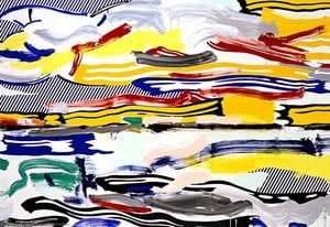
“Sunrise,” painted in 1965, is a quintessential example of Lichtenstein’s Pop Art philosophy. The painting immediately commands attention with its vibrant, almost aggressively bright yellow background – a color typically associated with advertising and commercial signage. This deliberate choice establishes an immediate connection to the consumer culture that would become central to his artistic exploration. Scattered across this luminous field are stylized clouds, rendered in varying shades of blue and gray, creating a sense of depth and atmospheric perspective, albeit achieved through simplified geometric forms.
At the heart of the composition lies a large, bold red circle – the sun itself. This isn’t a realistic depiction; rather, it's an iconic symbol, instantly recognizable as a motif borrowed from comic books and advertising. The stark contrast between the yellow background and the crimson sun creates a powerful visual impact, drawing the viewer’s eye directly to this central element. The clouds are strategically positioned, not to mimic natural forms but to serve as framing devices, further emphasizing the dominance of the radiant sun.
Lichtenstein's technique is instantly recognizable through his masterful use of Ben-Day dots – small, colored circles that simulate the halftone printing process used in commercial illustrations. This technique, borrowed directly from comic books and advertising, creates a textured surface and an illusion of depth within the painting. The dots aren’t simply applied randomly; they are meticulously arranged to suggest shading and form, contributing significantly to the overall visual impact. The careful placement of these tiny dots transforms what could have been a flat, two-dimensional image into something remarkably tactile and engaging.
This deliberate mimicry of commercial printing techniques wasn’t merely stylistic; it was a commentary on the way images were produced and consumed in mass culture. By employing this technique, Lichtenstein elevated everyday imagery to the level of fine art, prompting viewers to reconsider their relationship with advertising and popular media.
"Sunrise" is more than just a depiction of a natural phenomenon; it’s an exploration of beauty within the context of modern life. The painting evokes a sense of optimism and energy, mirroring the vibrant spirit of the 1960s. Despite its reliance on commercial imagery, there's a surprising elegance to Lichtenstein’s composition – a testament to his artistic skill and his ability to transform the mundane into something visually compelling. The bold colors, simplified forms, and iconic motifs create an image that is both instantly recognizable and deeply evocative, inviting viewers to contemplate the beauty and complexity of the world around them.
Anbefalt bruk av et trykk av "Sunrise" er Accent.
Fargene i "Sunrise" har en metning på Clear Color Presence og en intensitet på Vivid.
Fargeintensiteten i "Sunrise" er Vivid. Intensitet beskriver hvor sterke fargene fremstår.


1923 - 1997 , USA
 Forhåndsvisning
 Send
Send Del
Del
 Vis detaljer
 Utskriftsvennlig guide

 Last ned bilde
 Liknende objekter
 Røntgenundersøkelse
 Lysbildefremvisning
 Q&A
Q&A Statistikk

 Vis hele teksten