

Kunstverket som vises på denne siden er beskyttet av opphavsretten, noe som betyr at vi ikke har juridisk tillatelse til å lage eller selge identiske reproduksjoner. Denne beskyttelsen håndheves i henhold til internasjonale avtaler som for eksempel Bernerkonvensjonen og av nasjonale lover, inkludert de som er fastsatt i Amerikansk lov om opphavsrett – Tittel 17.
Denne metoden er i fullt samsvar med opphavsrettslige regler, da den ikke innebærer kopiering eller duplisering av det beskyttede kunstverket. I stedet er det snakk om en kreativ nytolkning – et nytt maleri som er inspirert av originalen, men ikke identisk med den.
Giclée- eller lerretsprint av museumskvalitet med rask produksjon og fleksible valgmuligheter for etterbehandling. ( Kjøp håndmalt maleri Bytt til digitalt bilde)





























Velg mellom våre forhåndsdefinerte størrelser som bevarer kunstverkets opprinnelige proporsjoner.

Skriv inn ønsket bredde og høyde for å tilpasse trykket til din ramme eller vegg. Et trykk kan kun beskjæres, aldri skaleres opp utover motivets opprinnelige størrelse, noe som betyr at et format med andre proporsjoner vil føre til tap av deler av bildet. Vi sender deg en digital mockup for godkjenning før vi starter trykkeprosessen. Bildet som vises på denne siden viser ikke den faktiske beskjæringen — det er kun mockuppen som viser dette.
Verdensomspennende levering () på 2 uker i stedet for standard 4/5 uker. (5 November)
Ochre and Red on Red
Størrelse på reproduksjon
To stand before Mark Rothko’s “Ochre and Red on Red” is to enter a realm where language fails and pure sensation takes command. Created in 1962, this masterpiece serves as a profound cornerstone of the Color Field painting movement, a period that fundamentally redefined the boundaries of modern art. Rather than presenting a recognizable subject, Rothko invites the viewer into a deep, meditative state, using the canvas not merely as a surface for pigment, but as a portal for spiritual and emotional exploration. The work embodies his radical belief that color alone possesses the power to convey the most complex human experiences, offering a sanctuary for contemplation and introspection in an increasingly noisy world.
The composition is a masterclass in deceptive simplicity. At first glance, the viewer encounters a square canvas divided into two dominant, breathing rectangles. A deep, resonant red occupies the majority of the surface, acting as a powerful, enveloping atmosphere. Nestled within this sea of crimson sits a smaller rectangle of ochre pigment, providing a subtle yet vital counterbalance to the surrounding intensity. This interplay between the warmth of the ochre and the depth of the red creates a mesmerizing visual tension, where the edges of the forms seem to bleed into one another, blurring the line between shape and space.
The ethereal, almost glowing quality of Ochre and Red on Red is the result of Rothko’s meticulous and labor-intensive technique. He achieved this luminous effect through the careful layering of thin, translucent washes of paint. By applying these delicate veils of color, he allowed light to penetrate the various strata of pigment, creating a sense of internal radiance that seems to emanate from within the canvas itself. This method of diffusion ensures that there are no harsh boundaries; instead, the colors transition with a soft, atmospheric grace, mimicking the way light shifts through mist or the way heat radiates from an ember.
For the collector or interior designer, this painting offers an unparalleled ability to command a space. The work does not merely decorate a wall; it transforms the very energy of a room. Its high-impact palette of reds and oranges provides a bold, energetic presence that can serve as a focal point in contemporary settings, while its soft, blurred edges allow it to integrate seamlessly into more serene, minimalist environments. It is a piece that demands attention through its quiet intensity, making it an ideal acquisition for those seeking to infuse their surroundings with a sense of profound, artistic weight and sophisticated warmth.
"Ochre and Red on Red" av Mark Rothko har en Vivid fargeintensitet.
Mark Rothko er også kjent under navnene Marcus Rothkowitz.
Fargeanalysen av "Ochre and Red on Red" av Mark Rothko viser en Balanced kontrast og en Unified Palette harmoni.


1903 - 1970 , Latvia

Explore the profound emotional depth of Color Field painting. Discover the history of mid-century abstraction, from Rothko to Newman, and learn how pure color transforms the viewer's experience through our expert art history guide.

Explore the profound emotional depth of Color Field painting. Our expert guide delves into the post-war origins of Abstract Expressionism, analyzing masterpieces by Rothko and Newman. Discover museum-grade, hand-painted oil reproductions that bring art history to your walls.

Oppdag Mark Rothkos 25 mest ikoniske malerier! Fordyp deg i abstrakt ekspresjonisme, fargefeltmaling og emosjonell kunsthistorie. Finn inspirasjon til ditt hjem med museumskvalitets reproduksjoner på WahooArt.com.

Oppdag de 10 mest ikoniske verkene fra abstrakt ekspresjonisme! Lær historien bak Jackson Pollock, Mark Rothko og andre mestere. Finn kunsttrykk av høy kvalitet for ditt hjem på WahooArt.com – museumskvalitet & inspirasjon.
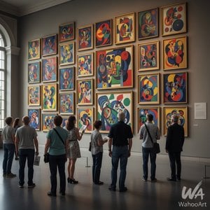
Utforsk Wassily Kandinskys 25 mest ikoniske malerier! Oppdag historien bak abstrakt kunst, ekspresjonisme og fargeharmoni. Finn inspirasjon til interiøret – museumskvalitet reproduksjoner på WahooArt.com.
 Forhåndsvisning
 Send
Send Del
Del
 Vis detaljer
 Utskriftsvennlig guide

 Last ned bilde
 Liknende objekter
 Røntgenundersøkelse
 Lysbildefremvisning
 Spørsmål og svar
 Statistikk

 Vis hele teksten









 Glassalternativet er kun tilgjengelig i størrelser under 110 cm


