Een Leven in Kleur: De Reis van Markus Rothkowitz tot Mark Rothko
Mark Rothko, geboren als Markus Yakovlevich Rothkowitz in 1903 in het Russische Dvinsk (het huidige Daugavpils, Letland), droeg al vroeg een gevoel van onthechting met zich mee dat zijn artistieke pad diepgaand zou beïnvloeden. Zijn jeugdjaren waren getekend door de onzekerheid van een Joods gezin in het Pale of Settlement, bedreigd door pogroms en politieke onrust. Deze atmosfeer schiep een intense gevoeligheid voor menselijk lijden, een thema dat als rode draad door zijn gehele oeuvre loopt. De emigratie naar Portland, Oregon in 1913 was niet slechts een geografische verandering; het betekende een culturele omwenteling voor de jonge Rothkowitz. Hoewel zijn vader, een apotheker en intellectueel met socialistische ideeën, een thuis creëerde waarin debat en kennis centraal stonden, wierp het vroege overlijden van Jacob Rothkowitz kort na aankomst een lange schaduw. Deze eerste ervaring met verlies, gecombineerd met de uitdagingen van assimilatie, voedde een levenslange zoektocht naar existentiële vragen – sterfelijkheid, trauma en de behoefte aan betekenis in een chaotische wereld. Ondanks zijn academisch succes aan Yale University voelde Rothko zich meer aangetrokken tot de bruisende energie van New York City, waar hij zijn passie voor kunst nastreefde op de Art Students League. Deze vormende jaren legden de basis voor een artistieke visie die conventionele noties over schilderkunst zou uitdagen en de emotionele kracht van kleur opnieuw zou definiëren.
Van Figuratieve Beginnen tot Abstract Expressionisme
Rothko’s eerste artistieke experimenten waren stevig geworteld in het realisme, met gedetailleerde weergaven van stedelijke scènes en portretten. Deze vroege werken verraadden echter al de psychologische diepgang die zo kenmerkend zou worden voor zijn latere stijl. Naarmate de jaren veertig naderden en de wereld worstelde met de verschrikkingen van de Tweede Wereldoorlog, onderging Rothko’s kunst een ingrijpende transformatie. Geïnspireerd door het surrealisme en mythologie begon hij zich af te keren van representatieve beelden, op zoek naar manieren om universele menselijke emoties uit te drukken door middel van symbolische vormen. Deze periode zag de opkomst van multi-vorm schilderijen – doeken bevolkt met ambigue, biomorfe figuren die leken te zweven tussen figuration en abstractie. Dit waren geen louter formele experimenten; het waren diep gevoelde reacties op de angst en onzekerheid van een wereld in oorlog. Tegen het einde van de jaren veertig had Rothko zijn kenmerkende stijl bereikt: grootschalige doeken met rechthoekige kleurblokken die leken te zweven en met elkaar te resoneren. Hij schrapte alle sporen van herkenbare beelden, waarbij hij zich uitsluitend richtte op de pure emotionele impact van kleur en vorm. Dit markeerde een cruciaal moment in de ontwikkeling van het Abstract Expressionisme en vestigde Rothko als een vooraanstaande figuur binnen deze baanbrekende beweging.
Het Kleurenveld en de Zoektocht naar Transcendentie
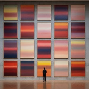
Rothko’s volwassen werk wordt gekenmerkt door wat bekend staat als “Color Field” schilderkunst – uitgestrekte vlakken van lichtgevende kleur die de toeschouwer omhullen in een meeslepende ervaring. Deze schilderijen gaan niet over *wat* ze afbeelden, maar eerder over *hoe* ze je laten voelen. Rothko geloofde dat kunst de toeschouwer direct moest aanspreken, zonder intellectuele analyse en rechtstreeks op de emoties inwerkend. Hij legde minutieus dunne lagen verf aan, waardoor subtiele variaties in toon en textuur ontstonden die leken voort te komen uit het doek zelf. De randen van zijn rechthoekige vormen zijn vaak vervaagd, waardoor ze met elkaar versmelten en interageren, wat een gevoel van diepte en beweging creëert. Rothko vermeed bewust titels voorbij nummers – “No. 1”, “No. 6” – om toeschouwers aan te moedigen de schilderijen zonder vooroordelen te benaderen en hun eigen emotionele reacties te laten leiden. Hij zocht een ruimte voor contemplatie, een heiligdom waar toeschouwers in contact konden komen met iets groters dan zichzelf. Zijn ambitie was niets minder dan het oproepen van diepe spirituele ervaringen door middel van de taal van kleur.
Belangrijkste Prestaties en Blijvende Erfenis
Tot Rothko’s belangrijkste prestaties behoren “No. 10 (1950)”, een cruciaal werk dat zijn evoluerende stijl illustreert, en de Seagram Murals (1958). In opdracht van het Four Seasons Restaurant in New York City werden deze muurschilderingen uiteindelijk afgewezen door Rothko, die vond dat ze zouden worden aangetast door hun beoogde omgeving. Hij schonk ze vervolgens aan de Tate Gallery in Londen, waar ze tot op de dag van vandaag ontzag en contemplatie blijven inspireren. Misschien was zijn meest ambitieuze project de Rothko Chapel (1971) in Houston, Texas – een niet-confessioneel heiligdom met veertien van zijn schilderijen. Ontworpen als een ruimte voor stille reflectie, wordt de kapel door velen beschouwd als een heilige plaats, die Rothko’s geloof in de spirituele kracht van kunst belichaamt.
Rothko's invloed op latere generaties kunstenaars is enorm geweest. Hij baande de weg voor het Minimalisme en blijft hedendaagse schilders inspireren die de emotionele mogelijkheden van abstractie onderzoeken. Ondanks dat hij zijn hele leven worstelde met depressie, wat culmineerde in zijn tragische zelfmoord in 1970, is Mark Rothko een van de belangrijkste en invloedrijkste kunstenaars van de twintigste eeuw gebleven – een meester van kleur wiens werk nog steeds resoneert bij publiek over de hele wereld.
De Blijvende Kracht van Emotionele Resonantie
- Rothko’s schilderijen worden geprezen om hun vermogen universele menselijke emoties over te brengen – tragedie, extase, wanhoop en hoop.
- Zijn verkenning van kleur als drager van emotionele expressie heeft de abstracte schilderkunst gerevolutioneerd.
- De Rothko Chapel staat als een getuigenis van zijn geloof in de spirituele kracht van kunst.
- Hij blijft een sleutelfiguur binnen het Abstract Expressionisme en een belangrijke inspiratiebron voor hedendaagse kunstenaars.
Rothko’s erfenis reikt verder dan de geschiedenis van de kunst. Zijn werk nodigt ons uit om onze eigen sterfelijkheid onder ogen te zien, met de complexiteit van het menselijk bestaan te worstelen en betekenis te zoeken in een wereld die vaak leeg lijkt. Hij herinnert ons eraan dat kunst niet alleen over esthetiek gaat; het gaat over verbinding – verbinding met onszelf, met anderen en met iets groters dan onszelf. De blijvende kracht van zijn schilderijen ligt in hun vermogen om deze diepe emoties op te roepen, troost, inspiratie en een glimp van de diepten van de menselijke ziel te bieden.



 Bekijk op ware grootte
 Koop handgeschilderd kunstwerk
 Verstuur
 Delen
Delen
 Details bekijken
 Gids voor studentenkunstwerken

 Download
 Vergelijkbare items
 Röntgenonderzoek
 Diavoorstelling
 Statistieken

 Lees meer






































 De optie voor glas is alleen beschikbaar bij een formaat kleiner dan 110 cm.