A Symphony of Brown: The Soul of Mark Rothko’s No. 17
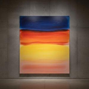
To stand before Mark Rothko’s No. 17 is to enter a sanctuary of quiet intensity. Painted in 1958, this monumental work serves as a cornerstone of the Color Field movement, offering much more than a mere arrangement of pigment on canvas. It is a deliberate orchestration of tonal variations designed to pull the viewer into a state of deep contemplation. The composition, a square expanse measuring 170 x 158 cm, immediately captivates with its dominant palette of earth tones—ranging from warm, reddish-browns to deep, onyx shades, all punctuated by unexpected, ethereal flashes of magenta. There are no figures here, no landscapes to recognize, and no lines to guide the eye; instead, there is only the profound weight of color itself.
The power of this piece lies in its ability to evoke an intangible sense of melancholy and spiritual resonance. Rothko’s approach eschews traditional representational techniques, opting instead for large, amorphous blocks of color that appear to bleed into one another at their edges. This lack of discernible contour creates a feeling of stillness, inviting the observer to immerse themselves in the visual experience without the distraction of external reality. For the collector or interior designer, this painting offers a unique atmospheric quality; it does not merely occupy a room but transforms its very energy, providing a focal point that encourages inner reflection and emotional depth.
Mastery of Light and Layered Texture
The technical brilliance of No. 17 is found in the subtle, almost imperceptible layers of oil paint that compose its surface. Rothko was a master of manipulating pigment density to create an illusion of recession and depth within a seemingly flat plane. Through meticulous layering, he achieved a luminous quality where light seems to emanate from within the canvas rather than simply reflecting off it. The brushstrokes are softened by this process, contributing to a smooth yet textured appearance that hints at the artist's painstaking labor.
This technique is essential to the painting's emotional impact. As the eye moves across the vertical stack of rectangular blocks, the transitions between the lighter reddish-browns and the darker, more somber tones create a rhythmic pulse. This movement mimics the ebb and flow of human emotion—the way sadness can feel heavy and opaque, or how hope can appear as a sudden, vibrant flicker of magenta against a dark background. It is this interplay of light and shadow, achieved through sheer technical discipline, that allows the work to transcend its abstract form and touch upon universal human experiences.
A Legacy of Abstract Expressionism
Historically, No. 17 emerged during a pivotal era for American art, a time when the New York School was redefining the boundaries of creativity. As part of the Abstract Expressionist movement, Rothko sought to communicate profound psychological states directly through color and form. His personal history—marked by the displacement of his Latvian roots and the complexities of the immigrant experience—infused his work with a deep sensitivity to themes of mortality, trauma, and the search for meaning. This painting is a testament to that lifelong quest.
For those seeking to bring a piece of art history into a contemporary space, a high-quality reproduction of No. 17 offers an unparalleled opportunity. It serves as a sophisticated element of decor, blending seamlessly with modern minimalist aesthetics while providing a rich, historical narrative. Whether placed in a quiet study, a grand gallery, or a thoughtfully curated living area, this work remains a timeless portal to the inner landscape, reminding us that even in the absence of form, color can speak volumes about the human condition.
Vragen & Antwoorden
Wat deelt "No. 17" met het overige werk van Mark Rothko?
Binnen het oeuvre van Mark Rothko past "No. 17" binnen de Color Field Painting-stijl, samen met de thema's van key rothko work, exemplifies color field style, explores human emotion, color field, abstract expressionism, minimalism, spiritual contemplation, emotional resonance.
Hoe verbindt "No. 17" door Mark Rothko Color Field Painting met het geboorteland van de kunstenaar?
"No. 17" werd gecreëerd door Mark Rothko, geboren in Letland, binnen de Color Field Painting-stroming. De herkomst van de kunstenaar verbindt het werk met Color Field Painting, zoals beoefend door kunstenaars uit Letland.
Waarom heeft de auteursrechtelijke status van "No. 17" deze specifieke aard?
De auteursrechtstatus van "No. 17" - nog steeds auteursrechtelijk beschermd - vloeit voort uit het overlijden van de kunstenaar in 1970.
Waarvoor wordt een reproductie van "No. 17" door Mark Rothko aanbevolen?
Een reproductie van "No. 17" door Mark Rothko wordt aanbevolen voor Mood. Dit advies is gebaseerd op het onderwerp, de sfeer en de kleuren van het werk.
Wie heeft "No. 17" gemaakt en in welk jaar?
De maker van "No. 17" is Mark Rothko, en het werk dateert uit 1958.
Hoe komen stroming en tijdperk samen in "No. 17" door Mark Rothko?
"No. 17" door Mark Rothko wordt geplaatst binnen de Color Field Painting-stroming, uit de Moderne tijd-periode van de maker.
Is "No. 17" door Mark Rothko een aanrader als cadeau, en voor wie?
De cadeau-aanbeveling voor "No. 17" door Mark Rothko combineert Corporate Gift met Mood.
Wat voor soort kunstwerk is "No. 17"?
"No. 17" door Mark Rothko wordt geclassificeerd als WallArt. De categorie beschrijft het type kunstwerk dat het origineel is.



 Bekijk op ware grootte
 Schakel over naar print
 Verstuur
 Delen
Delen
 Details bekijken
 Gids voor studentenkunstwerken

 Download
 Vergelijkbare items
 Röntgenonderzoek
 Diavoorstelling
 Statistieken


 Lees meer






































 De optie voor glas is alleen beschikbaar bij een formaat kleiner dan 110 cm.