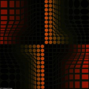
이 페이지에 표시된 작품은 저작권법의 보호를 받으며, 이에 따라 동일한 복제품을 제작하거나 판매하는 것은 법으로 금지되어 있습니다. 이러한 권리 보호는 다음과 같은 국제 협약에 따라 시행됩니다. 베른 협약 또한 다음에서 명시하는 법률을 포함한 국내법에 의해 보호됩니다. 미국 저작권법 제17조.
이 방식은 저작권 보호를 받는 예술 작품을 복제하거나 그대로 재현하는 것이 아니기에 저작권 규정을 완벽히 준수합니다. 대신, 이는 창의적인 재해석의 과정을 거칩니다. 즉, 원작에서 영감을 받되 원작과 동일하지 않은 새로운 회화 작품을 의미합니다.
빠른 제작과 다양한 마감 옵션을 선택할 수 있는 박물관 수준의 지클레이 및 캔버스 프린트. ( 수작업 채색 복제본 주문하기 디지털 이미지 판매 채널로 전환)





























작품의 원본 비율을 그대로 유지하는 프리셋 사이즈 중에서 선택해 보세요.

특정 프레임이나 공간에 맞춰 직접 치수를 입력하실 수 있습니다. 선택하신 사이즈가 원본 이미지의 비율과 일치하지 않을 경우, 작품을 크롭(자르기)하거나 이미지를 대칭 또는 단색 채우기로 확장하여 제작합니다. 제작 시작 전, 최종 확인을 위해 디지털 목업이 전송됩니다.
화면상의 미리보기는 실제 크롭이나 확장 상태를 반영하지 않으므로, 최종 구도는 오직 목업을 통해서만 정확하게 확인하실 수 있습니다.
맞춤 사이즈 제작도 가능하지만, 원본 비율을 유지하기 위해서는 사전 정의된 목록에서 치수를 선택하시는 것을 권장합니다.
Composition 9
복제본 규격
"Composition 9" 작품의 권장 인쇄 설정은 Large 크기와 Square 방향입니다.
빅터 바사렐리의 "Composition 9"의 주요 색상은 Clay (#846c3e)입니다.
빅터 바사렐리의 "Composition 9"은(는) 분위기가 Serene한 것으로 묘사됩니다. 이러한 분류는 작품을 공간에 맞게 매치하는 데 도움이 될 수 있습니다.
빅터 바사렐리의 "Composition 9"의 기록된 인기도는 Iconic입니다.
빅터 바사렐리의 "Composition 9"은(는) WallArt로 분류됩니다. 이 카테고리는 원작이 어떤 종류의 예술 작품인지를 설명합니다.
빅터 바사렐리의 "Composition 9"은(는) Serene 분위기를 자아내며, Living Room에 추천하는 작품입니다. 무드란 작품이 주변 공간에 선사하는 정취를 의미합니다.
빅터 바사렐리의 "Composition 9"은(는) Living Room에 추천하는 작품입니다. 이 제안은 작품의 주제, 색상 및 분위기를 바탕으로 합니다.
빅터 바사렐리의 "Composition 9"은(는) Earthy 색조의 팔레트를 사용합니다. 이 팔레트는 작품 전체의 색채적 특징을 집약적으로 보여줍니다.

1906 - 1997 , 크로아티아

Explore the profound evolution of Neo-Abstract art. Discover how bold geometric forms, vibrant chromatic depth, and tactile textures redefine modern expression for the discerning collector seeking sophisticated, high-impact masterpieces for contemporary interiors.
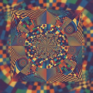
Explore the mesmerizing world of Victor Vasarely. Discover how his Bauhaus-inspired Op Art masters the science of perception through geometric abstraction and vibrant color. A sophisticated guide for discerning art collectors seeking to understand the legacy of optical illusion.

Explore the profound spiritual depth of geometric abstraction. From Malevich's Suprematism to modern masters, our expert guide reveals how pure form and color command presence in fine art collections.

 실제 크기로 보기
 보내기
보내기 공유하기
공유하기
 상세 보기
상세 보기 가이드 보기

 이미지 다운로드
 유사 작품 더 보기
 X-레이
X-레이 슬라이드 쇼 보기
 통계 정보
통계 정보
 상세 보기
상세 보기









 유리 옵션은 110cm 미만 크기에서만 선택 가능합니다.