The Electric Pulse of Pop Art: Reimagining Brattata
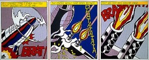
Brattata, a 1962 masterpiece by the visionary Roy Lichtenstein, serves as a thunderous declaration of the power inherent in popular culture. At first glance, the painting presents itself as a single, high-octle panel plucked from the pages of a mid-century comic book, specifically inspired by DC Comics’
All-American Men of War #89. Yet, to view it merely as a reproduction of pulp fiction is to miss its profound artistic rebellion. Lichtenstein takes the ephemeral, disposable imagery of mass media and elevates it to the status of high art, freezing a moment of intense aerial combat within the dignified confines of an oil on canvas. The composition centers on a pilot, his face etched with a grim, focused determination, surrounded by the mechanical chaos of a cockpit. Through this lens, Lichtenstein invites us to find beauty in the manufactured and significance in the mundane, making it an irresistible centerpiece for any collection that celebrates the intersection of fine art and modern iconography.
A Symphony of Dots and Primary Colors
The technical brilliance of
Brattata lies in Lichtenstein’s meticulous mimicry of commercial printing processes. He famously employed the Ben-Day dot technique—a method of using small, closely spaced colored dots to create shading and secondary colors—to replicate the halftone look of cheap newsprint. This deliberate choice creates a fascinating tension between the hand-painted nature of the work and its machine-made appearance. The color palette is strikingly bold, dominated by the primary triad of red, yellow, and blue. These vibrant blocks of color are delineated by thick, authoritative black outlines that lend the piece a graphic, almost architectural strength. For the interior designer, this high-contrast aesthetic offers a dynamic energy; the way the bright yellows and reds pop against the structured lines makes the artwork a commanding focal point in contemporary or minimalist spaces, injecting a sense of rhythmic movement and visual excitement into a room.
Narrative Tension and the Modern Icon
Beyond its striking surface,
Brattata pulsates with an underlying narrative intensity. The inclusion of a text balloon—bearing the words, "That was their mistake - because it gave me more targets than I could have shot at"—anchors the visual action in a specific moment of strategic calculation and wartime drama. This dialogue does more than just tell a story; it integrates language directly into the visual texture of the painting, blurring the line between reading and viewing. The subject matter reflects the cultural anxieties of the Cold War era, capturing the tension of military preparedness through a stylized, almost detached lens. There is an emotional duality at play: the visceral excitement of combat paired with the cool, calculated detachment of the Pop Art movement. For collectors, owning a piece like
Brattata means possessing a fragment of history that continues to challenge our perceptions of heroism, technology, and the very definition of artistic originality.
질의응답
"Brattata"은(는) 무엇에 관한 작품인가요?
로이 리히텐슈타인의 "Brattata"에 나타난 주제로는 comic book, aerial combat, pilot helmet, ben-day dots, dialogue balloon, neon colors, military imagery 등이 있습니다. 이들은 모여 작품의 소재를 요약해 보여줍니다.
"Brattata"의 화풍은 작가가 활동했던 시대와 어떤 연관이 있나요?
로이 리히텐슈타인의 "Brattata"은(는) 작가의 근대 미술 시대 중 Pop Art 사조에 속합니다.
로이 리히텐슈타인의 "Brattata"이(가) 인테리어에 어떤 분위기를 더해주나요?
Dramatic 분위기를 자아내는 "Brattata"은(는) Living Room에 추천합니다.
로이 리히텐슈타인의 "Brattata"은 어느 시대에 제작되었나요?
로이 리히텐슈타인의 "Brattata"은(는) Modern 시대의 작품입니다. 이 시기는 해당 작품의 역사적 배경을 잘 보여줍니다.
"Brattata"의 제작 기법은 무엇인가요?
로이 리히텐슈타인의 "Brattata"의 재료는 Oil On Canvas입니다. 복제화는 이 기법의 질감을 그대로 구현하는 것을 목표로 합니다.
로이 리히텐슈타인의 "Brattata"의 제작 연도는 언제인가요?
로이 리히텐슈타인의 "Brattata"의 제작 연도는 1962년입니다.
로이 리히텐슈타인의 "Brattata"의 휘도는 어느 정도인가요?
로이 리히텐슈타인의 "Brattata"의 기록된 휘도는 Bright Balance입니다.
"Brattata"은(는) 저작권 보호 대상이 아닌가요?
저작권과 관련하여, "Brattata"은(는) 여전히 저작권의 보호를 받고 있습니다 상태입니다.


 Oil On Canvas
 1962
1962 106.0 x 106.0 cm
 프린트 판매로 전환

 실제 크기로 보기
 보내기
보내기 공유하기
공유하기
 상세 보기
상세 보기 가이드 보기

 이미지 다운로드
 유사 작품 더 보기
 X-레이
X-레이 슬라이드 쇼 보기
 통계 정보
통계 정보 상세 보기
상세 보기