

작가가 직접 캔버스에 손으로 그린 유화 작품으로, 원하는 크기와 액자로 맞춤 제작해 드립니다. ( 프린트 판매로 전환 디지털 이미지 판매 채널로 전환)





























작품의 원본 비율을 그대로 유지하는 프리셋 사이즈 중에서 선택해 보세요.

액자나 벽면 크기에 맞춰 필요한 가로와 세로 길이를 입력해 주세요. 본 작품은 수작업으로 제작되므로, 요청하신 비율에 따라 작가가 그림의 가장자리를 조금 더 넓게 그리거나 일부를 조정하여 작업할 수 있습니다. 작업 시작 전, 최종 확인을 위해 디지털 목업 이미지를 보내드립니다. 이 페이지에 표시된 이미지는 실제 결과물과 다를 수 있으며, 오직 목업 이미지만이 정확한 결과물을 보여줍니다.
Composition in colour A
복제본 규격
Piet Mondrian's 1917 work, *Composition in Colour A*, isn’t merely a painting; it’s an architectural meditation on the fundamental elements of visual experience. Emerging from the fertile ground of early 20th-century abstraction, this piece represents a pivotal moment in the development of De Stijl – a movement Mondrian co-founded with Bart van der Leck and Theo van Doesburg – dedicated to stripping art down to its purest essence: lines and colours. It’s a testament to his lifelong pursuit of universal harmony, a vision born from a desire to transcend the limitations of representational painting and create a new language for expressing spiritual truth.
The canvas itself is dominated by a carefully orchestrated interplay of muted tones – a deep rose red, a rich dark ochre, and a profound midnight blue. These aren’t vibrant, assertive hues; rather, they are deliberately subdued, almost melancholic in their restraint. Mondrian eschewed the bright, energetic palette favored by earlier movements like Fauvism, opting instead for a sophisticated, contemplative approach. The colours themselves carry symbolic weight: red representing passion and energy, blue signifying spirituality and intellect, and ochre evoking the earth and grounding the composition. The deliberate choice of these specific shades speaks to Mondrian’s belief in their inherent balance and ability to evoke profound emotional responses.
What truly distinguishes *Composition in Colour A* is its masterful use of black lines. These aren't merely outlines defining shapes; they are the very structure of the painting, acting as a rigid grid that governs the placement and relationship of each coloured area. Mondrian’s approach moved beyond simply depicting objects; he sought to define the underlying geometric framework of reality itself. The lines don’t connect or converge in any obvious way – instead, they intersect and overlap with an almost unsettling precision, creating a sense of spatial ambiguity. This deliberate lack of closure contributes significantly to the painting's feeling of timelessness and its suggestion that it exists outside conventional notions of perspective and depth.
The white space surrounding the coloured blocks is equally crucial. It’s not simply a background; it’s an active participant in the composition, treated as a distinct form alongside the lines and colours. Mondrian believed that white held a vital role in creating visual equilibrium, acting as a ‘living component’ of the painting – a concept radical for its time. This rejection of traditional notions of negative space elevates the white areas to the status of integral design elements, mirroring the principles found in architecture and urban planning within the De Stijl philosophy.
*Composition in Colour A* is deeply rooted in the intellectual climate of 1917. The De Stijl movement was fueled by a desire to create a new, utopian world – one based on rationality, order, and harmony. Mondrian’s work reflects this ambition, representing an attempt to translate abstract principles into visual form. The painting can be seen as a blueprint for a new architectural style, anticipating the sleek, minimalist designs of the Bauhaus movement that would emerge shortly after. It's a powerful statement about the potential of art to shape not just our aesthetic experience but also our understanding of reality itself.
Beyond its historical significance, *Composition in Colour A* possesses a profound emotional impact. The painting’s quiet intensity and deliberate restraint evoke a sense of calm contemplation. The carefully balanced composition invites the viewer to lose themselves within its geometric embrace, offering a momentary respite from the chaos and complexity of everyday life. It's a work that speaks to our innate desire for order and harmony, suggesting that beauty can be found in simplicity and abstraction.
A hand-painted reproduction of *Composition in Colour A* offers a unique opportunity to bring this seminal artwork into your home or office. WahooArt’s meticulous reproductions capture the subtle nuances of Mondrian's technique, faithfully recreating the painting’s muted palette and precise lines. Whether you are an art enthusiast, a collector seeking to expand your collection, or simply someone looking for a piece that embodies timeless elegance and intellectual depth, this reproduction provides a beautiful and meaningful way to experience the legacy of Piet Mondrian.
피에트 몬드리안의 "Composition in colour A"의 Square 형식은 Living Room에 추천합니다. 작품의 형식과 공간의 조화는 복제화 배치에 중요한 가이드가 됩니다.
전반적으로 "Composition in colour A"의 밝기는 brilliant로 기록되었습니다. 인지된 밝기는 작품이 얼마나 밝거나 어둡게 보이는지를 나타냅니다.
네, 해당 작품은 작가의 본국에 보관되어 있습니다.. "Composition in colour A"은(는) 네덜란드에 소장되어 있는 반면, 피에트 몬드리안의 출생지는 네덜란드입니다.


1872 - 1944 , 네덜란드
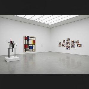
Explore the profound essence of Neoplasticism. Discover how Piet Mondrian and De Stijl masters used pure color and geometric form to redefine modern art. An essential guide for collectors seeking to understand the enduring power of abstract harmony and universal order.

Explore the profound evolution of Neo-Abstract art. Discover how bold geometric forms, vibrant chromatic depth, and tactile textures redefine modern expression for the discerning collector seeking sophisticated, high-impact masterpieces for contemporary interiors.

Explore the profound elegance of De Stijl. Discover how Piet Mondrian and the masters of Neoplasticism utilized geometric harmony and primary colors to redefine modern abstraction. An authoritative guide for the discerning collector seeking timeless, structured beauty.

 실제 크기로 보기
 보내기
보내기 공유하기
공유하기
 상세 보기
상세 보기 가이드 보기

 이미지 다운로드
 유사 작품 더 보기
 X-레이
X-레이 슬라이드 쇼 보기
 통계 정보
통계 정보


 상세 보기
상세 보기









 유리 옵션은 110cm 미만 크기에서만 선택 가능합니다.


