Morris Louis’s “High”: A Cascade of Color and Quiet Intensity
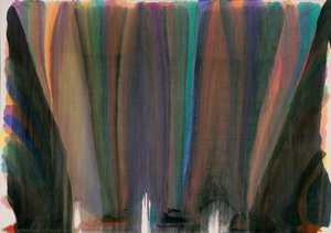
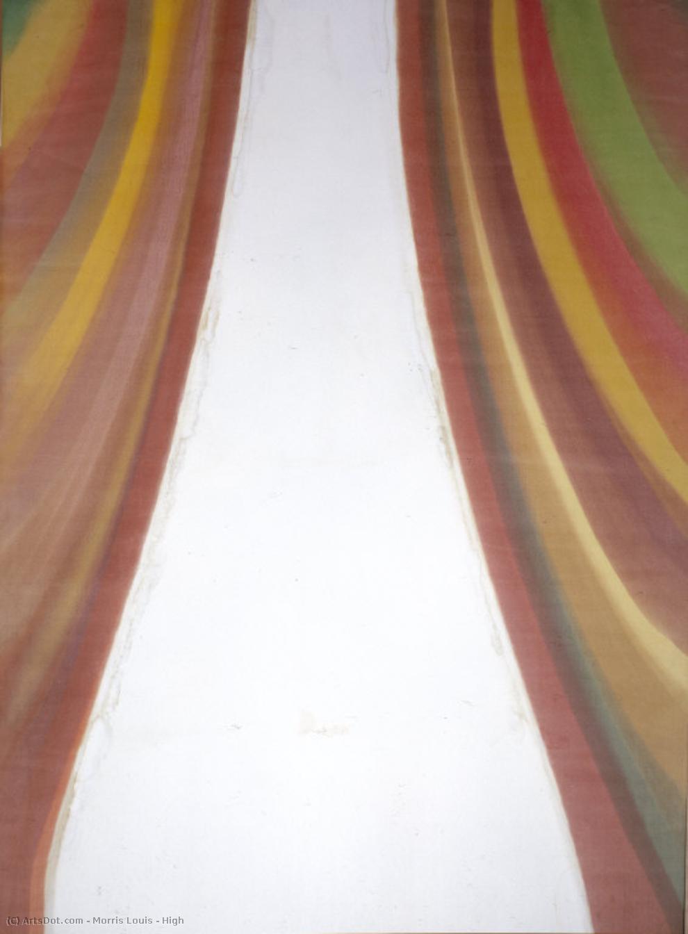
Morris Louis’s “High,” painted in 1959, isn't merely a canvas splashed with color; it’s an invitation to contemplate the very nature of perception and emotion. This pivotal work from the Washington Color School movement embodies Louis’s groundbreaking approach to Abstract Expressionism, moving beyond traditional brushstrokes and sculptural forms to create a dynamic field of layered hues that seem to both dissolve and intensify before your eyes. The painting immediately draws you in with its verticality – two distinct channels of white space act as anchors, framing washes of vibrant yellow, green, pink, and brown that bleed into one another with an almost liquid grace.
Louis’s technique was revolutionary for its time. He eschewed the conventional methods of painting, opting instead to pour diluted acrylic paint directly onto unprimed canvas. This “staining” process allowed the colors to permeate the fabric itself, creating a sense of depth and luminosity that is rarely achieved with traditional layering techniques. The resulting surface isn’t smooth or polished; it possesses a subtle texture – a testament to the way the pigment soaked into the raw linen, lending an organic quality to the composition. This deliberate roughness contrasts beautifully with the fluidity of the color fields, generating a captivating tension between solidity and transparency.
Decoding the Language of Color
The palette of “High” is deceptively simple yet profoundly rich. Louis wasn’t interested in creating representational images; instead, he sought to evoke feelings through pure color relationships. The yellows are not bright or assertive but rather muted, almost melancholic, while the greens possess a subtle depth and complexity. The pinks range from delicate blush tones to warmer, more saturated hues, contributing to an overall sense of harmony and movement. Importantly, Louis avoided sharp edges or defined shapes, allowing the colors to flow into one another seamlessly. This deliberate ambiguity invites viewers to project their own emotions and interpretations onto the canvas.
The central white space within “High” is particularly significant. It’s not merely a void but rather an active element—a pathway, a breath of air, or perhaps even a reflection of the viewer's own inner landscape. The surrounding colors seem to radiate outwards from this core, creating a sense of expansion and release. This interplay between color and space is central to Louis’s artistic vision, suggesting that art can be experienced not just as an object but as a dynamic process of perception.
A Reflection of the Era
“High” was created during a period of profound social and cultural change in America. The post-war era witnessed a growing interest in psychology, spirituality, and alternative ways of experiencing reality. Abstract Expressionism, with its emphasis on subjective experience and emotional expression, provided a powerful outlet for these emerging sensibilities. Louis’s Color Field paintings—characterized by their large scale and focus on color alone—were particularly attuned to this cultural shift, offering viewers a chance to engage in a meditative and deeply personal encounter with art.
The painting's creation coincided with Louis's discovery of Magna paint, a revolutionary acrylic medium developed for him by Leo Sebak. This new material allowed for unprecedented control over color saturation and transparency, enabling Louis to achieve the delicate layering and luminous effects that define his work. The use of Magna paint was crucial to his ability to create the fluid, staining textures that characterize “High” and other paintings from this period.
Beyond Representation: An Invitation to Feeling
Ultimately, "High" is a testament to Louis’s belief that color could speak directly to the soul. It's not about depicting a specific scene or object; it’s about conveying an emotional state—a sense of openness, release, and quiet intensity. The painting invites viewers to step into its world of pure color and experience art as a source of profound personal resonance. It remains a powerful example of how abstraction can transcend representation and tap directly into the human heart.



 미리보기
미리보기
 프린트 구매
 공유하기
공유하기 공유하기
공유하기
 상세 정보
상세 정보

 다운로드
다운로드
 유사 작품
유사 작품 X-레이
X-레이 슬라이드 쇼


 더 보기
더 보기






































 유리 옵션은 110cm 미만 크기에서만 선택 가능합니다.