

 Acrylic On CanvasWallArtColor Field Expressionism
 1969
1969 206.0 x 194.0 cm
이 페이지에 표시된 작품은 저작권법의 보호를 받으며, 이에 따라 동일한 복제품을 제작하거나 판매하는 것은 법으로 금지되어 있습니다. 이러한 권리 보호는 다음과 같은 국제 협약에 따라 시행됩니다. 베른 협약 또한 다음에서 명시하는 법률을 포함한 국내법에 의해 보호됩니다. 미국 저작권법 제17조.
저희는 존중을 담은 합법적인 대안으로서, 원작에서 영감을 받은 맞춤형 수제 유화 작품을 제공합니다. 저희의 숙련된 전문 화가들은 원작의 스타일, 분위기, 예술적 정수를 면밀히 연구하여, 그 자체로 독창적인 창작물이면서도 원작과 동일한 감동을 불러일으키는 새로운 작품을 만들어냅니다.
이 방식은 저작권 보호를 받는 예술 작품을 복제하거나 그대로 재현하는 것이 아니기에 저작권 규정을 완벽히 준수합니다. 대신, 이는 창의적인 재해석의 과정을 거칩니다. 즉, 원작에서 영감을 받되 원작과 동일하지 않은 새로운 회화 작품을 의미합니다.
작가가 직접 캔버스에 손으로 그린 유화 작품으로, 원하는 크기와 액자로 맞춤 제작해 드립니다. ( 프린트 판매로 전환 디지털 이미지 판매 채널로 전환)





























작품의 원본 비율을 그대로 유지하는 프리셋 사이즈 중에서 선택해 보세요.

특정 프레임이나 공간에 맞춰 원하는 크기를 직접 입력하실 수 있습니다. 선택하신 크기가 원본 이미지의 비율과 일치하지 않을 경우, 작품을 자르거나 추가적인 수작업 요소를 더해 그림을 확장하여 제작합니다. 제작 시작 전, 최종 확인을 위해 디지털 목업을 보내드립니다.
화면상의 미리 보기는 실제 크롭(자르기)이나 확장된 상태를 완벽히 반영하지 않을 수 있습니다. 최종 구도는 오직 목업을 통해서만 정확하게 확인하실 수 있습니다.
맞춤 크기 제작도 가능하지만, 원본의 비율을 그대로 유지하기 위해서는 미리 정의된 목록에서 크기를 선택하시는 것을 권장합니다.
Untitled
복제본 규격
마크 로스코의 "Untitled"은(는) Minimalist한 분위기 속에서 minimalism, color blocks, emotion, darkness, light, geometry, existentialism을(를) 묘사합니다. 작품의 주제와 분위기가 어우러져 하나의 완성된 세계를 보여줍니다.
"Untitled"은(는) 1969년에 Acrylic On Canvas 기법으로 제작되었습니다. 재료와 제작 연도는 원작이 어떤 방식으로 언제 만들어졌는지를 설명합니다.
"Untitled"은 작가의 탄생지를 통해 Color Field Expressionism 사조와 라트비아를 연결합니다.
"Untitled"의 원작 크기는 206 x 194 cm입니다. 원작의 규격은 복제본(reproduction) 사이즈를 선택할 때 유용한 참고 자료가 됩니다.
마크 로스코의 기록된 주제들인 color field, minimalism, emotion, existential reflection, rothko legacy 중에서도, "Untitled"은 minimalism, color blocks, emotion, darkness, light, geometry, existentialism에 독자적인 초점을 맞추고 있습니다.
마크 로스코의 "Untitled"의 프린트는 현재 페이지에서 바로 주문하실 수 있습니다: 코튼 캔버스 또는 아카이브용 캔버스지에 인쇄된 파인 아트 프린트.
마크 로스코의 "Untitled"에서는 Color Field Expressionism 사조와 근대 미술 시대가 만납니다.
마크 로스코의 "Untitled"은(는) 전반적인 Minimalist 분위기 속에서 Reflective한 느낌을 전달합니다.

1903 - 1970 , 라트비아
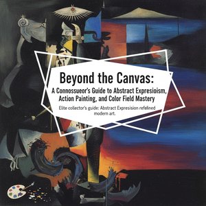
Unveil the visceral power of Abstract Expressionism. Our expert exploration delves into the transformative legacies of Pollock, Rothko, and De Kooning, offering discerning collectors a profound understanding of the New York School’s enduring mastery and historical impact.

 실제 크기로 보기
 보내기
보내기 공유하기
공유하기
 상세 보기
상세 보기 가이드 보기

 이미지 다운로드
 유사 작품 더 보기
 X-레이
X-레이 슬라이드 쇼 보기
 통계 정보
통계 정보 상세 보기
상세 보기









 유리 옵션은 110cm 미만 크기에서만 선택 가능합니다.


