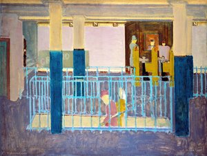
마크 로스코: 색채의 심연으로 향한 여정
마크 로스코는 1903년 라트비아 다우가프필스에서 Marcus Yakovlevich Rothkowitz라는 이름으로 태어났습니다. 어린 시절, 그는 러시아 제국의 팔레를 벗어나 유대인 가정에서 겪은 불안과 정치적 격변의 그림자 속에서 자랐습니다. 이러한 경험은 인간 고통에 대한 깊은 민감성을 심어주었고, 이는 그의 작품 전반에 걸쳐 울려 퍼지는 주제가 되었습니다. 1913년 가족과 함께 미국으로 이민하여 엘리스 아일랜드에 도착한 후, 포틀랜드 오리건에서 새로운 삶을 시작했지만, 아버지의 갑작스러운 죽음은 어린 로스코에게 깊은 상실감을 안겨주었습니다. 이러한 초기 경험들은 그를 실존적 주제 – 죽음, 트라우마, 혼돈 속에서 의미를 찾는 여정 – 에 대한 끊임없는 탐구로 이끌었습니다. 예일 대학교에서의 학업을 중단하고 뉴욕으로 이동하여 미술가로서의 길을 걷기 시작한 로스코는 도시 풍경과 초상화를 사실적으로 묘사하며 예술적 기반을 다졌습니다. 그러나 그의 작품에는 이미 심리적인 깊이를 암시하는 섬세한 감성이 드러나 있었습니다.
전쟁의 그림자와 추상 표현주의로의 전환
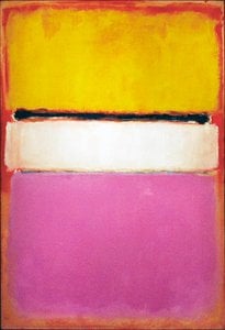
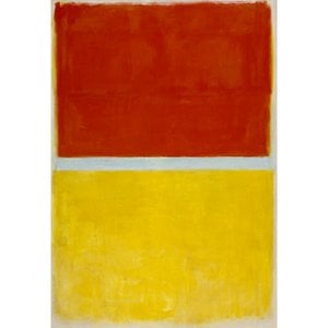
제2차 세계 대전이라는 격동적인 시기를 거치면서 로스코의 예술은 극적인 변화를 겪기 시작했습니다. 초현실주의와 신화에서 영감을 받아 그는 점차 재현적 이미지에서 벗어나 상징적인 형태를 통해 보편적인 인간 감정을 표현하고자 했습니다. 이 시기에는 다소 모호하고 생물학적인 형태가 채워진 여러 형태의 그림들이 등장하며, 형상과 추상의 경계에 서 있는 듯한 인상을 주었습니다. 이러한 작품들은 단순한 형태 실험이 아니라 전쟁이라는 시대적 불안과 고뇌에 대한 깊은 반영이었습니다. 1940년대 후반에는 로스코는 그의 상징적인 스타일 – 불규칙하고 사각의 색채 영역으로 이루어진 거대한 캔버스 – 에 도달했습니다. 그는 모든 재현적 요소를 제거하고 색상과 형태의 순수한 감정적 영향력에 집중했습니다. 이는 추상 표현주의 운동의 중요한 전환점이 되었으며, 로스코를 이 혁신적인 운동의 선구자 중 한 명으로 자리매김하게 했습니다.
색채의 장(Color Field)과 초월을 향한 갈망
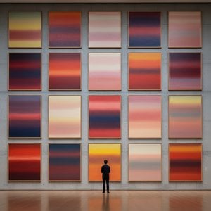
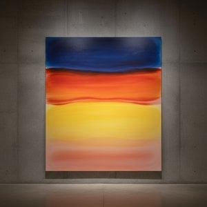
로스코의 성숙한 작품은 “색채의 장(Color Field)” 회화로 정의됩니다. 이는 보는 이를 몰입시키는 광활한 색상의 영역입니다. 로스코의 그림은 무엇을 묘사하는지가 아니라, 어떤 감정을 불러일으키느냐가 중요합니다. 그는 예술이 지적인 분석을 우회하고 직접적으로 감성에 호소해야 한다고 믿었습니다. 그는 얇게 겹쳐진 페인트를 정교하게 사용하여 색조와 질감의 미묘한 변화를 만들어내며, 캔버스 내부에서 빛이 발산되는 듯한 느낌을 주었습니다. 그의 사각형 형태의 가장자리는 종종 흐릿하여 서로 혼합되고 상호 작용하며 깊이와 움직임을 창출합니다. 로스코는 작품에 제목을 붙이지 않고 단순히 번호(“No. 1”, “No. 6” 등)만 사용하여, 선입견 없이 그림을 마주하고 자신의 감정적 반응에 따라 경험하도록 격려했습니다. 그는 고요한 사색의 공간, 즉 자신보다 더 큰 존재와 연결할 수 있는 안식처를 만들고자 했습니다.
그의 야망은 색채의 언어를 통해 심오한 영적인 경험을 불러일으키는 것 외에는 아무것도 아니었습니다.
주요 업적과 지속적인 유산
로스코의 가장 중요한 업적 중 하나는 그의 진화하는 스타일을 잘 보여주는 “No. 10 (1950)”와 뉴욕 시 포 시즌스 레스토랑에 장식될 예정이었던 ‘시그램 벽화(Seagram Murals)’가 있습니다. 그러나 로스코는 자신의 그림이 부유한 식객들을 위한 장식적인 물건으로 전락할 것이라는 생각에 혐오감을 느껴 이 프로젝트에서 철수하고, 수익성 있는 계약을 환불하여 테이트 갤러리 등 여러 박물관에 기증했습니다. 또한 그는 텍사스 주 휴스턴에 위치한 종파를 초월하는 성지인 로스코 예배당(Rothko Chapel)의 영구 설치 미술 작품으로 14개의 캔버스를 제작했습니다. 조용한 사색을 위한 공간으로 설계된 예배당은 많은 이들에게 신성한 장소로 여겨지며, 로스코가 예술의 영적 힘에 대해 믿었던 것을 구현합니다.
로스코의 영향력은 후대 세대의 예술가들에게 지대한 영향을 미쳤습니다. 그는 미니멀리즘 예술을 위한 길을 열었고, 오늘날에도 추상성의 감정적 가능성을 탐구하는 현대 화가들에게 영감을 주고 있습니다. 1970년 비극적인 자살로 생을 마감했음에도 불구하고, 마크 로스코는 20세기 가장 중요하고 영향력 있는 예술가 중 한 명으로 남아 있으며, 그의 작품은 전 세계 관객들의 마음을 사로잡고 있습니다.
지속적인 감정적 울림의 힘
- 로스코의 그림들은 비극, 황홀경, 절망, 희망과 같은 보편적인 인간 감정을 전달하는 능력으로 유명합니다.
- 색채를 감정 표현의 수단으로 탐구한 그의 노력은 추상 회화를 혁신했습니다.
- 로스코 예배당은 예술의 영적 힘에 대한 그의 믿음을 증명하는 기념비입니다.
- 그는 추상 표현주의의 중요한 인물이며 현대 예술가들에게 큰 영향을 미치고 있습니다.
로스코의 유산은 미술사의 영역을 넘어섭니다. 그의 작품은 우리에게 자신의 죽음과 마주하고, 인간 존재의 복잡성을 이해하며, 종종 의미를 찾기 어려운 세상에서 의미를 추구하도록 초대합니다. 그는 예술이 단순한 미학적 대상이 아니라 자기 자신, 타인, 그리고 우리 자신보다 더 큰 존재와의 연결에 관한 것이라는 점을 상기시켜 줍니다. 그의 그림들의 지속적인 힘은 이러한 깊은 감정을 불러일으키는 능력에 있으며, 위안과 영감, 그리고 인간 영혼의 심연으로 향하는 통찰력을 제공합니다.



 미리보기
미리보기
 프린트 구매
 공유하기
공유하기 공유하기
공유하기
 상세 정보
상세 정보

 다운로드
다운로드
 유사 작품
유사 작품 X-레이
X-레이 슬라이드 쇼

 더 보기
더 보기






































 유리 옵션은 110cm 미만 크기에서만 선택 가능합니다.