x


작품의 원본 비율을 유지하는 미리 설정된 크기 중에서 선택하세요.
특정 프레임이나 공간에 맞도록 직접 크기를 입력할 수 있습니다. 선택하신 크기가 원본 이미지의 비율과 일치하지 않는 경우, 작품을 자르거나 추가적인 손으로 그린 요소를 사용하여 그림을 확장합니다. 제작 시작 전 승인을 위해 디지털 목업을 보내드립니다.
화면 미리 보기는 실제 자르기 또는 확장을 반영하지 않습니다. 최종 구성은 목업을 통해서만 정확하게 확인하실 수 있습니다.
맞춤 크기 제작도 가능하지만, 원본 비율을 유지하기 위해 사전 정의된 목록에서 크기를 선택하시는 것을 권장합니다.

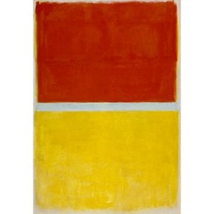
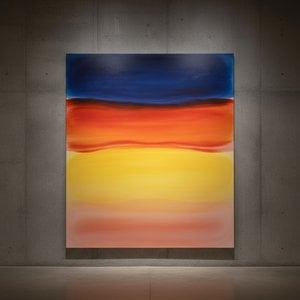
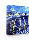
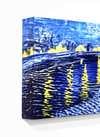
No. 3
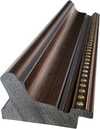
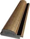
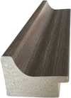
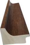
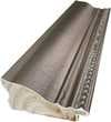
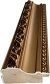
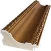
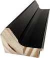
복제본 크기
Mark Rothko’s “No. 3” isn’t a painting that shouts; it whispers. It’s an invitation to quiet contemplation, a deliberate rejection of representational art in favor of pure emotional expression. Created during the heart of his mature style – roughly between 1949 and 1970 – this work embodies the core tenets of Abstract Expressionism while simultaneously forging its own unique path. The piece immediately draws the viewer into a space of profound introspection, utilizing a muted color palette dominated by deep blues, blacks, and greens layered over an orange foundation. It’s not simply a collection of colors; it's a carefully orchestrated symphony of tones designed to evoke a specific mood – one of melancholy, solitude, and perhaps even a touch of existential longing.
The power of “No. 3” lies not in its subject matter – which is deliberately ambiguous, hinting at figures or forms rather than explicitly depicting them – but in the meticulous execution of Rothko’s technique. Thick, layered brushstrokes are visible throughout the canvas, creating a tactile surface that invites close examination. These aren't sharp lines or defined edges; instead, they bleed into one another, blurring the boundaries between shapes and colors. This layering is crucial to the painting’s depth – it creates an illusion of space, drawing the eye inward and encouraging the viewer to lose themselves within the composition. Rothko famously described his paintings as “doors” or “windows,” suggesting a portal into another realm. Here, those doors are open, offering glimpses of something beyond the purely visual.
The deliberate lack of perspective is equally significant. Rothko abandoned traditional notions of linear space, opting instead for an implied sense of depth through color and layering. The overlapping forms create a dynamic interplay of positive and negative space, guiding the viewer’s eye across the canvas in a continuous, almost meditative, flow. It's a technique that mirrors the artist’s own exploration of spirituality and the search for meaning beyond the material world.
Understanding Mark Rothko requires acknowledging his deeply personal journey. Born in 1903 in Daugavpils, Latvia (then part of the Russian Empire), he experienced a childhood marked by displacement and uncertainty – a legacy of shifting borders, pogroms, and the trauma of immigration to Portland, Oregon, where his father, a pharmacist and intellectual, tragically died shortly after their arrival. This early exposure to loss and instability profoundly shaped Rothko’s artistic vision. He grappled with themes of mortality, faith, and the human condition throughout his career, seeking to express universal emotions through abstract forms. His work during this period reflects a deep engagement with existential questions – questions about life, death, and the search for meaning in an often-chaotic world.
The Rothko Chapel in Houston, Texas, serves as a poignant example of how the artist envisioned his paintings interacting with space. The fourteen Rothko panels within the chapel’s walls are designed to create a contemplative atmosphere, inviting viewers to engage in silent reflection. “No. 3” shares this spirit of quiet intensity, offering a visual meditation on the complexities of human experience.
While Rothko resisted definitive interpretations of his work, certain symbolic readings have emerged over time. The dominant blues and blacks are often associated with sadness, mourning, or introspection – reflecting the artist’s own personal struggles. The orange hue, appearing as a subtle undercurrent, can be seen as representing hope, warmth, or even spiritual illumination. The ambiguity of the forms themselves allows for individual interpretation, inviting each viewer to project their own emotions and experiences onto the canvas. “No. 3” is not simply a painting; it’s an emotional landscape – a space where the viewer becomes an active participant in the creation of meaning.

1903 - 1970 , 라트비아

Explore the captivating world of Color Field painting! Discover its origins, key artists like Rothko & Newman, philosophical depth, and lasting influence on modern art. Expert insights for collectors.
Explore the profound emotional depth of Mark Rothko's abstract expressionism. Discover the history, techniques & lasting impact of this pivotal Color Field painter. Expert insights for collectors and art enthusiasts.

Explore the groundbreaking abstract expressionism of Morris Louis, a pioneer of Color Field painting. Discover his innovative techniques, influential series & lasting legacy in post-war American art. Learn more at WahooArt.

Explore the life & work of Jacob Kainen, a pivotal figure in American Abstract Expressionism and Color Field painting. Discover his journey from Social Realism to vibrant abstraction and lasting influence on 20th-century art.

Explore the profound world of Color Field painting with WahooArt. Discover key artists like Rothko & Newman, its philosophical roots, and lasting impact on modern art. Expert insights for collectors.


최신 미술 뉴스, 특별 혜택 및 인테리어 아이디어를 가장 먼저 만나보세요.
프로젝트에 대해 알려주시면 저희 미술 전문가들이 맞춤형 아트 제안 3가지를 전달해 드립니다.
당신만을 위한 맞춤형 옵션 3가지를 무료로 추천해 드립니다!
 공유하기
공유하기


 유리 옵션은 110cm 미만 크기에서만 선택 가능합니다.