

이 페이지에 표시된 작품은 저작권법의 보호를 받으며, 이에 따라 동일한 복제품을 제작하거나 판매하는 것은 법으로 금지되어 있습니다. 이러한 권리 보호는 다음과 같은 국제 협약에 따라 시행됩니다. 베른 협약 또한 다음에서 명시하는 법률을 포함한 국내법에 의해 보호됩니다. 미국 저작권법 제17조.
이 방식은 저작권 보호를 받는 예술 작품을 복제하거나 그대로 재현하는 것이 아니기에 저작권 규정을 완벽히 준수합니다. 대신, 이는 창의적인 재해석의 과정을 거칩니다. 즉, 원작에서 영감을 받되 원작과 동일하지 않은 새로운 회화 작품을 의미합니다.
빠른 제작과 다양한 마감 옵션을 선택할 수 있는 박물관 수준의 지클레이 및 캔버스 프린트. ( 수작업 채색 복제본 주문하기 디지털 이미지 판매 채널로 전환)





























작품의 원본 비율을 그대로 유지하는 프리셋 사이즈 중에서 선택해 보세요.

Type the width and the height you need, to fit your frame or your wall. A print can only be cut, never made bigger than the picture, so a size with a different shape loses a part of the image. We send you a digital mockup to approve before we print anything. The picture shown on this page does not show the real cut — only the mockup does.
Paradise
복제본 규격
마르셀 뒤샹의 "Paradise"에 관한 통계 정보는 작품의 통계 페이지에서 확인하실 수 있습니다: 해당 작품의 월간 방문 횟수, 작가 작품의 방문 횟수, 그리고 최근 방문자의 국가 및 언어별 상세 현황을 제공합니다.
"Paradise" is available as 고해상도 디지털 이미지 다운로드, purchased directly on its Digital Image page.
마르셀 뒤샹의 "Paradise"에 대한 가이드 페이지를 이용하실 수 있습니다. 이 페이지는 학생들과 수업용으로 제작된, 인쇄 가능한 작품 정보 시트를 제공합니다.


1887 - 1968 , 프랑스

Explore the transformative era of Post-Impressionism. Discover how masters like Cézanne and Matisse revolutionized color and form, moving beyond Impressionism to shape modern art history through structural innovation and expressive emotion.

인상주의의 빛나는 찰나와 후기 인상주의의 강렬한 감정을 깊이 있게 탐구합니다. 모네부터 고흐까지, 거장들의 예술적 혁명을 통해 클래식 미술의 정수를 만나보세요. WahooArt는 숙련된 화가들이 100% 수작업으로 재현하는 프리미엄 유화 복제와 맞춤형 초상화 서비스를 통해 당신의 공간에 품격 있는 예술적 가치를 선사합니다.
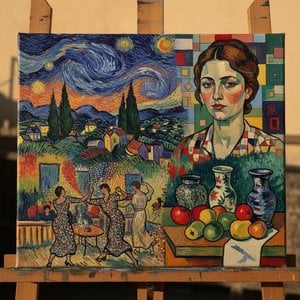
Unveil the profound revolution of Post-Impressionism. Explore how masters like Van Gogh and Cézanne utilized bold colors and emotional depth to transcend mere representation, laying the foundation for modern art. A sophisticated journey through history's most emotive brushstrokes.

Explore the vibrant evolution of Post-Impressionism. From Seurat's revolutionary Pointillism to the emotional depth of masters, discover how this movement redefined modern art history through color, structure, and unparalleled creative expression.

 실제 크기로 보기
 보내기
보내기 공유하기
공유하기
 상세 보기
상세 보기 가이드 보기

 이미지 다운로드
 유사 작품 더 보기
 X-레이
X-레이 슬라이드 쇼 보기
 통계 정보
통계 정보

 상세 보기
상세 보기









 유리 옵션은 110cm 미만 크기에서만 선택 가능합니다.


