

当社のアーティストが、お客様のご希望のサイズと額縁に合わせて、キャンバスに手描きで制作する油彩画です。 ( プリント版に切り替え デジタル画像販売へ切り替え)





























作品のオリジナル比率に合わせた、当店の規定サイズからお選びください。

フレームや壁のスペースに合わせて、ご希望の幅と高さを入力してください。本作品は手描きのため、異なる比率のサイズをご希望の場合、絵画の周囲を少し広げて描くか、あるいは端を少しカットして調整することが可能です。お客様のご要望に合わせます。制作を開始する前に、仕上がりを確認するためのデジタルモックアップをお送りいたします。このページに表示されている画像は完成品の実物ではなく、あくまでモックアップによるイメージです。
Counter composition XV
複製画サイズ一覧
Theo van Doesburg's "Counter Composition XV," painted in 1925, isn’t merely a painting; it’s a distilled essence of the De Stijl movement – a radical declaration of order and universal harmony. This deceptively simple work, executed against a stark white canvas, pulsates with an underlying tension born from the careful orchestration of geometric forms and primary colors. It represents a pivotal moment in 20th-century art, moving beyond representational imagery to explore the very foundations of visual language itself. The piece immediately commands attention not through elaborate detail or narrative, but through its profound sense of balance and its unwavering commitment to abstraction.
At first glance, the composition appears austere – a red rectangle dominating the upper left quadrant, juxtaposed with a blue counterpart in the lower right. However, this initial impression quickly gives way to an appreciation for the intricate grid that underpins the entire work. A network of black and white squares, meticulously arranged, creates a dynamic interplay of movement and stillness, suggesting both order and potential disruption. This isn’t haphazard placement; it's a deliberate choreography designed to evoke a feeling of controlled dynamism – a visual embodiment of De Stijl’s core philosophy.
The brilliance of "Counter Composition XV" lies in its reduction. Van Doesburg stripped away all extraneous elements, leaving only the fundamental building blocks of form and color: red, yellow, blue, black, and white. This limited palette wasn’t chosen arbitrarily; each hue was selected for its inherent purity and intensity, intended to be experienced without distraction. The application is equally crucial – flat, unmodulated areas devoid of shading or blending. This technique emphasizes the geometric shapes themselves, highlighting their sharp edges and creating a sense of crystalline clarity. It's a testament to the artist’s belief that beauty could be found in simplicity and precision.
The absence of perspective is equally significant. Van Doesburg deliberately rejects traditional spatial representation, opting instead for a two-dimensional plane where shapes are presented as independent entities. Overlapping elements and variations in size subtly suggest depth, but the overall effect is one of flattened planes interacting within a carefully constructed framework. This approach reflects De Stijl’s rejection of illusionism and its embrace of a purely conceptual understanding of space.
Beyond its formal qualities, "Counter Composition XV" carries profound symbolic weight. The geometric forms – rectangles, squares, lines – are not merely decorative; they represent fundamental principles of order, balance, and harmony. The primary colors, stripped of their associations with natural phenomena, become pure expressions of energy and vibration. Van Doesburg believed that through the rigorous application of these abstract elements, artists could create a visual language capable of transcending individual expression and communicating universal truths. The piece is an attempt to build a new aesthetic based on mathematical ratios and geometric relationships – a blueprint for a harmonious world reflected in art.
Theo van Doesburg’s “Counter Composition XV” stands as a powerful testament to the transformative potential of abstraction. It's more than just a painting; it’s an invitation to contemplate the underlying order of the universe and the possibility of creating beauty through pure geometric form. Its stark simplicity, combined with its profound symbolic depth, continues to resonate with viewers today, cementing its place as a cornerstone of modern art.
テオ・ファン・ドースブルフ作「Counter composition XV」の制作年は1925年です。
「Counter composition XV」の全体的な明るさはdeep_shadowで、輝度はSoft Shadowです。
テオ・ファン・ドースブルフ作「Counter composition XV」は、作品のスライドショーページにてスライドショーとしてご覧いただけます。


1883 - 1931 , オランダ

Explore the profound elegance of De Stijl. Discover how Piet Mondrian and the masters of Neoplasticism utilized geometric harmony and primary colors to redefine modern abstraction. An authoritative guide for the discerning collector seeking timeless, structured beauty.
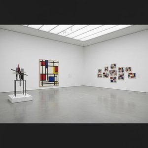
Explore the profound essence of Neoplasticism. Discover how Piet Mondrian and De Stijl masters used pure color and geometric form to redefine modern art. An essential guide for collectors seeking to understand the enduring power of abstract harmony and universal order.

 設置イメージを確認
 送る
送る シェア
シェア
 詳細情報
詳細情報 ガイドを表示

 画像をダウンロード
 似ている作品
 X線調査
X線調査 スライドショー
 統計情報
統計情報

 続きを読む
続きを読む









 ガラスオプションは、110cm未満のサイズでのみご利用いただけます。


