The Geometry of Pure Being: Exploring Counter composition X
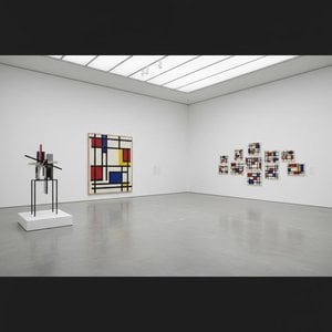
To stand before Theo van Doesburg's Counter composition X is not merely to observe paint on canvas; it is to encounter a moment of profound intellectual clarity, a visual manifesto rendered in primary colors and absolute structure. This piece, dating from 1924, pulses with the revolutionary spirit of early modernism. It presents itself as a seemingly simple square, yet within its rigid confines—the bold placement of red in the upper left, yellow centrally positioned, blue anchoring the lower left, and black completing the composition in the lower right—lies an entire philosophy. Van Doesburg strips away the illusion of depth and narrative chaos, leaving behind only the essential dialogue between form and color.
A Testament to De Stijl's Vision
This work is deeply embedded within the ethos of Neoplasticism, the movement that gave rise to De Stijl. For Van Doesburg, art could no longer afford the sentimental trappings of representation. The world, he argued, was best understood not through mimicry, but through its underlying structural harmonies. Counter composition X embodies this quest for universal order. The technique is characterized by an almost ascetic purity; clean lines meet flat planes of saturated color. It speaks to a desire to distill existence down to its most fundamental components—the vertical and the horizontal, the primary hues. Owning a reproduction of this piece allows one to bring that same sense of disciplined harmony into a contemporary living space.
Symbolism in Primary Dialogue
The selection of colors is never arbitrary; it is a carefully orchestrated symbolic language. The primaries—red, yellow, and blue—are the foundational notes of visual experience, while black provides the necessary grounding counterpoint. These elements interact not as separate entities, but as interdependent forces balancing within the square matrix. Consider the tension between the vibrant red corner and the deep, stabilizing black quadrant. This interplay suggests a dynamic equilibrium—a perfect balance achieved through opposing yet complementary forces. It is an abstract meditation on structure itself, suggesting that true beauty resides in the relationship between parts.
Emotional Resonance for the Modern Collector
For the collector or designer, Counter composition X offers more than mere decoration; it offers a focal point of contemplation. Its bold graphic nature acts as an immediate visual anchor, capable of elevating any room from mundane to monumental. The emotional impact is one of invigorating calm—the kind that comes from understanding underlying principles. It demands that the viewer slow down, look closer, and engage their intellect alongside their eye. Whether displayed in a minimalist gallery setting or integrated into a richly decorated interior, this painting asserts an undeniable modern sophistication, celebrating geometry as the ultimate form of expressive power.

 シェアする
シェアする


 ガラスオプションは、110cm未満のサイズでのみご利用いただけます。