


スピーディーな制作と多彩な仕上げオプションが魅力の、ミュージアムクオリティなジークレー・キャンバスプリント。 ( 手描き複製画を注文する デジタル画像販売へ切り替え)
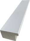
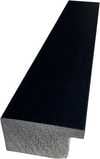
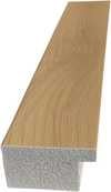
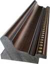
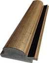
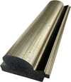
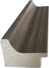
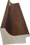
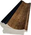
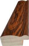
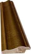
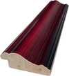
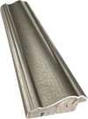
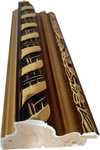
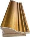
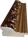
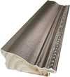
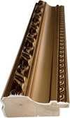
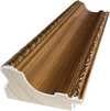
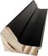
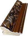
作品のオリジナル比率に合わせた、当店の規定サイズからお選びください。

額縁や壁のスペースに合わせて、ご希望の幅と高さを入力してください。プリントはカットすることは可能ですが、元の画像より大きくすることはできないため、異なる比率のサイズを選択された場合は、画像の一部が欠けることになります。印刷を開始する前に、内容を確認していただくためのデジタルモックアップをお送りいたします。このページに表示されている画像は、実際のカット後の状態を示すものではありません。実際の仕上がりはモックアップにてご確認ください。
Composition
複製画サイズ一覧
The canvas known as Composition emerges from the mind of Theo van Doesburg, a work that captures a specific moment in 1923. This piece exists as a precise arrangement of form and color, born from a period of intense creative focus. The artist, Theo van Doesburg, brings a sense of equilibrium to the surface, translating abstract thought into a tangible presence. It is a work that demands attention through its structural clarity and its commitment to the principles of the De Stijl movement.
The history of this object is tied to a specific circle of thinkers and patrons. Antony Kok commissioned the work, setting it on its path through the hands of those who shaped the modern era. From there, the painting finds its way into the hands of Bart de Ligt (1883–1938), who becomes its first owner. This transition marks the beginning of a long lineage of stewardship, as the work moves from the artist's studio into a private collection where its presence remains constant.
Every line and color choice within Composition reflects the artist's pursuit of a universal visual language. As we observe the work, we see the direct result of a vision that seeks to strip away the unnecessary to find a fundamental truth. The painting remains a vital part of the history of abstraction, holding the weight of its 1923 origins in every carefully placed rectangle and primary hue.
The canvas unfolds as a precise grid of rectangles, where vertical and horizontal lines intersect to dictate the movement of the eye. There is a profound sense of equilibrium achieved through this arrangement, as non-representational forms find their place within a structured, rhythmic order. The eye moves across the surface, guided by the intersections of these straight lines, finding balance in the way the shapes occupy the space. It is a study in pure geometry, where the subject matter is stripped of any external reference, leaving only the essence of form and relation.
Color acts as the primary force within this structured environment. The palette relies on the fundamental strength of red, yellow, and blue, which anchor the composition. These primary hues interact with a supporting cast of black, white, and grey, creating a tension between the boldest tones and the more neutral shades. The colors appear solid and flat, avoiding any blending or shading, which emphasizes the stark, clean nature of the geometric arrangement. Each rectangle holds its own weight, contributing to a visual language that seeks a universal harmony through simplicity.
The history of this work begins in the creative atmosphere of Paris, where it finds its way from the artist's studio into the hands of Bart de Ligt. This acquisition likely occurs in late 1923, marking the start of a long and steady lineage. De Ligt, a man deeply connected to the avant-garde circles of the time, holds the piece within his personal collection until his passing in 1938.
From that moment, the painting enters a quiet, private chapter. It remains within the same family, passing through the hands of descendants for nearly a century. This continuity preserves the work's integrity, keeping it sheltered within a single domestic line since 1923. The colors and forms remain as they were when they first left the artist's side, held in a state of careful preservation through the decades.
The canvas captures a moment of profound transition, acting as a key work within the artist's entire oeuvre. It reveals a growing complexity within his purist style, where the rigid logic of geometry begins to dance with a more nuanced sense of equilibrium. One senses the tension between the absolute and the evolving, as the lines and colors find a new, sophisticated rhythm. This evolution suggests a mind moving beyond simple shapes toward a more intricate visual language.
A deep connection between the realm of architecture and the act of painting pulses through the work. The composition feels less like a mere arrangement of pigment and more like a blueprint for a structured reality. This link is no accident; the artist himself articulated the concept behind its creation in the magazine Architectura on 17th July 1923. The painting exists as a bridge, where the spatial logic of built environments meets the spiritual pursuit of pure abstraction.
The evolution of this geometric language unfolds through several other pieces that trace the artist's shifting focus. One can look back to Composition XX from 1920 to see the early movements of these shapes. Nearby in the timeline, the 1923 work Study for a Composition offers a glimpse into the creative process behind these structured arrangements. These works exist as part of a continuous search for balance and order within the frame.
As the years progress, the compositions grow more complex and dynamic. The 1925 Counter composition XIV introduces a different energy to the grid. Later, the Simultaneous Counter-Composition from 1929–1930 pushes the boundaries of the aesthetic even further. Each piece captures a specific moment in a lifelong pursuit of a new visual language, moving from the rigid to the more fluid and experimental.
「Composition」の複製画は、Officeに美しく調和します。
テオ・ファン・ドースブルフ作「Composition」は、Oil On Canvasの技法とDe Stijlの様式を融合させた作品です。技法(テクニック)は制作手法を、様式(ムーブメント)はその作品のスタイルを表しています。
「Composition」において、Statementな対比とDiscordant Paletteな調和が響き合っています。


1883 - 1931 , オランダ

Discover how Theo van Doesburg's Card Players transitioned from representational art to De Stijl abstraction in this historical overview.

Master the secrets of classical portraiture through geometry and light. Explore the techniques of the Old Masters today.

Immerse yourself in the vibrant world of Fernand Léger. Explore 25 iconic Cubist masterpieces, from his bold 'Tubism' to machine-age aesthetics. Find inspiration for museum-quality art reproductions and curated decor. Discover all masterpieces on WahooArt.com.

Explore the revolutionary De Stijl movement & Neo-Plasticism with our expert guide. Discover Piet Mondrian, Theo van Doesburg, and the lasting impact of this influential art style. Learn about collecting & investing in De Stijl masterpieces.

Discover the invisible architecture of Impressionism. Explore how the Rule of Thirds, Golden Ratio, and dynamic diagonals create the luminous, emotional magic found in masterpieces by Monet and Renoir. An expert guide for the dedicated art lover.
 設置イメージを表示

 シェアする
 シェアする
 詳細を見る
 ガイドを表示


 ダウンロード
 似ている作品
 X線調査
 スライドショーを表示
 Q&A

 統計情報


 詳細を表示
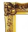
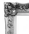
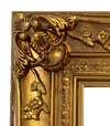
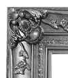


 ガラスオプションは、110cm未満のサイズでのみご利用いただけます。


