Oil On CanvasWallArtPop Art
 1962Modern
 106.0 x 106.0 cm
このページに掲載されている作品は著作権法によって保護されており、当社の許可なく同一の複製物を制作または販売することは法律で禁じられています。この保護は、以下のような国際条約に基づき執行されます。 ベルヌ条約 および、以下の条項に定められたものを含む各国の法律により、 米国著作権法 第17編。
敬意を払った法的な代替手段として、私たちはオリジナルにインスピレーションを与えられた、カスタムの手描きアートワークを提供しています。私たちの熟練したプロのアーティストは、元の作品が持つスタイル、情緒、そして芸術的なエッセンスを注意深く研究し、独自の創作物でありながら、同じ感性を呼び起こすような、新しくユニークな作品を作り上げます。
この手法は、著作権で保護された作品の複製や複写を伴わないため、著作権法に完全に準拠しています。これは単なる模倣ではなく、創造的な再解釈です。元の作品からインスピレーションを受けつつも、それとは異なる、全く新しい絵画を生み出すものです。
当社のアーティストが、お客様のご希望のサイズと額縁に合わせて、キャンバスに手描きで制作する油彩画です。 ( プリント版に切り替え デジタル画像販売へ切り替え)





























作品のオリジナル比率に合わせた、当店の規定サイズからお選びください。

特定のフレームやスペースに合わせて、ご希望のサイズをご入力いただけます。選択されたサイズが元の画像の比率と異なる場合、アートワークをトリミングするか、手描きで要素を追加して絵画を拡張いたします。デジタルモックアップ を制作し、制作開始前にご確認(承認)をいただきます。
画面上のプレビューは、実際のトリミングや拡張を正確に反映しているものではありません。最終的な構図は、モックアップによってのみ正確にご確認いただけます。
カスタムサイズもご利用いただけますが、元の比率を維持するためには、あらかじめ用意されたリストからサイズを選択することをお勧めいたします。
Brattata
複製画サイズ一覧
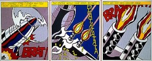
ロイ・リヒテンシュタイン作「Brattata」に描かれているテーマには、comic book, aerial combat, pilot helmet, ben-day dots, dialogue balloon, neon colors, military imageryなどがあります。これらが合わさることで、本作の主題を構成しています。
ロイ・リヒテンシュタイン作「Brattata」は、作者の近代美術という時代における、Pop Artのムーブメントに位置づけられます。
Dramaticな雰囲気を持つ「Brattata」は、Living Roomに飾るのがおすすめです。
ロイ・リヒテンシュタイン作「Brattata」はModern時代の作品です。この時代背景が、本作の歴史的な文脈を形作っています。
ロイ・リヒテンシュタイン作「Brattata」の技法はOil On Canvasです。複製画は、この技法の質感や風合いを再現することを目指しています。
ロイ・リヒテンシュタイン作「Brattata」の制作年は1962年です。
ロイ・リヒテンシュタイン作「Brattata」 の記録された輝度は Bright Balance です。
著作権について、「Brattata」は著作権により保護されていますです。

1923 - 1997 , アメリカ合衆国

Explore the profound impact of the Pop Art Revolution on modern aesthetics. From Lichtenstein’s dots to Warhol’s icons, gain expert insights into how this vibrant movement redefined culture through consumerism and mass media. A definitive guide for art lovers and collectors.

Dive into the vibrant world of Ben-Day dots. Explore how Roy Lichtenstein transformed mass media imagery into high art, redefining modern aesthetics through the iconic textures of Pop Art and its enduring impact on contemporary visual culture.

Explore the profound psychological depth of Roy Lichtenstein's color theory. An expert analysis for art collectors on how bold palettes and Ben-Day dots redefine modern aesthetics and luxury interior curation.

Explore the profound impact of Pop Art on modern aesthetics. From Warhol’s icons to Lichtenstein's bold dots, discover how mass media redefined the masterpiece and continues to inspire sophisticated art collectors and contemporary interior design.

Explore the industrial artistry of Pop Art. Delve into the sophisticated history of Ben-Day dots and silk screen techniques that transformed mass media into high art, perfect for discerning collectors seeking deep historical insight and aesthetic excellence.

 設置イメージを確認
 送る
送る シェア
シェア
 詳細情報
詳細情報 ガイドを表示

 画像をダウンロード
 似ている作品
 X線調査
X線調査 スライドショー
 統計情報
統計情報 続きを読む
続きを読む









 ガラスオプションは、110cm未満のサイズでのみご利用いただけます。