A Vertical Symphony of Hue: Unpacking Mark Rothko's 1949 Masterpiece
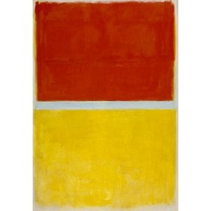
Mark Rothko’s “Untitled,” painted in 1949, isn’t merely a painting; it’s an immersive experience. This vertical canvas explodes with saturated rectangles and bands of color – crimson, deep plum, velvety black, and a shimmering copper green – arranged against a grounding field of golden yellow. The composition immediately commands attention, drawing the viewer into its quiet intensity. Rothko wasn't interested in depicting recognizable forms or narratives; instead, he sought to evoke profound emotional states through pure color itself. Born amidst the anxieties of post-war Europe and fueled by a deep sensitivity to human suffering – a legacy of his family’s experiences with displacement and loss – Rothko channeled these complex emotions into this powerfully reductive visual language.
The painting's strength lies in its deceptively simple structure. The stacked rectangles, devoid of sharp edges or defined boundaries, create an illusion of depth and movement. Rothko meticulously layered the pigments, building up a velvety surface that seems to absorb light. This technique, known as ‘gesso,’ contributes significantly to the work’s tactile quality and creates a sense of luminous richness. The soft, blended transitions between colors are crucial; they prevent the forms from appearing static or rigid, instead suggesting an ongoing process of becoming – a visual representation of contemplation and perhaps even grief.
The Purple Band: A Nexus of Tension and Release
A striking element within the composition is the dramatic interplay between the vibrant orange strip and the expansive deep plum purple band. This juxtaposition immediately establishes a dynamic tension, suggesting a push and pull between opposing forces. The thinness of the orange stripe against the breadth of the purple creates a visual imbalance that draws the eye across the canvas. The purple itself – often interpreted as representing mourning or introspection – seems to dominate the space, while the orange hints at fleeting moments of joy or remembrance. This deliberate contrast is characteristic of Rothko’s approach; he wasn't aiming for harmonious balance but rather for a compelling dialogue between contrasting emotional registers.
The placement of the monumental black rectangle below further intensifies this dynamic. Its sheer size and velvety texture create a sense of weight and gravity, anchoring the composition while simultaneously absorbing much of the light. This dark form can be seen as representing mortality or the void – a stark reminder of our own impermanence. The narrow rectangular area painted with copper green over rusty orange adds another layer of complexity, suggesting a glimmer of hope amidst the prevailing darkness, a subtle suggestion of resilience.
Rothko’s Legacy and the Pursuit of Pure Emotion
“Untitled” is a pivotal work in Rothko's development, marking a shift towards his signature color field paintings. It exemplifies his belief that art could transcend representation and directly access the viewer’s emotions. The painting was originally intended for inclusion in the Seagram Murals, but Rothko ultimately rejected this commission, recognizing that such monumental works should not be displayed as mere decorative elements. Instead, he sought environments – like the Rothko Chapel in Houston – where viewers could experience his paintings in isolation and allow themselves to be fully immersed in their emotional power.
Today, “Untitled” continues to resonate with audiences worldwide. Its simplicity belies a profound depth of feeling, inviting contemplation and offering a glimpse into the artist’s intensely personal vision. WahooArt's meticulously crafted hand-painted reproductions capture the luminosity and textural richness of this iconic work, allowing you to experience Rothko’s emotional landscape in exquisite detail. Consider bringing this powerful piece into your home or office – a testament to the enduring legacy of one of modern art’s most influential figures.

 シェアする
シェアする


 ガラスオプションは、110cm未満のサイズでのみご利用いただけます。