x

 Acrylic On CanvasWallArtAbstract Expressionism
 1948
1948 135.0 x 118.0 cm
作品のオリジナル比率に合わせた、当店の規定サイズからお選びください。
特定のフレームやスペースに合わせて、ご希望のサイズをご入力いただけます。選択されたサイズが元の画像の比率と異なる場合、アートワークをトリミングするか、手描きで要素を追加して絵画を拡張いたします。デジタルモックアップ を制作し、制作開始前にご確認(承認)をいただきます。
画面上のプレビューは、実際のトリミングや拡張を正確に反映しているものではありません。最終的な構図は、モックアップによってのみ正確にご確認いただけます。
カスタムサイズもご利用いただけますが、元の比率を維持するためには、あらかじめ用意されたリストからサイズを選択することをお勧めいたします。

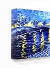
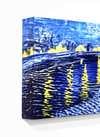
No. 9
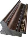
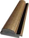
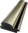
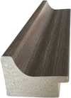
複製画のサイズ
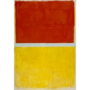
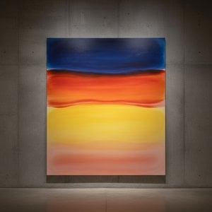
Mark Rothko's "No. 9," painted in 1948, isn’t merely a canvas splashed with color; it’s an immersion into the profound and often unsettling realm of human experience. Born Markus Yakovlevich Rothkowitz in Dvinsk, Latvia, in 1903, Rothko's early life was steeped in displacement – a constant negotiation between cultural identities shaped by pogroms and political instability. This inherent sense of otherness profoundly informed his artistic vision, driving him to explore themes of mortality, trauma, and the elusive search for meaning. “No. 9” embodies this exploration with an arresting simplicity, inviting viewers into a meditative space where color itself becomes a conduit for emotion.
At first glance, "No. 9" appears almost elemental – a collection of rectangular blocks in muted tones of ivory, slate blue, crimson red, and apricot orange. However, to reduce it to mere geometric abstraction would be a grave oversight. Rothko’s masterful technique lies in the subtle blending of these forms, creating an atmosphere of hazy depth. The edges are deliberately blurred, dissolving the boundaries between shapes and fostering a sense of ambiguity. It's not about precise representation; rather, it’s about conveying a feeling – a quiet melancholy, perhaps, or a yearning for something beyond comprehension. Notice how the slate blue streak, beginning near the center and cascading downwards, acts as a visual anchor, grounding the composition while simultaneously suggesting an inexorable flow.
Considering Rothko’s personal history – his early experiences with loss and displacement – it's not surprising that “No. 9” carries a palpable sense of grief and remembrance. The stacked shapes in the left corner, beginning with pale pink rectangles and culminating in an ivory-white rectangle extending off the bottom edge, could be interpreted as fragments of memory, stubbornly clinging to existence. The crimson red rectangle streaked with white lines evokes a feeling of blood or tears, while the overall composition suggests a landscape scarred by hardship. The repetition of forms – particularly the vertical rectangles – creates a hypnotic effect, drawing the viewer into a state of contemplation and inviting them to confront their own experiences of loss.
“No. 9” is a pivotal work in Rothko's development, marking a shift towards his signature style – large, luminous fields of color intended to evoke profound emotional responses. Painted just after his arrival in Portland and following the tragic loss of his father, it’s a testament to the artist’s ability to transform personal sorrow into universal themes. The painting’s enduring power lies not in its representational qualities but in its capacity to connect with viewers on an intuitive level, prompting introspection and offering a glimpse into the depths of human emotion. WahooArt offers meticulously crafted hand-painted reproductions that faithfully capture the essence of this iconic piece, allowing you to experience Rothko's vision firsthand.


1903年、ラトビアのダウガフピルスでマルクス・ヤコヴレヴィチ・ロトコヴィッチとして生まれたマーク・ロスコは、その生涯を色彩という言葉で人間の存在と感情の深淵を探求することに捧げた。幼少期から政治不安や迫害に晒されたユダヤ人家庭環境は、彼の中に深い感受性と苦悩の種を植え付けた。1913年のアメリカへの移民は、新たな文化との出会いをもたらす一方で、故郷との断絶という喪失感も与えた。ポートランドでの生活を経てニューヨークへ移り、当初は都市風景や人物を描いていたロスコだが、第二次世界大戦の激動期を迎え、その芸術は劇的な変貌を遂げる。
シュルレアリスムの影響を受けながら、ロスコは象徴的な形を通して普遍的な人間の感情を表現しようと試みた。1940年代後半には、彼の画業における転換点となる、純粋な色彩領域による作品群が誕生する。それらは単なる色の配置ではなく、深遠な精神性を帯びた、瞑想的な空間へと誘う力を持っていた。次第に、ロスコは具象表現から完全に脱却し、巨大なキャンバス上に不規則な矩形の色面を配置することで、見る者を圧倒的な色彩の海へと引き込むような作品を生み出した。このスタイルこそが、後のカラーフィールド絵画と呼ばれるものであり、抽象表現主義運動における重要な位置を占める。
ロスコの成熟期作品は、色彩そのものが感情と直接的に結びつくという信念に基づいている。彼は、色の微妙なニュアンスや重ね合わせによって、喜び、悲しみ、絶望、希望といった人間の複雑な感情を表現しようとした。彼の絵画は、しばしば静寂の中に潜む激しいエネルギーを感じさせる。それは、色彩が互いに共鳴し合い、まるで音楽のように響き渡るかのような感覚である。ロスコは、作品にタイトルを与えることを避け、「No. 1」や「No. 6」といった番号のみを付与することで、鑑賞者が先入観なしに作品と向き合い、自身の感情を通して作品の意味を受け止めることを望んだ。
セagram美術館の壁画プロジェクトは、ロスコにとって重要な出来事であった。しかし、彼の作品が単なる装飾品として扱われることへの嫌悪感から、依頼を断り、これらの作品を Tate Gallery に寄贈した。この行為は、彼が芸術を商業主義から切り離し、純粋な精神的価値を守ろうとした姿勢を示すものだった。そして、ヒューストンにあるロスコ礼拝堂は、彼の芸術的探求の集大成と言えるだろう。14枚の絵画が配置されたこの聖域は、静寂と瞑想の中で、人間の魂を深く揺さぶる体験を提供する。
マーク・ロスコの死後も、彼の作品は世界中の人々に深い感銘を与え続けている。彼の芸術は、ミニマリズムや現代絵画に多大な影響を与え、色彩を通して感情を表現する可能性を広げた。ロスコの作品は、単なる視覚的な体験を超え、鑑賞者の内面へと深く入り込み、自己と向き合い、存在の意味を探求することを促す力を持っている。彼の遺産は、抽象表現主義という芸術史上の重要な潮流を代表するだけでなく、人間の感情と精神性を探求する普遍的な芸術の力を体現していると言えるだろう。
ロスコの作品群は、色彩が持つ無限の可能性を示し、私たちに心の奥底にある感情と向き合う勇気を与えてくれる。それは、言葉では表現できない、人間の魂の叫びであり、永遠に人々の心に響き続けるであろう。

1903 - 1970 , ラトビア
Explore the profound emotional depth of Mark Rothko's abstract expressionism. Discover the history, techniques & lasting impact of this pivotal Color Field painter. Expert insights for collectors and art enthusiasts.

Explore the vibrant world of Gene Davis and the Washington Color School. Discover his iconic stripe paintings, innovative techniques, and lasting impact on American abstract art. A deep dive for collectors & enthusiasts.

Explore 10 iconic paintings with captivating 'mushroom' tones! Discover Van Gogh, Monet & Rembrandt’s masterpieces—earthy palettes, rich history & artistic techniques. Find museum-quality art reproductions and curated decor ideas at

Explore the profound world of Color Field painting with WahooArt. Discover key artists like Rothko & Newman, its philosophical roots, and lasting impact on modern art. Expert insights for collectors.

Explore the evolution of geometric abstraction from Cubism to contemporary art. Discover key artists like Malevich & Mondrian, investment insights, and expert collecting advice at WahooArt.


最新の美術ニュース、限定オファー、そしてインテリアのアイデアをいち早くお届けします。
お客様のプロジェクトについてお聞かせください。当社の美術専門家が、お客様に合わせた3つのパーソナライズされた芸術提案をご提供いたします。
あなたにぴったりの3作品を無料で厳選いたします
 シェアする
シェアする
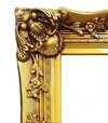


 ガラスオプションは、110cm未満のサイズでのみご利用いただけます。